


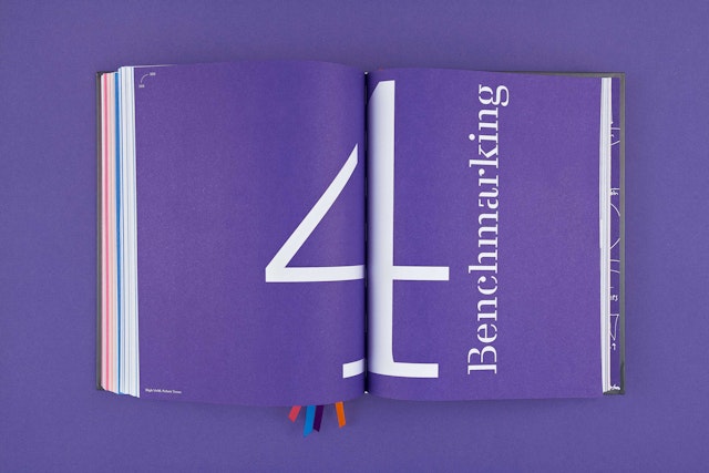
The book is divided into four sections, each with its own distinctive typography and color.

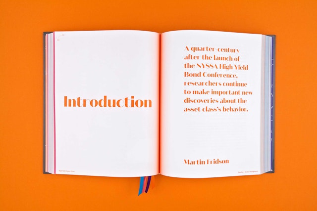
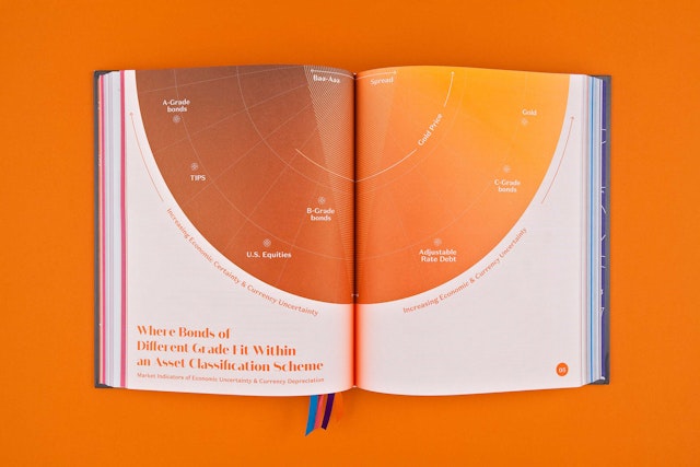




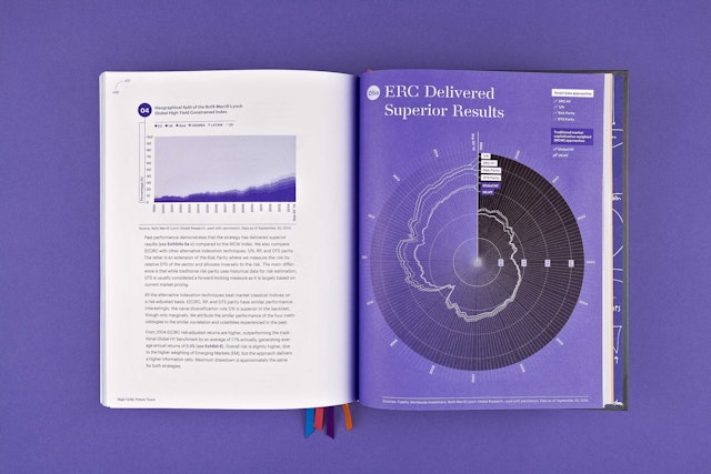
Pivotal infographics extend across the double-page spreads in a horizontal landscape orientation, symbolic of the wide view. This switches to a vertical orientation for important quotes, which are treated like mini posters.


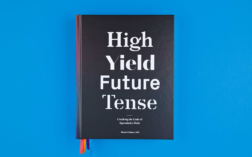
Money may be a powerful, exciting and provocative subject, but one would hardly know it from the conventional look of most financial publications. Pentagram set out to change this with the design of High Yield, Future Tense: Cracking the Code of Speculative Debt, the debut book from the New York Society of Security Analysts (NYSSA). The volume presents the outlook for high yield bonds and predicts profound changes in the marketplace, some of which have started to appear, and its pioneering point of view is matched by a design that is visually innovative, dynamic and sophisticated.
To design the book, the designers collaborated closely with publisher and co-editor Karen Sterling, Ph.D., CFA, turnaround President and Chief Executive Officer of NYSSA from May 2014–September 2015. Ms. Sterling has since returned to her position as Managing Director of Healthcare Investment Banking at a New York boutique firm. Adam Sterling, a consultant to early stage businesses, acted as the project producer. NYSSA is a not-for-profit professional society that promotes excellence and ethics in financial markets. The book is co-edited by Karen Sterling and Martin Fridson, CFA, a distinguished thought leader in the world of high yield bonds. NYSSA produces over 200 conferences each year, and the publication of the new book commemorates Fridson’s 25th Anniversary High Yield Bond Conference, held last fall. For its first book, NYSSA wanted to create a publication that felt unique, substantial and important. At the same time it had to reflect the forward-looking theories, research and methodologies of Fridson and the other contributors.
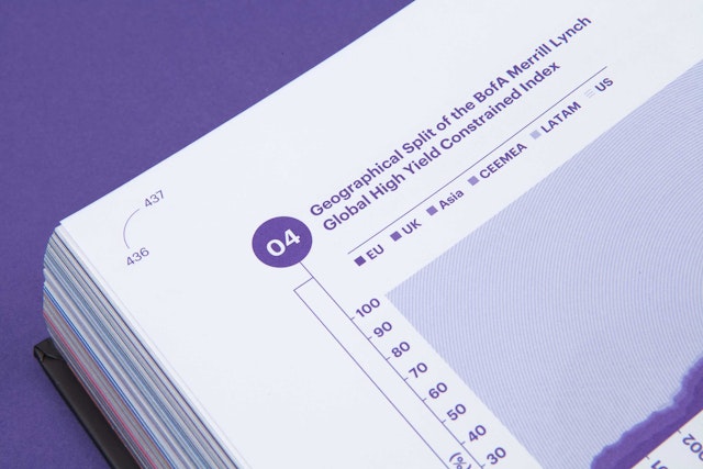
At heart, the book was a complex data visualization project. The content is dense with information, essays and statistics from analysts and academics from all over the world, and is richly illustrated with 168 exhibits, including 111 charts and graphs and 57 tables, plus 31 mathematical formulae. The book describes how to use this detailed information to generate higher yields, and there was a corollary challenge for the designers: getting a high yield, visually, from a subject that is usually graphically sedate.
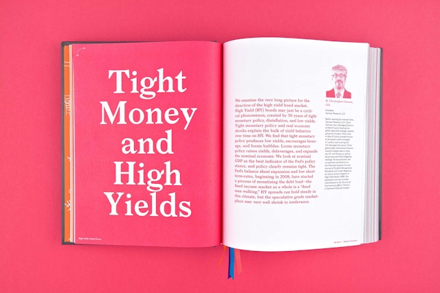
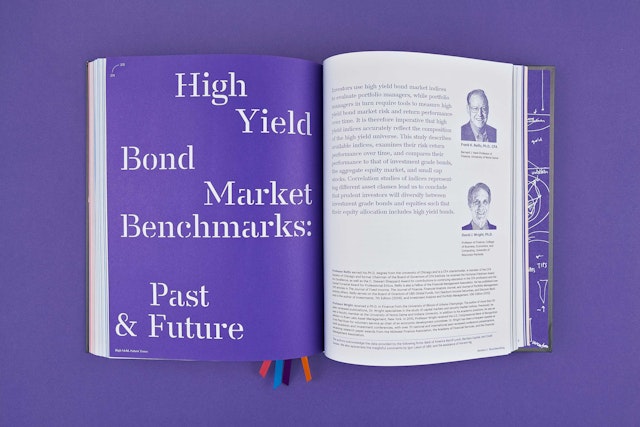
The design uses typography and color as organizing elements. The book is divided into four sections: market dynamics, active management, analytical innovation and benchmarking. Each section features its own distinctive typography, with different fonts used for titles and text. Unfamiliar, ultramodern typefaces were selected to give the book the feel of being completely new; the fonts used in the title typography include Larish Neue, Domaine Sans Display, Px Grotesk and Danmark. These are introduced on the cover and mapped out in the table of contents.
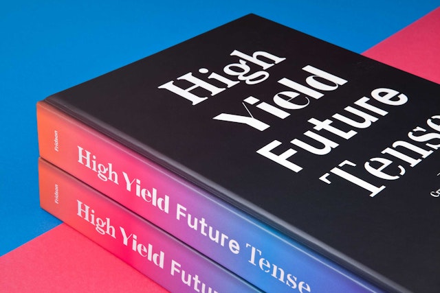
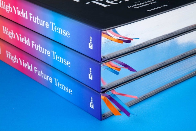
The design makes the most of the format. Pivotal infographics extend across the double-page spreads in a horizontal landscape orientation, symbolic of the wide view. This switches to a vertical orientation for important quotes, which are treated like mini posters. (The designers thought of these as graphic centerfolds, “eureka” moments of excitement for readers.) The designers weren’t afraid of the gutter, which radiates with a glow of gradated color that quickly lets readers know which part of the book they are in. Matching ribbon bookmarks also help indicate the sections.
The graphic language of finance is utilized in unexpected ways. Meticulous charts and graphs appear in the vibrant colors of their respective sections. Portraits of contributors are a pixelated take on the iconic pointillistic “hedcuts” of The Wall Street Journal. Terms in the index are highlighted to give them the appearance of a bar graph. The endpapers feature sketches by project producer Adam Sterling and Yo-E Ryou, a designer of the book, drawn during meetings to introduce the complex quantitative financial topics addressed in the book. They show the first imagining of potential ways to interpret technical data. The cover packages the book as a desirable object that invites readers to pick it up and explore. Title typography is crisply debossed in white on the cover of metallic silver, selected for the 25th anniversary, with a warm grey tint. Soft matte lamination gives the cover a welcoming tactility and keeps it spotless from fingerprints, and the fore-edges of the pages are gilded with silver.
High Yield, Future Tense: Cracking the Code of Speculative Debt can be ordered here.
Sector
- Publishing
- Finance
Discipline
- Books
- Data Driven Experiences
