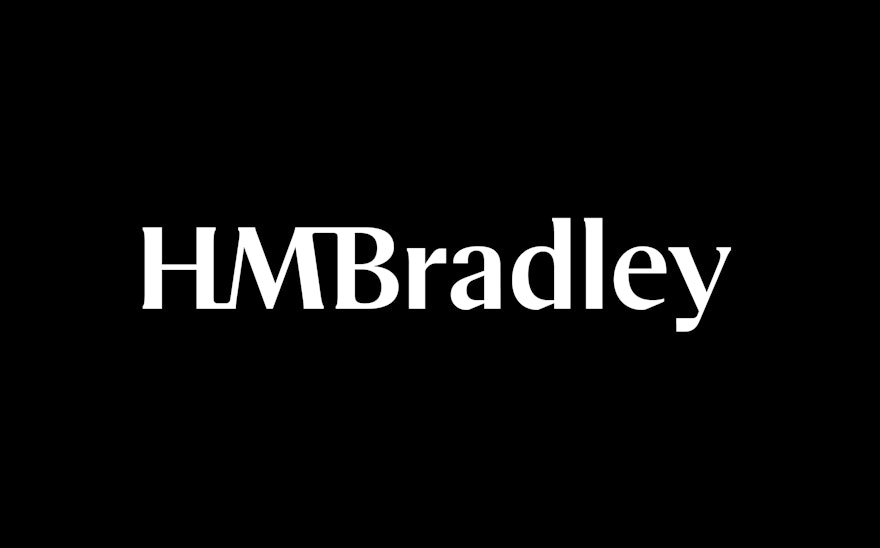

The wordmark doubles as an escalating line chart that subtly illustrates the bank’s central concept of growing worth.


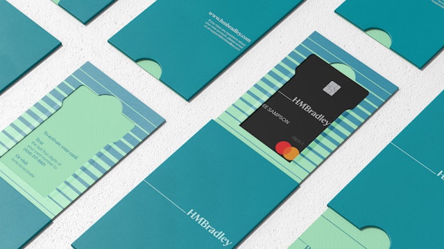
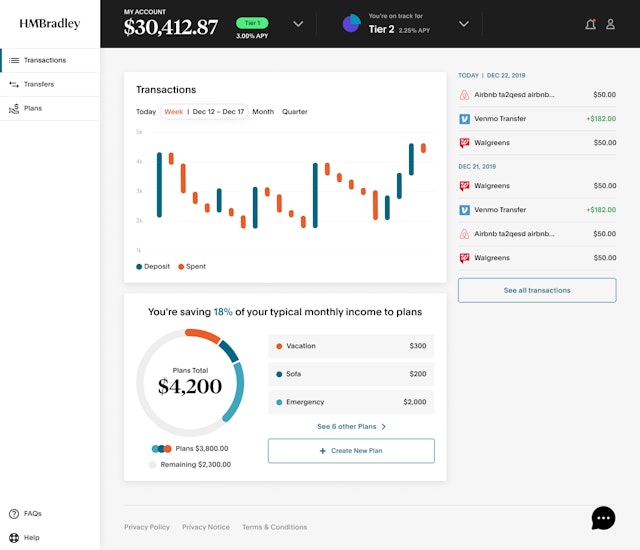

Saving is the fundamental building block of an individual’s successful financial life, but one of the hardest things to master. HMBradley is a new high-yield digital banking platform that makes saving simple and rewards people for their positive financial behaviors. The bank will pay the industry’s highest interest rates to account holders who save a portion of their monthly deposits, regardless of how much money they earn. At the same time, the platform streamlines banking by combining checking and saving into a single digital bank account for its members.
Pentagram created a brand identity for HMBradley that captures the platform’s innovative concept and introduces an engaging set of tools that help users start building wealth. The branding hints at the familiar symbols and motifs of banking and finance, but with a point of view uniquely suited for the digital world.
Pentagram worked closely on the project with the leadership at HMBradley, including co-founder and CEO Zach Bruhnke and co-founder Dmitry Gritskevich. Based in Santa Monica, the startup was developed by a team of banking and technology veterans and is backed by PayPal founder Max Levchin and other fintech heavyweights. The founders recognized that traditional banks were not set up for today’s financial practices and activities. Despite tremendous advances in fintech, the banking industry still relies on foundations devised over a century ago, which were based on physical currency that needed to be stored.
HMBradley has been designed from the ground up to deliver a modern banking experience made for the digital world. Every aspect has been planned around the user to make the banking experience a pleasure. The company wants to change how consumers think about banking and help them fall in love with personal finance. It actively encourages its members to save and increases awareness about planning ahead, even in uncertain times.
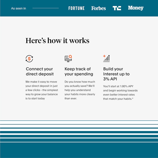
The platform centers on “Saving Tiers” that offer a structured incentive system for members, who get paid a higher level of interest for saving a greater percentage of their direct deposits rather than spending the money. A user’s Savings Tier is calculated based on the percentage of their deposits that remain in their account at the end of each quarter. The more they save, the higher their annual percentage yield (APY), all the way up to an industry-leading 3% for users who save 20 percent or more of their deposits. Merging checking and saving into a single digital bank account makes it easier for members to monitor and build their money.
“HMBradley presents an entirely new experience that will change how consumers think about banking,” said Levchin. “Aside from its digital-first design that makes sense for the way people handle money today, it was developed to help consumers be more responsible with their money.”
HMBradley is positioning itself as a challenger brand in its category, targeting an audience of millennials and Gen Xers whose rates of saving tend to fall behind their elders. The Pentagram team started with an audit of existing brands, recognizing that HMBradley needed to fit into the relatively new world of cashless apps and platforms that are working to democratize the financial system and help consumers achieve financial well-being. Within this group, HMBradley wants to set itself apart as the go-to bank for saving and a trusted partner in users’ financial lives.
The conceptual approach combines a classic-sounding name with a contemporary design presentation that puts a fresh spin on visual language familiar to banks and financial institutions. The “HMBradley” name was invented to sound like a classic financial personage––think JP Morgan or Warren Buffet. The brand’s tone of voice and personality of the brand is smart, approachable and straightforward, summed up in messaging like “Banking is old. Building is new.”
The graphic identity is built around two linear motifs: A rising line runs through the logo, and is echoed in patterns of lines that appear throughout the branding. The HMBradley wordmark transforms the angles of the “M” into an escalating line chart that subtly illustrates the bank’s central concept of growing worth. (The idea is clearly seen in the “HMB” monogram version.) A serif-like line links the letters “H” and “M” at bottom, and “M” and “B” at top. The logotype customizes the typeface Tempios Headline (originally designed by Klim Type Foundry), with the serifs smoothed away into transitional forms.
In some applications the wordmark aligns with a baseline at left, a connecting element that doubles as a starting point for the chart that runs through the logo. Lines also form the basis of the second motif, a pattern of parallel lines that thicken to form a gradation. The pattern visualizes the idea of increasing value and different saving tiers, while also suggesting openness and security. The line also provides the basis for a series of simple custom icons for online banking.
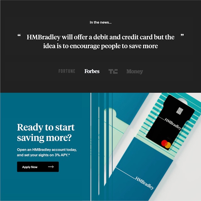
The designers developed a brand architecture that clearly outlines the HMBradley system, including the different Saving Tiers. The sleek, aspirational look of the branding is carried through applications such as debit cards, promotional materials and the digital design of the website. Art direction of imagery playfully captures the brand’s central proposition of building wealth with visuals of ascending stairs and ladders. The images mix 2D and 3D, placing the planes of the flat debit card in dimensional environments that visually create a sense of depth and richness.
Office
- New York
Partner
Project team
- Jang Hyun Han
- Pedro Cardoso
- Diego Prestes
- John Sampson
- Ran Zheng
- Taylor Holland
Collaborators
- Eduardo Braniff, strategist
- Jeremy Faro, strategist
