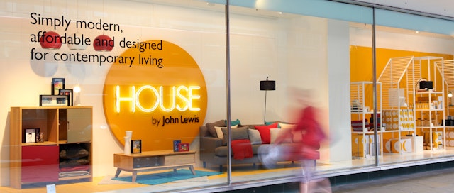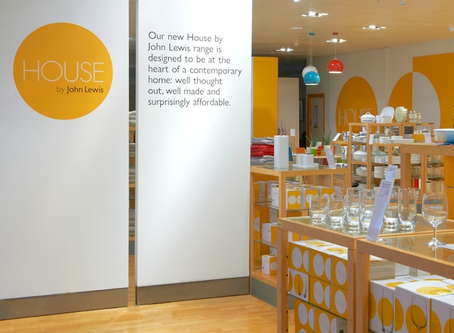


The circle is a platform and presenter of both the range name and any product that sits upon it. Collectively the circles create an eye catching pattern in store, or as a single statement of scale in the store windows


John Lewis, one of the UK’s largest department stores has just launched ‘House by John Lewis’, a broad contemporary range of products for modern day living.
Pentagram briefed to create an identity that would both introduce the range and work across a diverse array of products - and they developed a simple, flexible system that looks modern while catching the eye.
Using a bespoke dual keyline typeface for the word ‘House’, Pentagram has created a simple, bold identity for the brand. The type sits in a circle on a plain background, using white and yellow as the primary colours. The circle is a platform and presenter of both the range name and any product that sits upon it. Collectively the circles create an eye catching pattern in store, or as a single statement of scale in the store windows.
When used on packaging, the circles carry, the product, the descriptor and the range name, all held in a simple system that wraps the 3D packaging.
Office
- London
