The look and feel evoke the visual world of technology and code and the excitement of progress through scientific and engineering invention.

The subjects covered are complex and technical, but the design is clear, accessible and visually engaging in a way that reflects technology’s innovation and promise.


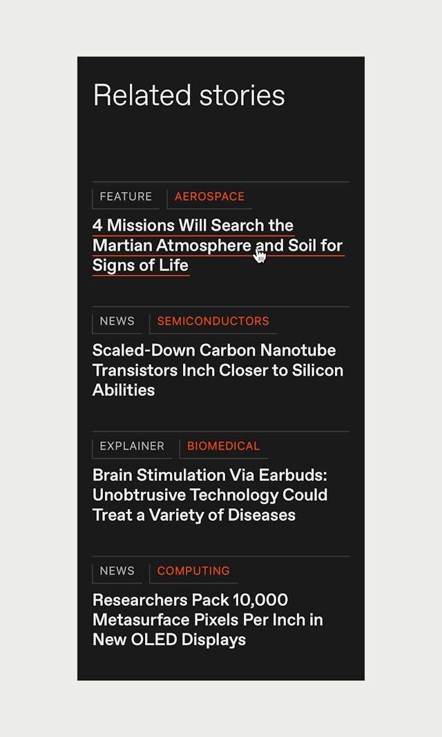
The modular design of the website surfaces more content and allows for a variety of different story hierarchies.


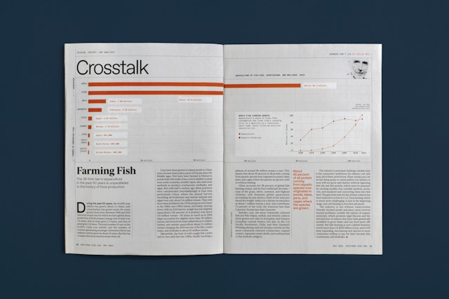

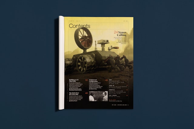
The modular organization carries through to the print magazine, which uses the same palettes, fonts and graphic devices, but can flex further across double-page spreads.


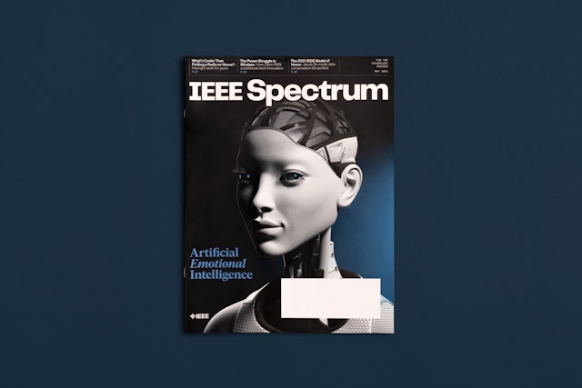
IEEE Spectrum is an award-winning technology magazine and the flagship publication of the Institute of Electrical and Electronics Engineers (IEEE), the world’s largest professional organization devoted to engineering and the applied sciences. Pentagram has collaborated with IEEE Spectrum on a comprehensive editorial redesign for both the website and print magazine, including a new identity. The look and feel of the refresh evoke the visual world of technology and the excitement of progress through scientific and engineering invention.
The Pentagram designers worked closely on the project with leadership at the magazine, including Editor-in-Chief Susan Hassler, Senior Art Director Mark Montgomery, Executive Editor Glenn Zorpette, Digital Editorial Director Harry Goldstein, Digital Project Manager Erico Guizzo, Photography Director Randi Klett and their teams.
With roots going back to 1884, the IEEE promotes research conferences, publishes engineering journals, and is responsible for major technology standards, including most famously Ethernet and Wi-Fi. Founded in 1964, IEEE Spectrum’s charter is to keep the more than 400,000 members of the organization informed about emerging concepts and developments in the field with a mix of news stories, features, special reports, podcasts, videos and infographics.
Advancements in technology and engineering are changing the world every day and have a profound impact on our lives. IEEE Spectrum wanted the redesign to convey a sense of the vitality, vision and inspiration of the field. The subjects the magazine covers are complex and technical, but the design needed to be clear, accessible and visually engaging in a way that reflected technology’s innovation and promise.
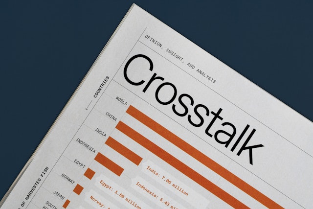
The redesign introduces a new wordmark that is systematic, rational and forward looking. The brand palette lives up to the “Spectrum” name with a vibrant color scheme that balances the black, greys and blues typical of tech with bright, warm colors like red, orange and yellow.
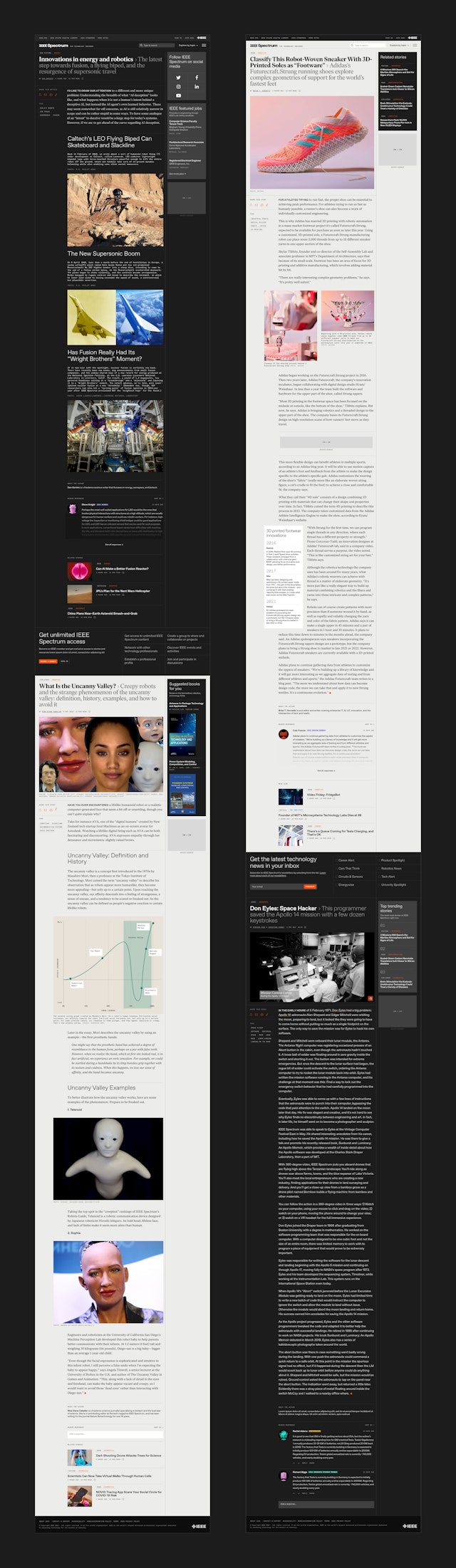
The IEEE Spectrum website has been completely overhauled with a modular design that offers a more engaging user experience and that seamlessly translates to mobile devices. The flexible grid accommodates a wide range of content, helping readers navigate the vast array of stories. The site is built on a new platform developed by RebelMouse with a continuous scroll that enables users to easily read through from one article to the next.
The modular structure of the homepage surfaces more content and allows for a variety of different story hierarchies. Larger features display imagery across the full width of the webpage for an immersive experience that signals the article’s relative importance. Graphic blocks group together trending stories and related pieces that explore topics in depth, while smaller “widgets” feature Radio Spectrum podcasts and special reports. Ad units and sponsored modules also elegantly fit within the system—and are clearly labeled to avoid any reader confusion. Pentagram also helped to reorganize and streamline the story categories and tagging system.
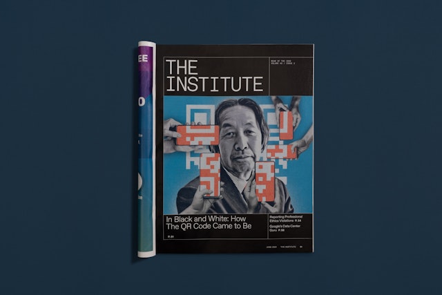
One of the goals of the redesign was to better connect with IEEE members and make them feel more invested in the publication. A distinct section called “The Institute” was developed for both the site and magazine that highlights stories about the IEEE and its members’ activities. The user experience extended to the design of the firewall that separates free content and members’ area—with subtle prompts to encourage membership.
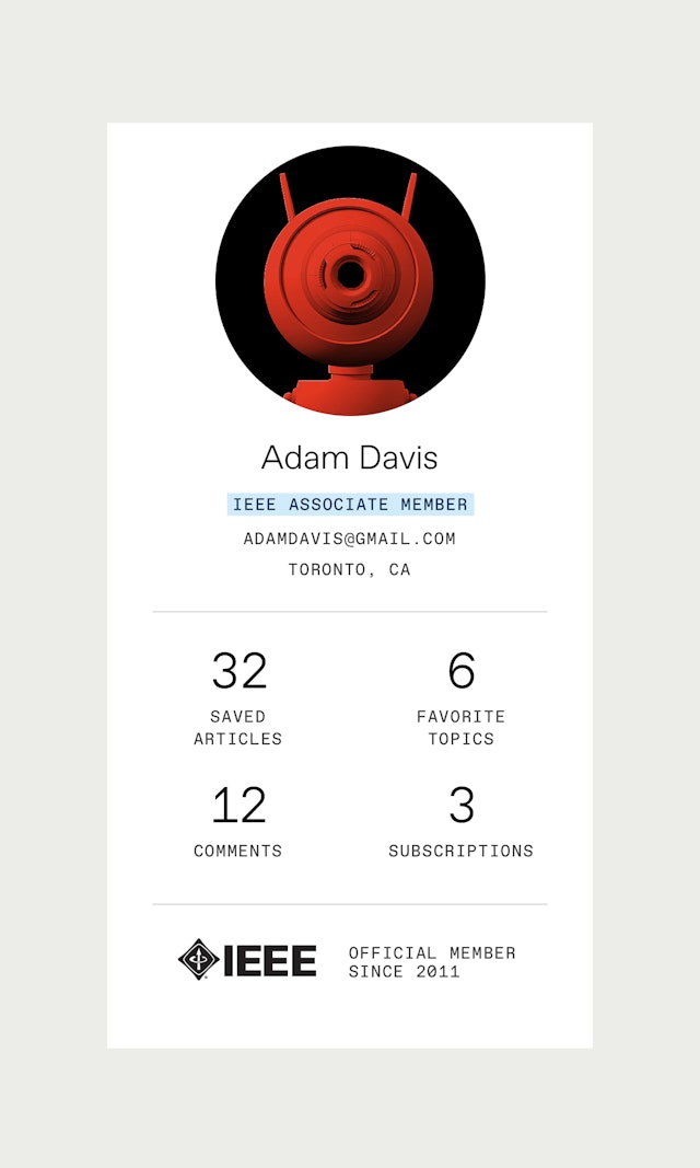
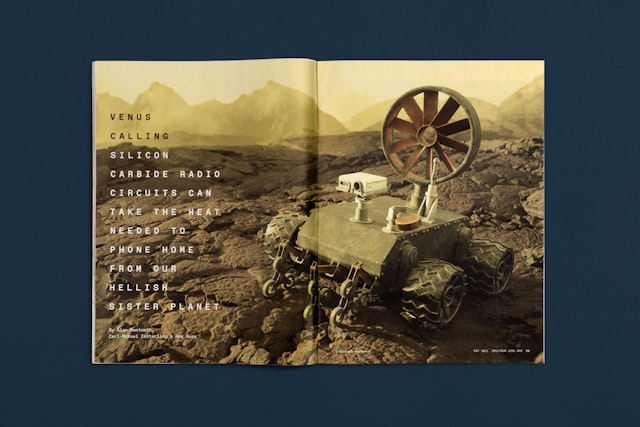
The Pentagram designers established new guidelines for commissioning photography, illustrations and digital renderings that ground the images in reality. This extends to making 3D CGI art as true to life as possible—even encouraging artists to render blemishes and dents on machines. Other approaches are more playful: When subscribers create an account, they can choose from a series of colorful robot heads to use as their avatars. The whimsical characters, illustrated by Eddie Guy, feature a variety of shapes and colors that users can choose from for their portrait. (This also saves the editorial team from having to moderate profile photos.)
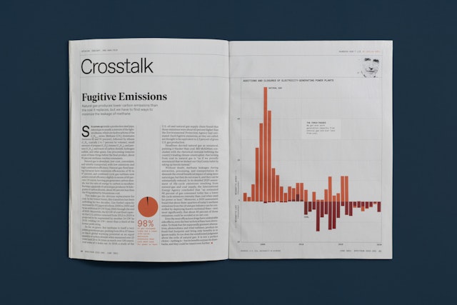
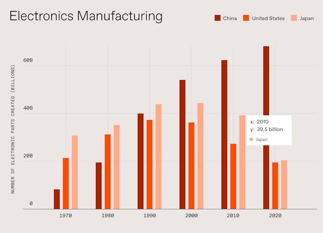
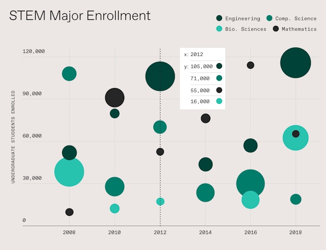
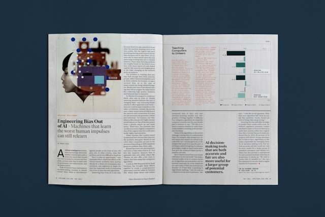
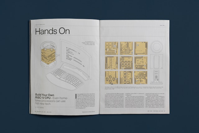
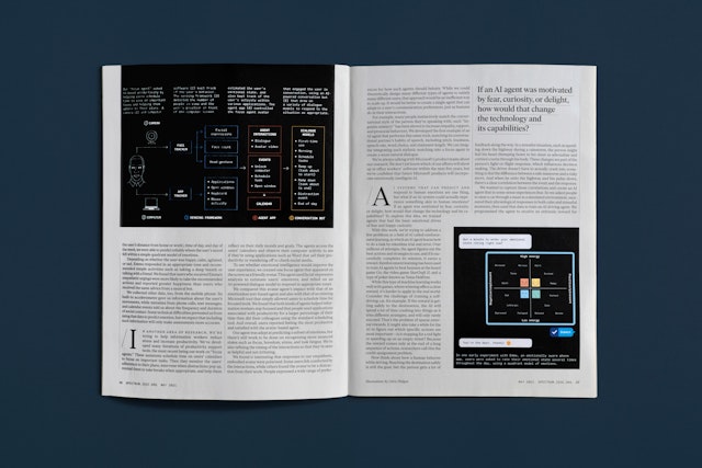
Standards were created for the consistent presentation of charts, diagrams and other infographics that scale across a full range of digital applications and can be exported for print as well. Technical diagrams use simple axonometric projection with a uniformly even and fine line weight.
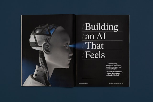
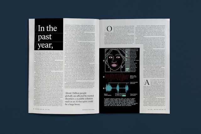
The modular organization of the site carries over to the print magazine, which uses the same palettes, fonts and graphic devices, but can flex further across double-page spreads in feature stories, where custom designs help create pacing, drama and tone setting for the content. Front and back of book pages are heavily formatted for production efficiency, allowing Spectrum’s small design team to focus on creating graphics and sourcing and commissioning imagery.
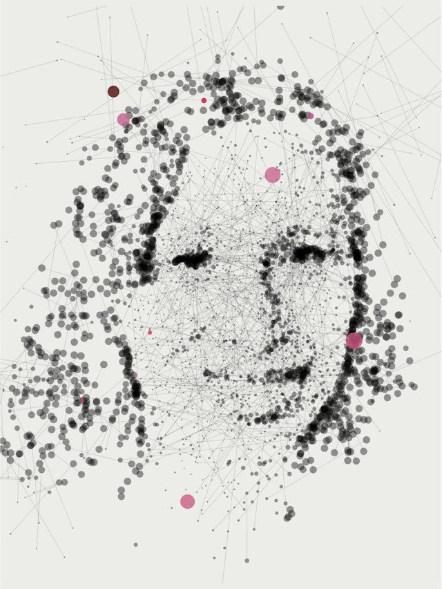
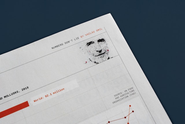
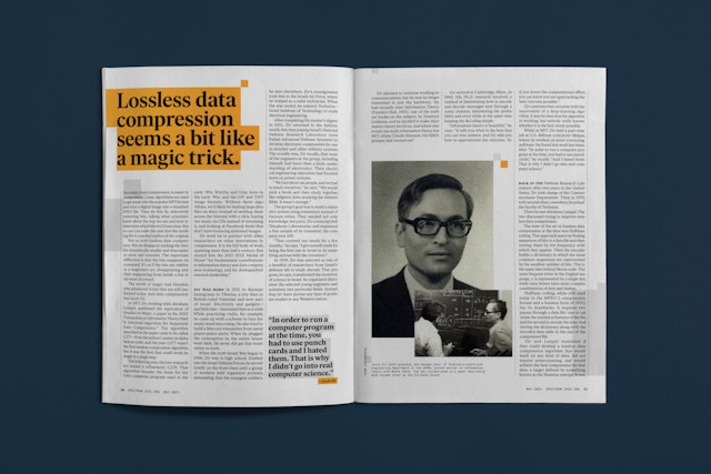
A few design details are tailored for the print publication. The generative computer code-based artist Sergio Albiac was commissioned to create a custom portrait style for contributors that renders them as networks of dots and lines. Diagrams appear on white backgrounds to set them off from the warmly tinted pages and create an additional layer of depth.
Office
- New York
Partner
Project team
- Austin Maurer
- Laura McNeill
Collaborators
- Eddie Guy, illustrator
- Sergio Albiac, digital artist
- RebelMouse, developer
