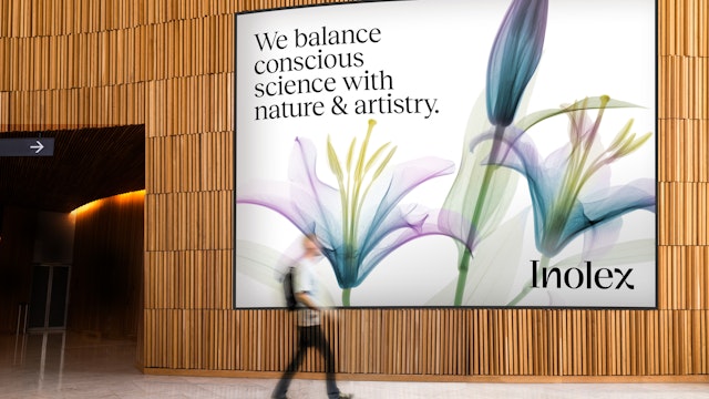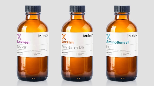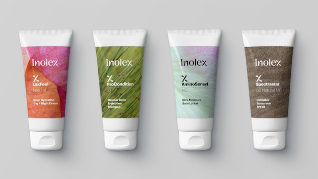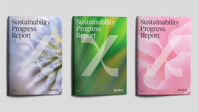
With its new identity, Inolex stands apart from the traditional companies in its industry and instead fits in alongside the beauty and personal care brands that are its clients.


The identity's special ingredient is right in the name––the "x" at the end of Inolex. As a symbol rich in meaning, it is immediately recognizable as Inolex.


Inspired by historical imagery from pioneering studies of botany, Pentagram developed a visual language that combines science, nature and artistry in a way that is both technological and expressive.


Inolex is a fiercely independent company that creates sustainable ingredients for health, beauty and wellness. It designs emerging technologies that honor nature as they ensure the safe and optimum performance of leading brands and products in more than 85 countries around the world.
By balancing conscious science with nature and artistry, their imaginative approaches become the building blocks for a wide range of consumer products.
Pentagram's Michael Gericke and team have developed a new brand identity that captures the company's mission and defines Inolex as a disruptor in its industry.
The Strategy
The brand strategy makes visible the company's forward-looking focus. With its new identity, Inolex stands apart from the traditional companies in its industry and instead fits in alongside the beauty and personal care brands that are its clients. The new look was designed to be bold, confident and irreverent.
In the words of Chief Executive Officer David Plimpton, "we challenge ourselves to think differently to invent the future of ingredient platforms—and our people and products exist to serve the greater good. Can you be disruptive while still caring deeply for others? Absolutely."
The Solution
The identity's special ingredient is right in the name––the "x" at the end of Inolex. As a symbol rich in meaning, it is immediately recognizable as Inolex. The letter can stand for "x factor," denoting an exceptional quality or attribute or a value not yet known. It also suggests multiplication and increasing power, as well as "ex," the prefix meaning "out of" or "from."
The designers created a distinctive "x" with rectilinear and curvilinear forms that nod to the company's duality between science and nature, technology and wellness, gesture and precision, creativity and knowledge, research and artistry. The look of the transfigured "x" extends to the new wordmark constructed of bespoke type that combines sans and sans serif letterforms.
Just as the logo combines the solid and fluid, the Inolex brand color is a vibrant teal balanced between earth green and water blue, part of a broader contemporary palette that expresses the company's mission around sustainability and creativity.
While its ingredients are used in products for personal care, Inolex chose not to define its idea of beauty with commonly used photos of people but rather to look for the boundless beauty in nature. Inspired by historical imagery from pioneering studies of botany, Pentagram developed a visual language that combines science, nature and artistry in a way that is both technological and expressive.
The program features vivid images created from 3D micro-CT scanning, with full-color ultra-high resolution images of cross-sections of plants and flowers with remarkable detail and ethereal, translucent beauty. Across the identity program's materials, they are paired with immersive photographs of the natural world with evocative and abstract patterns.
Client
InolexSector
- Fashion & Beauty
- Manufacturing & Industrials
Discipline
- Brand Identity
- Brand Strategy
Office
- New York
Partner
Project team
- Marielle Gross
- Melisa Ozkan
- Reid Parsekian
- Amanda Walter
- Catherine Chung
- Migle Jankauskaite
Collaborators
- Victor Bartis (Typography)
- Matt McInerney (Web)
- Sarah Stump (Editorial)
