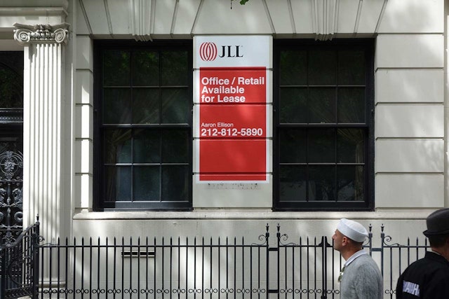

The JLL symbol is known as the ‘Worldmark’ and represents a truly global company comprised of multiple strands of expertise working in collaboration.
Pentagram Berlin has updated the brand identity of JLL, the global real estate services provider. The new logo accompanies the shortening of the company’s name from Jones Lang LaSalle to JLL.
A leader in its category, JLL specializes in commercial real estate services and investment management and employs 48,000 people in 1,000 locations in 70 countries around the world. The JLL symbol is known as the ‘Worldmark’ and represents a truly global company comprised of multiple strands of expertise working in collaboration. Pentagram retained the iconic symbol for the refresh, but made it red to help it better stand out and added shading to make it more dimensional.
The symbol has been paired with a new JLL wordmark that replaces the name Jones Lang LaSalle, which was originally set in Minion Pro Condensed. Newly drawn by the designers for the identity, the JLL letterforms are bold yet narrow serif letters that look modern but still carry the heritage of the brand. The name was shortened to reflect the fact that many clients, investors and other stakeholders already refer to the company as JLL, and the new name is also more easily recognized and pronounced in languages worldwide. The shortened name is also ideal for digital applications.
In addition to the logo, Pentagram has produced a set of design guidelines and templates for the identity.
Office
- Berlin
