The Katerra brand identity conveys the company’s design approach, linking standardization with customization.

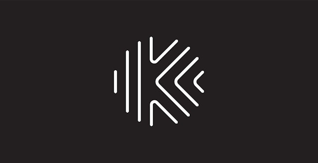

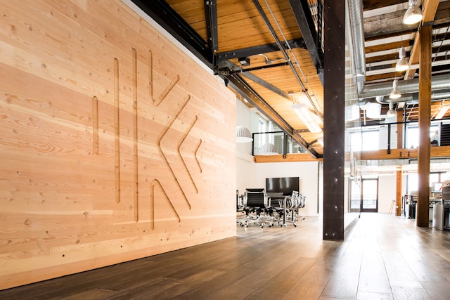
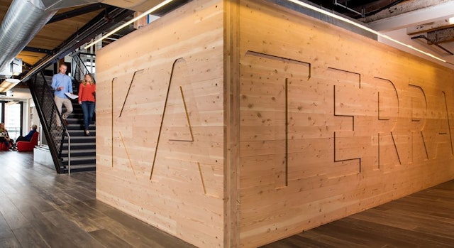
The Katerra icon evokes foundational systems like tree rings, urban grids, topography and fingerprints.

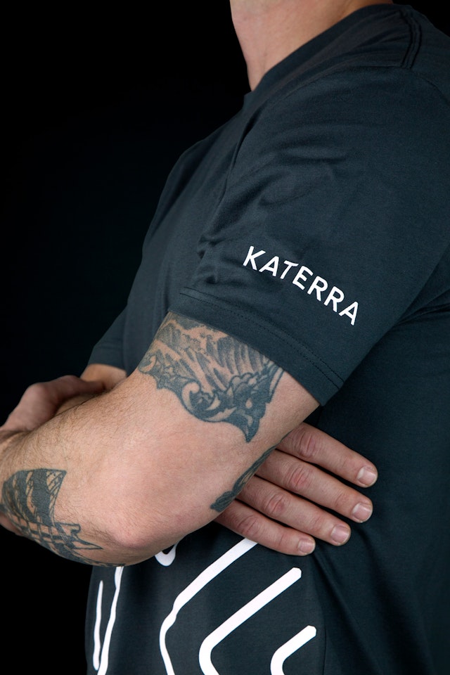
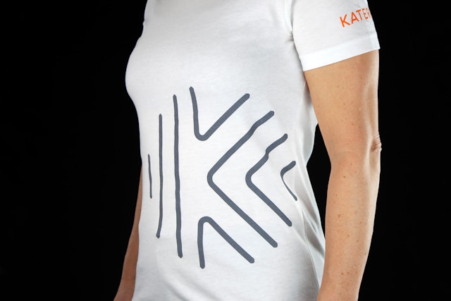
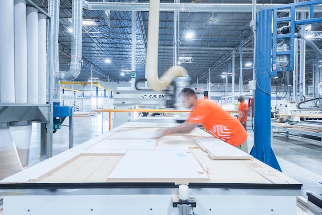


Graphic elements use the visual language of construction and building as a starting point.

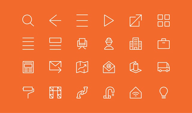
The symbol’s radiating lines have been extended into a series of different geometric patterns.




Katerra is a technology-driven offsite construction company that provides fully integrated, end-to-end building services that result in better, faster and cheaper projects. The company is transforming the industry, bringing the technologies and efficiencies that revolutionized Silicon Valley to optimize every aspect of building design, materials supply and construction. Katerra also goes beyond design-build to partner with architects, cities, governments and companies to develop sustainable practices and smart urban planning.
Pentagram has designed a brand identity for Katerra that raises the profile of the company and helps convey what it does. The project encompasses brand strategy and messaging, iconography, promotional materials, packaging and livery, environmental graphics, website and digital applications, and a brand animation.
Pentagram worked closely with Katerra leadership on the program. Founded in 2015, the fast-growing company is no longer really a startup––it’s already one of the top 25 multifamily general contractors in the U.S., with a $1 billion valuation and more than 1,500 employees globally––and it wanted to look like an established brand. It also required a brand architecture that could expand along with it, as it moves into launching a portfolio of products that offer everything needed to deliver high-quality building projects.
The first challenge for the designers was to develop a brand story, a narrative of how Katerra works, to form the basis of the identity. The company’s design approach links standardization with customization, and the brand identity is inspired by foundational systems that are both unique and patterned, such as tree rings, urban grids, topography and fingerprints. The Katerra icon evokes these sources with a “K” formed by lines that radiate from the shape of the letter. The ends of the lines are cut with angles, like joinery in construction. This specialization extends to the letterforms of the wordmark, set in a custom font with angled ends and apexes.
Graphic elements embrace Katerra’s contemporary, streamlined and sustainable approach, using the visual language of construction and building as a starting point. The typography balances simple functionality with elegance, combining the neutral sans Univers with the serif Publico Banner Light. A limited color palette of construction-oriented orange, black and gray appears in skewed shades that feel more modern. The designers developed a system of custom icons that use the line weights and angled cuts from the Katerra “K,” and the symbol’s radiating lines have been extended into a series of different geometric patterns.
The Katerra website is a comprehensive resource with a clean, clear and accessible design that highlights the company’s services and products. Film and video is used in wide-screen views to give a sense of Katerra’s all-encompassing capabilities and the scale of its projects. The Pentagram team also created a brand animation that illustrates the design and construction process and brings the identity to life.
Client
KaterraSector
- Arts & Culture
- Manufacturing & Industrials
- Technology
Discipline
- Brand Identity
- Digital Experiences
Office
- New York
Partner
Project team
- Brankica Harvey
- Pedro Mendes
- Jack Collins
- Shannon Jager
- Paul Yoon
