A keel is the structural spine of a ship, and the name is a nod to the company’s connection to the sea, as well as a reference to its mission to serve as a leader in textiles, innovation, and sustainability.

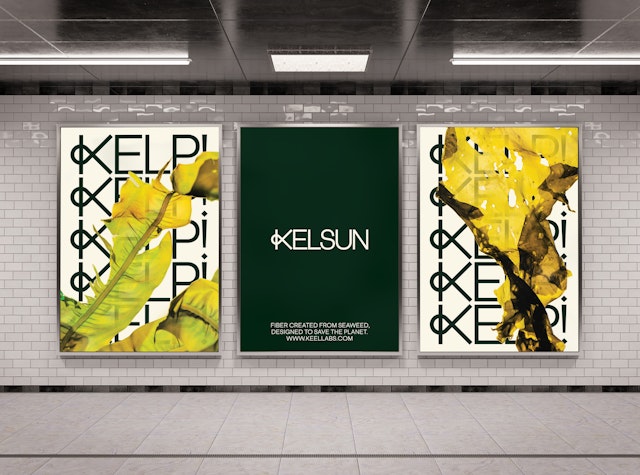
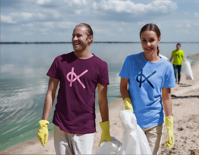
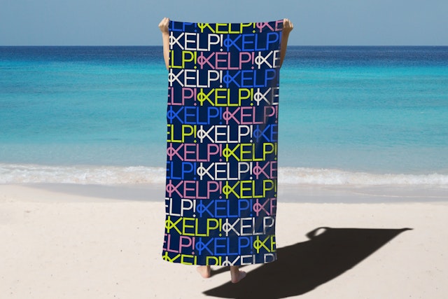
The Kelsun identity centers on customized ‘K’ that combines the letter with a knit loop and can be used to form growing patterns.
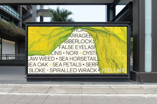
The visuals celebrate the beauty of the natural environment that is both the starting point and the inspiration for Keel’s work.

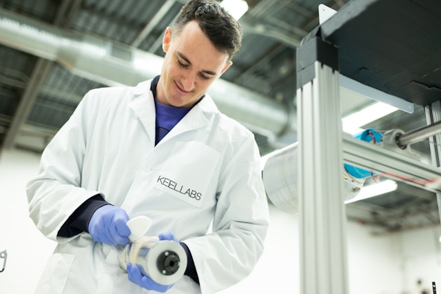
Keel Labs is a sustainable materials company addressing the highly polluting systems of textile production with aquaculture-based technologies. Pentagram has designed a brand identity for Keel Labs that supports its mission as a platform for climate-focused material solutions. The rebrand includes a new name for the company, formerly known as AlgiKnit, as well as the identity and name for its debut product Kelsun, a seaweed-based yarn that has a significantly lower environmental footprint than conventional fibers.
Founded in 2017 and based in Morrisville, North Carolina, Keel Labs is working to harness the natural power of aquatic ecosystems to transform the textile industry. Many of the most widely used fabrics today are petroleum-based, and thus reliant on fossil fuels. Even natural legacy fibers use water and pesticides in cultivation, and some even use toxic chemicals in their production process. By contrast, Kelsun is derived from kelp, a form of algae that is one of the most regenerative organisms on the planet. It also absorbs carbon dioxide at a rapid rate, resulting in cleaner, improved marine habitats and ecosystems.
Given the planet-sized challenges it is taking on, Keel Labs needed a brand identity that was energetic and enduring. By definition, a keel is the structural spine of a ship, from the bow to the stern, functioning to create balance between the ocean and to keep a ship’s momentum moving forward. Choosing the term for its name was a nod to Keel Labs’ connection to the sea, as well as a reference to its mission to serve as a leader in textiles, innovation, and sustainability overall.
“The name Keel Labs encompasses our vision of ever expanding horizons, of our commitment to innovation and opportunity,” said Keel Labs co-founder and CEO Tessa Callaghan. “Our work begins with fiber but our responsibility does not end there. We are building a future in which sustainable materials harness the power of our oceans to span industries and applications, repairing humanity’s relationship with our natural ecosystems.”
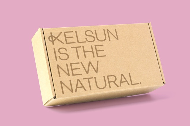
The name Kelsun, adapted from kelson, is also rooted in seafaring. In shipbuilding, the kelson is the reinforcing structure supporting the keel; as the company’s flagship product, Kelsun is the backbone of Keel Labs.
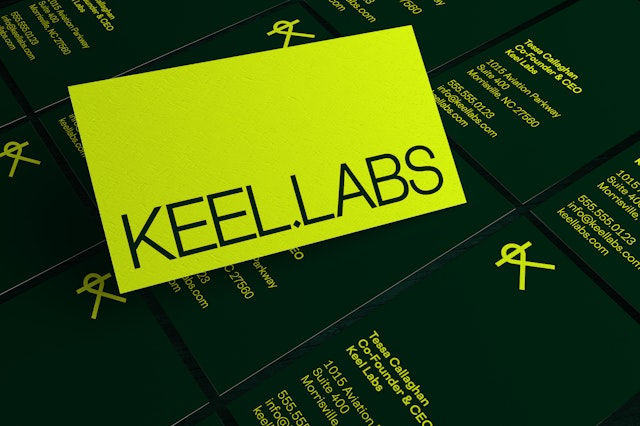
The overall look and feel of the identity is bright, clear and simple, balancing the organic and the scientific. The Keel Labs wordmark is set in the geometric sans Cosmica, with the words separated by a square diamond shape that repeats throughout the brand.
The Kelsun identity centers on a “spun K” symbol that combines the letter with a knit loop. The logo can be multiplied in dynamic graphic patterns that suggest growing kelp or weaving fabric. The customized “K” provides a link from Keel Labs to the products it makes, and is designed to work at any scale, to be reproduced on any substrate, and to provide the basis for an expanding family of materials.
The visuals celebrate the beauty of the natural environment that is both the starting point and the inspiration for Keel’s work. The designers commissioned original photography of kelp plants and the processes that transform it into yarn, which is showcased in immersive, large scale images on the Keel Labs website.
Client
Keel LabsSector
- Fashion & Beauty
- Manufacturing & Industrials
- Technology
Discipline
- Brand Identity
- Brand Strategy
- Naming
Office
- New York
Partner
Project team
- Sachi Chandiramani
- Gabe Smoller
- Abby Matousek
- Camila Pérez
