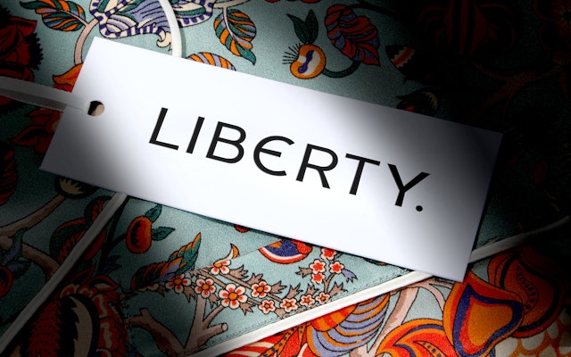
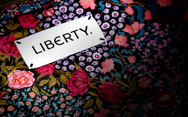
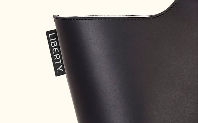
Carefully redrawn and refined from the original sign that hung above the store’s Great Marlborough Street entrance, the new logotype also includes the full-stop which appeared on the original sign.


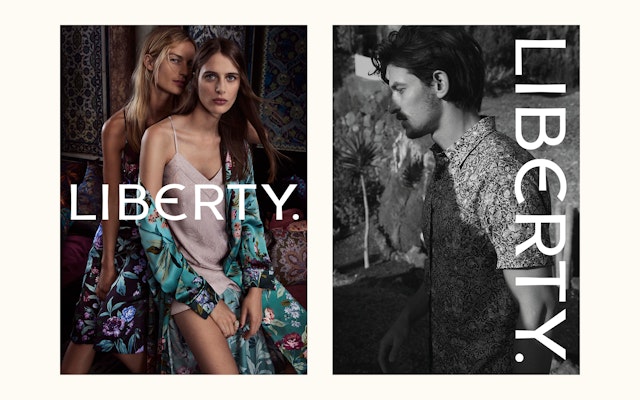
The design team used letterforms inspired by the new logotype to create a custom display typeface Lasenby Sans, named after Liberty’s founder. Although idiosyncratic and crafted, it still feels effortlessly modern.


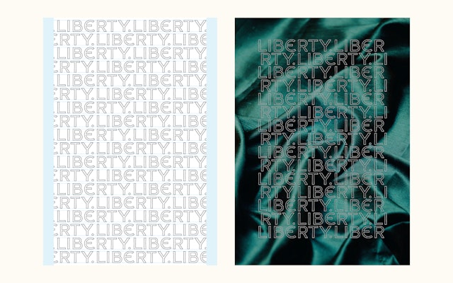
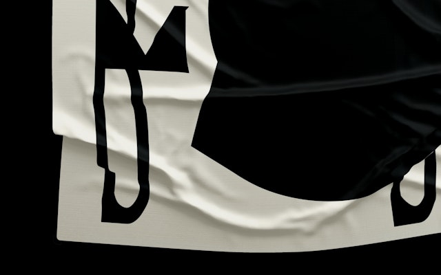
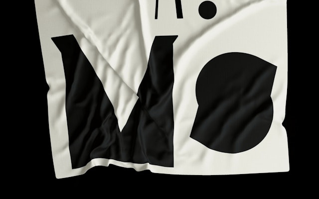
The design team created a series of playful and unexpected typographic executions which perfectly capture the spirit of the ‘unapologetically eccentric’ brand.


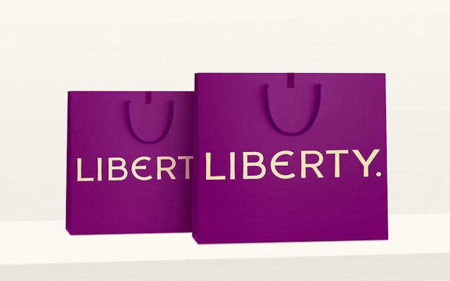
The new branding is designed to work seamlessly across all of Liberty’s many applications, both in-store and online, from its iconic carrier bags and swing tags to its new website and app.


Pentagram’s new identity embodies craft, archaeology and refinement, combining modernism and timeless classicism to give Liberty a renewed confidence.

Pentagram has created a new brand identity for Liberty, London’s iconic luxury department store which was set up by Arthur Lasenby Liberty in 1875. Liberty carries a carefully curated collection of fashion and homeware, combining directional design and celebrating craftsmanship with its combination of high-end brands and emerging designers.
Globally, the Liberty brand is instantly recognisable and synonymous with the very best in contemporary design. While it references Liberty’s rich heritage, the new identity needed to embody Liberty’s forward-thinking ethos, and take it confidently into its next chapter.
Liberty has been trading from its current building on Regent Street, built using timber from two ancient battleships since 1924. While it has other retail outlets, the Liberty brand is synonymous with London and the unique shopping experience created in the Regent Street store—hence, a sense of place was an important consideration for the design team.
Carefully redrawn and refined from the original sign that hung above the store’s Great Marlborough Street entrance, the new logotype also includes the full-stop which appeared on the original sign. It is designed to be flexible and can be repeated, layered and bent to cover packaging and campaigns, as well as transforming into its own repeat print.
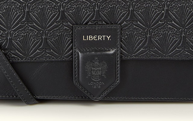
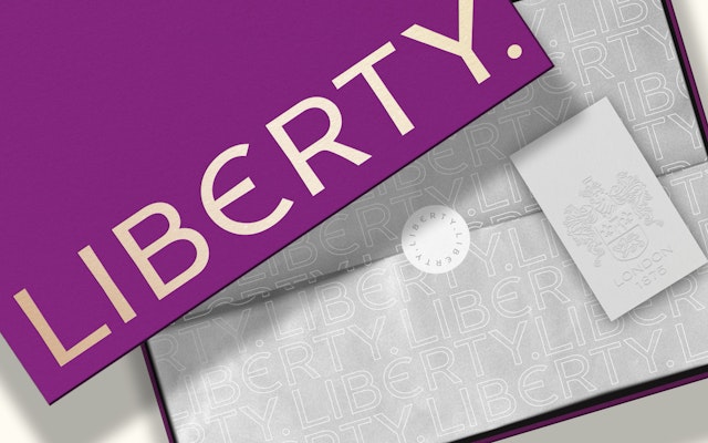
Another important element in the brand identity is the Liberty crest which has been redrawn to give a subtler, more modern effect. Both the crest and the strapline ‘London 1875’ are essential brand assets but are treated as embellishments to the brand rather than part of the brand itself. Working alongside the retail brand without dominating it, both can be used sensitively to add a sense of heritage, place or ‘added’ value, especially for the overseas market.
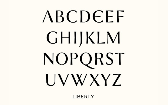
The design team used letterforms inspired by the new logotype to create a custom display typeface Lasenby Sans, named after Liberty’s founder. Created in collaboration with Colophon type foundry, the typeface includes tapered line endings, a low x-height and a distinctive curved ‘Epsilon’ style letter ‘E’. Although idiosyncratic and crafted, it still feels effortlessly modern.
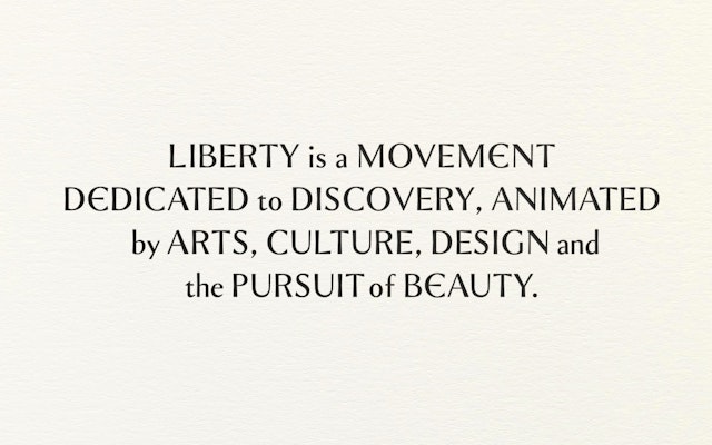
Lasenby Sans is adaptable and designed to be used in many different contexts, which allows for a wide array of expressive forms. The design team created a series of playful and unexpected typographic executions which perfectly capture the spirit of the ‘unapologetically eccentric’ brand.
Two secondary typefaces which complement Lasenby Sans, the sans serif Akzidenz Grotesk BQ and the serif Portrait by Commercial Type, which is used for running text and body copy. The primary colour palette mixes tradition, luxury and modernity with Liberty’s famous purple supported by a subtle gold, black and white.
The new branding is designed to work seamlessly across all of Liberty’s many applications, both in-store and online, from its iconic carrier bags and swing tags to its new website and app. To ensure that the brand refresh was cost-effective and sustainable, the new branding will gradually be introduced to customers over a period of time.
Liberty CMO Madeleine Macey comments: “145 years after Liberty opened its doors for the first time, we’re proud to remain a destination for discovery and good design for all. With new branding, a restored store and a reimagined digital platform, as custodians of this beloved British institution we hope to have prepared Liberty for the next part of its journey which will last longer than any of us.”
Pentagram’s new identity embodies craft and refinement, combining modernism and timeless classicism to give Liberty a renewed confidence. While Liberty has always acknowledged its incredible history, its willingness to embrace change and set new trends has seen it remain at the very forefront of British retail. Pentagram’s new identity will only add to Liberty’s enduring charm, appealing to its loyal clientele while helping it attract a new generation of discerning customers from all over the world.
Office
- London
Partner
Project team
- Johannes Grimmond
- Romilly Winter
- Tom Walker
- Tiffany Fenner
- Mariana Santiago
Collaborators
- Carrie Stokes (strategist)
- Colophon (typeface development)
