Pentagram has designed a new identity for MacroFactor that frames science as both exacting and human.
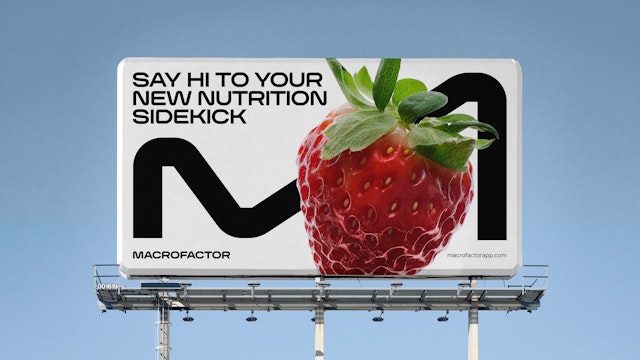
At its core is MacroSans, a custom variable typeface designed to embody the brand’s dual character: architectural in structure yet fluid in application.
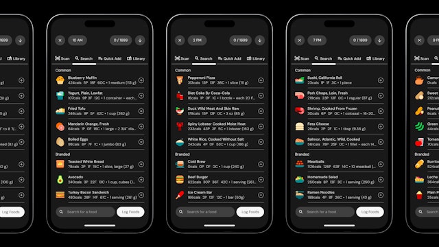
Over 450 icons were redrawn not as embellishment but as instruments—visual units of measurement that make discipline legible and even delightful.
In the ecosystem of nutrition apps, most products trade on convenience or aspiration: they count calories, gamify habits, or stage lifestyle fantasies. These technologies often feel disposable to dedicated gym-goers and disciplined athletes—too lightweight to match their rigor.
MacroFactor is built for people who want to get serious about their bodies—whether that means losing weight, gaining muscle, or simply building healthier habits. Developed by scientists, coaches, and engineers, the app turns adaptive algorithms into practical guidance, delivering precision that users can trust. Its proposition is simple and direct: knowledge creates clarity, and clarity creates progress. But clarity alone doesn’t make a brand. Numbers require narratives; data needs design.
Pentagram has designed a new identity for MacroFactor that frames science as both exacting and human. Inspired Science is less a slogan than a tension: rigorous and empathetic, motivating and methodical. This idea crystallizes in the mission Empower Every Body, turning evidence into possibility—making strength, confidence, and insight accessible to all. And it expands into a vision: The whole MF World—a playful shorthand that signals both the scale of ambition and the community spirit at the heart of MacroFactor.
"What excites us the most is that our brand can now look as big as we aspire to be,” says the MacroFactor team. “We feel like we can hold our heads high and square-up to every big challenge ahead.”
The design system is where precision and adaptability are brought to life. At its core is MacroSans, a custom variable typeface designed to embody the brand’s dual character: architectural in structure yet fluid in application. With its wide range of weights and widths, MacroSans adapts effortlessly across interfaces, editorial, and motion—an essential tool for a brand that thrives on flexibility.
The dynamic “M” extends that adaptability into motion. Expanding, contracting, and wrapping around text and imagery, it translates the intelligence of the algorithm into a visual rhythm—stretch, sprint, jump, spin—that energizes every digital application.
Icons and illustrations are another essential layer of the identity. Food logging is the ritual heart of the product, and over 450 icons were redrawn not as embellishment but as instruments—visual units of measurement that make discipline legible and even delightful. Alongside them, a suite of in-app illustrations marks key moments of accomplishment. These range from simple affirmations to playful, humorous scenarios—like exploration on Mars, a satellite in orbit, or an alien abduction —that reward progress with personality. Together, the icons and illustrations bring clarity to the everyday and spark joy in the milestones.
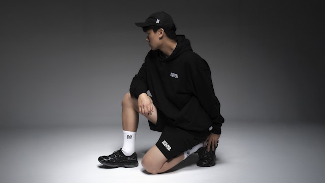
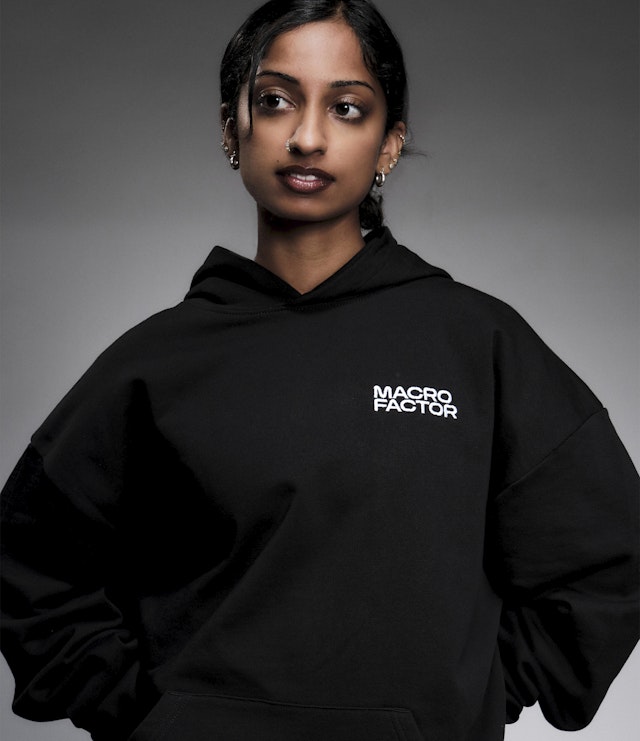
Art direction, expressed through photography, extends the identity into editorial space. MacroFactor doesn’t only exist inside the app; it publishes articles to inform, educate, and inspire a growing community. Food photography is treated with clarity and restraint—clean, crisp, and celebratory, highlighting vibrancy and freshness. Workout photography emphasizes the beauty of bodies in motion, capturing strength and energy as form. Together, these approaches create a visual language that elevates content into experience, turning information into inspiration.
“The new brand isn’t just a coat of paint; it’s part of the infrastructure that enables clear storytelling across these different channels,” says the team at MacroFactor.
The identity celebrates both sides of MacroFactor: the discipline of data and the joy of progress. It elevates the game of similar apps, raising expectations for how design can make science both useful and inspiring.
Office
- New York
Partner
Project team
- Whitney Badge
- Kevin Li
- Justin Zhang
- Drithi Kandoor
- Jin Chun
- Jennifer Bahng
- Edgar Ferrer, motion design
- Harrison Adams
Collaborators
- Kyle Barron-Cohen, strategy
- Eva Green, strategy
- Edgar Ferrer, motion design
- Reset Type Studio, typeface development
- Jaison Lin, merch photography
