Reflecting on the idea of Maggie’s being ‘Everyone’s home of cancer care’, many shapes of ‘homes’ drawn in a clear modern style are used as the logo family.


The house motif is often used in the graphic language as a framework, representing a space where you can find comfort, warmth and hope. The houses are combined with a bespoke typeface and a warm and welcoming colour palette.


Pentagram created the brand identity for Maggie’s, an organisation which provides free practical, emotional and social support to people with cancer and their family and friends.
Based on progressive ideas about cancer care by its founder Maggie Keswick Jencks, Maggie’s spaces are designed as an antidote to the institutional and unwelcoming environments that people living with cancer often have to spend time in.
Maggie Keswick Jencks believed that in order to live more positively with cancer, people needed information that would allow them to be an informed participant in their medical treatment, stress-reducing strategies, psychological support and the opportunity to meet other people in similar circumstances. She felt strongly that this should all take place in a relaxed domestic atmosphere, away from the clinical environment of the hospital.
Maggie’s’ aim is to provide the best possible experience for those going through difficult times. Design plays a very important role in its ethos, with each of the 22 centres in the grounds of NHS hospitals designed by one of the UK’s leading architecture practices, including Zaha Hadid, Rem Koolhaas and Richard Rogers. Maggie’s works in partnership with world-class manufacturers to create beautiful, high-quality, innovative spaces that anyone affected by cancer can enjoy.
Maggie’s centres are places where people can feel at home to talk, socialise or just spend some downtime in a calm and uplifting space. Advice is on hand from cancer support specialists, benefits advisors, nutritionists, therapists and psychologists for those who need it. Maggie’s centres are human and informal—staff don’t wear badges and kitchen tables replace reception desks. Visitors can come in and make a cup of tea, sit with others or rest quietly by the window.
Pentagram worked with Maggie’s to create a new brand identity which has been gradually rolled out over the past two years.
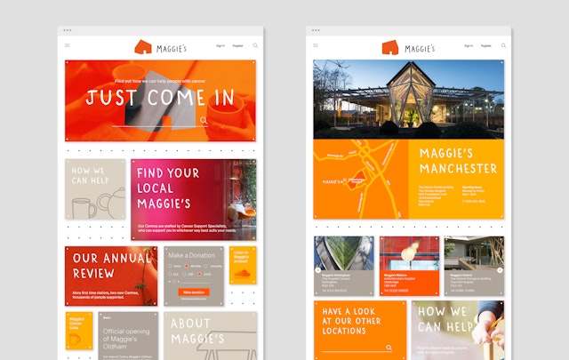
The design team created the new brand starting from its position, expressing it across print, digital and in physical spaces, emphasising the feeling of home, which Maggie’s centres represent for many people.
Reflecting on the idea of Maggie’s being ‘Everyone’s home of cancer care’, many shapes of ‘homes’ drawn in a clear modern style are used as the logo family. It is a unique point of difference for this charity that it provides physical places where people can get support.
The house motif is often used in the graphic language as a framework and represents a space where you can find comfort, warmth and hope. The houses are combined with a bespoke typeface and a warm and welcoming colour palette in red, yellow and orange. The wordmark is human and practical—set in Uppercase, it resembles an architect’s handwriting, but is not a signature (thus avoiding any possible confusion with Maggie’s personal signature).
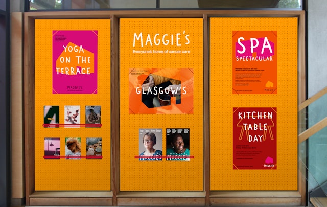
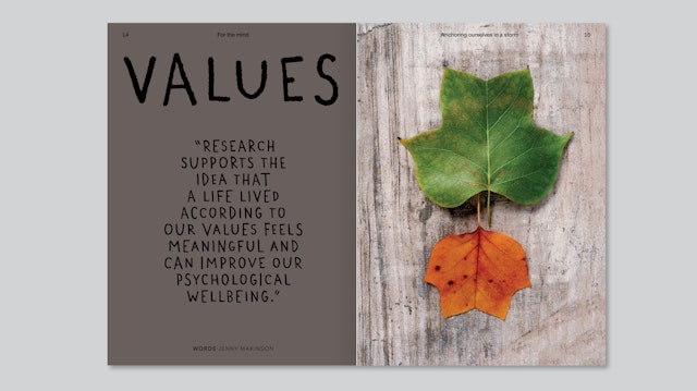
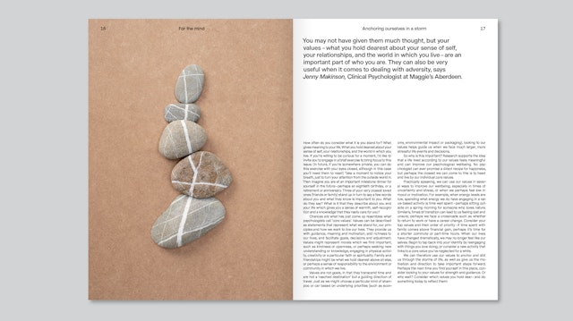
Pentagram’s team also redesigned Maggie’s Magazine, moving it away from a typical charity publication with an institutional and unappealing feel, and making it feel more like a lifestyle magazine. The redesign of notice boards located on every hospital unit and Maggie’s Centre is also an important channel reflecting a human voice rather than the clinical approach. The team also designed other pieces, including welcome booklets, flyers, and an approach to social media.
By making cancer part of life—as tough as that can be—its aim is to prevent those affected by cancer feeling isolated and help make the experience and outcome the best it can be.
Office
- London
Partner
Project team
- Stuart Gough
- Hamlet Auyeung
- Marta Gaspar
- Cleber de Campos
- Ana Lapa
- Clare Newsam
- Kate Blewett
- Jenni Kaunisto
Collaborators
- Sara Fanelli (type design)
- Fred North (type design)
- Daniel Weil (support partner)


