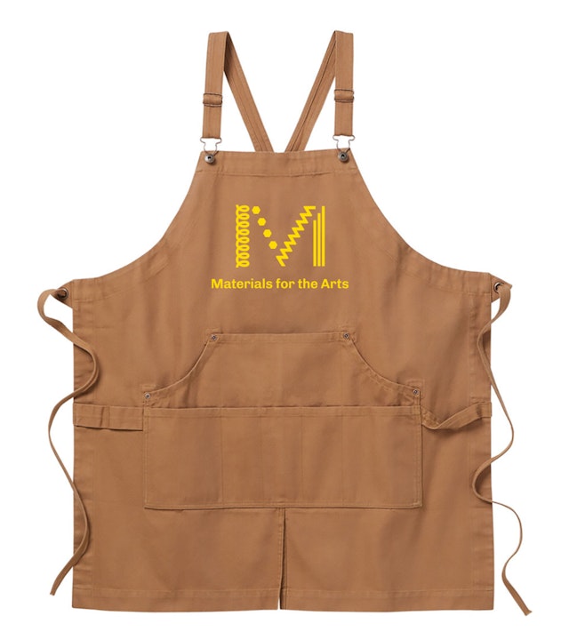
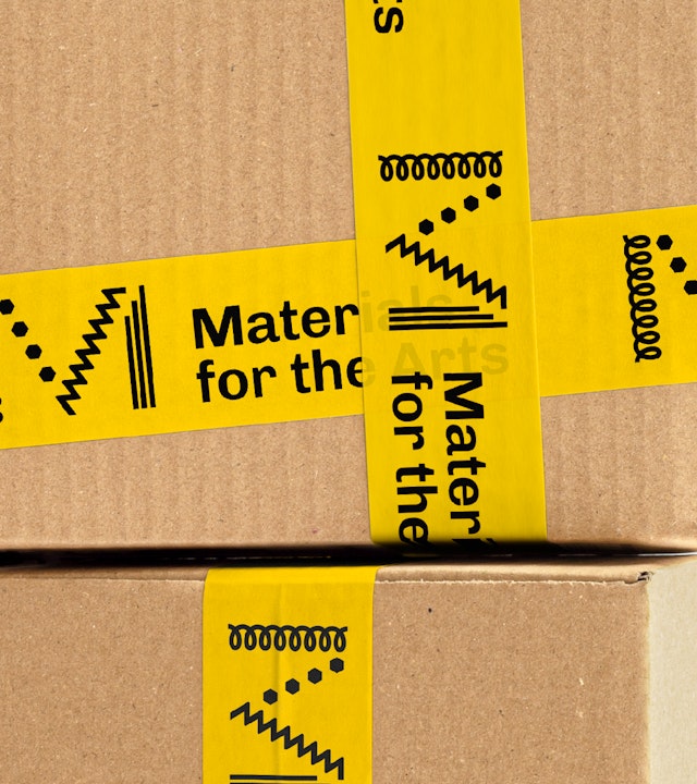
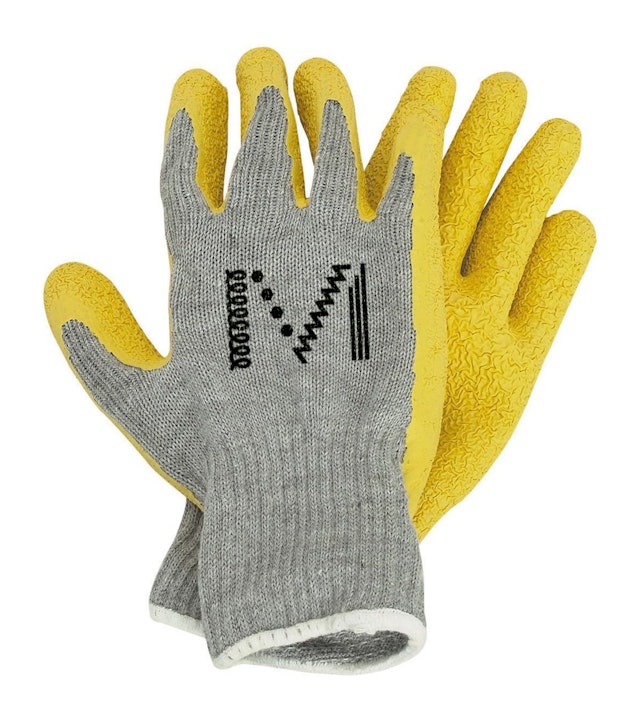
The new logo abstracts the materials depicted in the ‘legs’ of the previous M, making the simplified elements the foundation for an extended graphic language.


The new identity communicates energy and creativity with a graphic simplicity that helps it stand out in New York’s visual landscape and on social media.
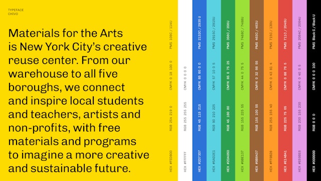


The vibrant brand yellow is inspired by the bins on the shelves in the MTA warehouse and also pays homage to iconic NYC symbols—taxi cabs, school buses, the N/R train.


Founded in 1978, Materials for the Arts (MFTA) is one of the country’s largest creative reuse centers. Funded in part by the City of New York as a program of the Department of Cultural Affairs, MFTA works to source and redistribute over 800 tons of unwanted artmaking materials annually to local teachers, artists and other non-profits—all free of charge. A visit to MFTA’s sprawling 35,000 sq ft warehouse in Long Island City might unearth any number of upcycled treasures: discarded 35-millimeter slides from the Metropolitan Museum of Art; 11,000 dance shoes; or even props from Broadway’s “Phantom of the Opera,” recently closed after 35 years of performances.
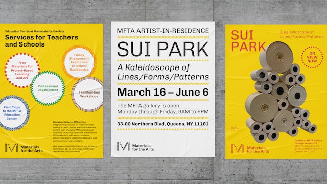
With new leadership at the helm and a growing stable of educational programs, community partnerships, and artist residencies, MFTA approached Pentagram to overhaul MFTA’s visual and verbal identity. Initial research confirmed MFTA’s beloved status as one of New York City’s great institutions. Staff and community members described the non-profit as the city’s “best kept secret,” an essential resource for both teachers, students and artists alike. A new mission statement, clarifying the non-profit's work and conservation-minded approach, served as a conceptual anchor for the brand’s evolved personality. Messaging developed with MFTA’s fundraising staff further accentuated this ethos while also adding a healthy dose of wit and vibrancy.
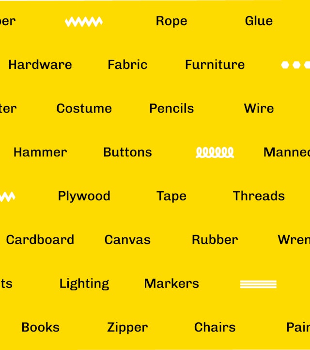
The new logo is a thoughtful progression of the beloved original mark, retaining a connection to the history of this unique organization. First introduced in 1993, MFTA’s previous logo paid homage to the warehouse’s contents. A pillar, a wrench, a screw, a pencil: these items are often used by artists and MFTA members for their craft.
The old symbol was eclectic and charming, but its visual complexity proved challenging to scale and reproduce across dynamic branding applications that now range from small social media icons all the way up to animated digital billboards. The new design abstracts the materials, making the elements the foundation for an extended graphic language that broadens what each “leg” of the M represents.
The vibrant brand yellow is inspired by the bins on the shelves in the MTA warehouse and also pays homage to iconic NYC symbols—taxi cabs, school buses, the N/R train. The cheerful, sunny yellow captures the spirit of optimism that is a hallmark of MFTA, and is balanced by a secondary palette of bright accent colors like green, red, blue and pink. Rounding out the graphic tool kit is a single bold font, Chivo.
Modern, warm and inviting, the new identity communicates energy and creativity with a graphic simplicity that helps it stand out in New York’s noisy visual landscape and on social media. At the same time, the system is highly functional and easy to execute by MFTA’s in-house team.
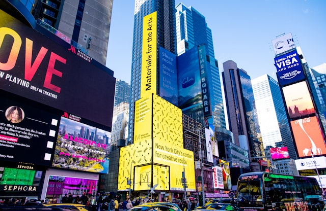
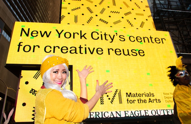
The identity made its debut on a massive digital billboard in Times Square at a launch event with NYC Cultural Affairs Commissioner Laurie Cumbo and MFTA Executive Director Tara Sansone. The kickoff is part of a broader campaign to raise awareness of MFTA’s wide range of programs and services.
“We’re thrilled to unveil MFTA’s new logo and rebranding, as we invite more New Yorkers to engage for Materials for the Arts and our work fostering a cleaner, greener, more creative NYC,” said Sansone. “Pentagram’s rebrand propels MFTA into the future, where the legacy of creative reuse is boundless, and I thank them for so beautifully capturing the essence of MFTA in their design.”
Sector
- Arts & Culture
- Non-profits
- Civic & Public
Discipline
- Brand Identity
