

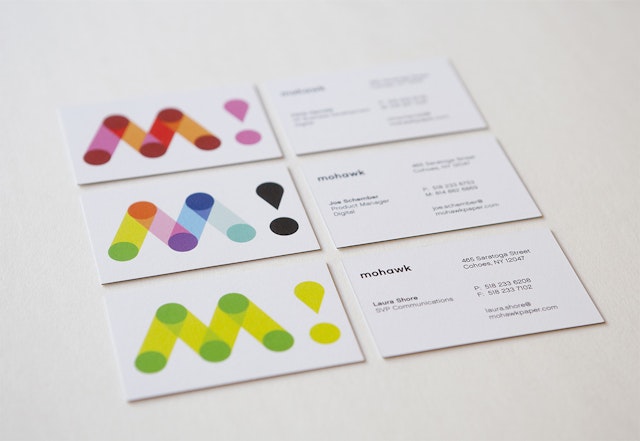

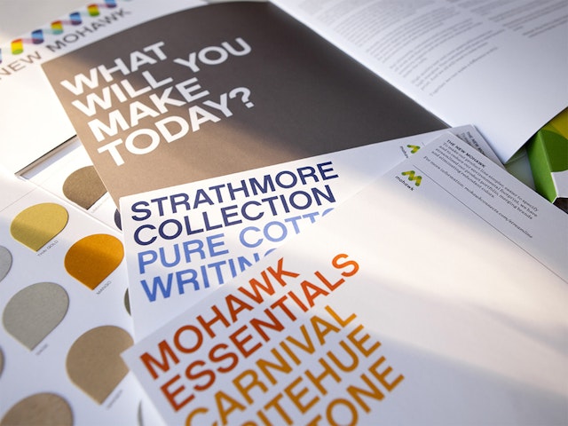

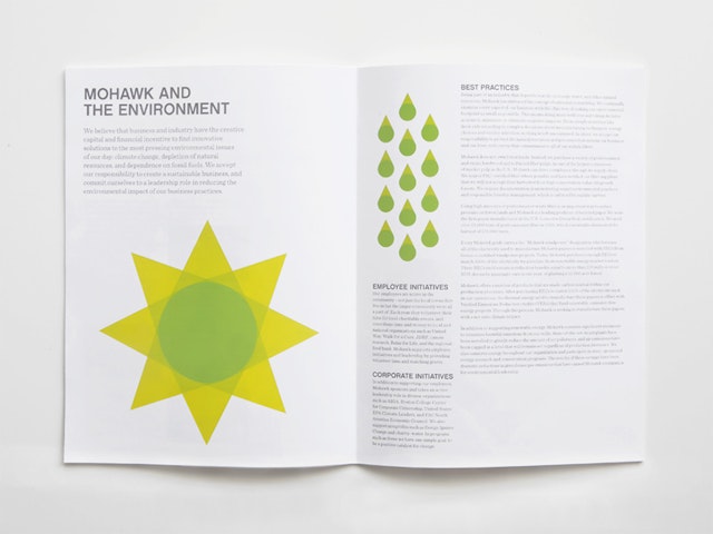
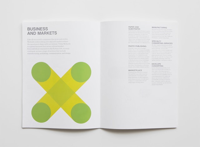
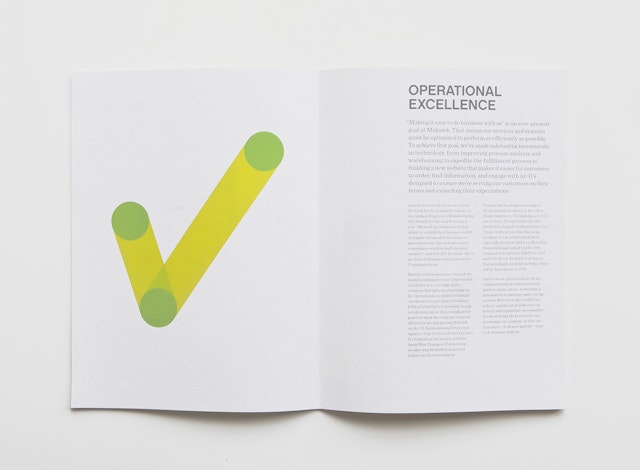

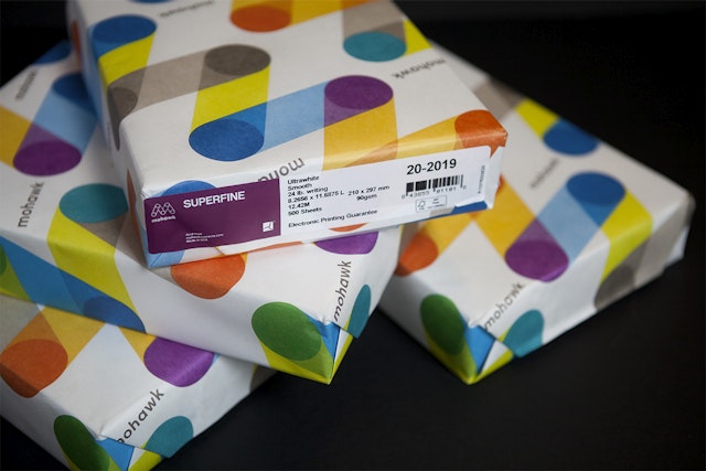

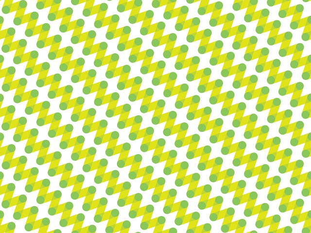
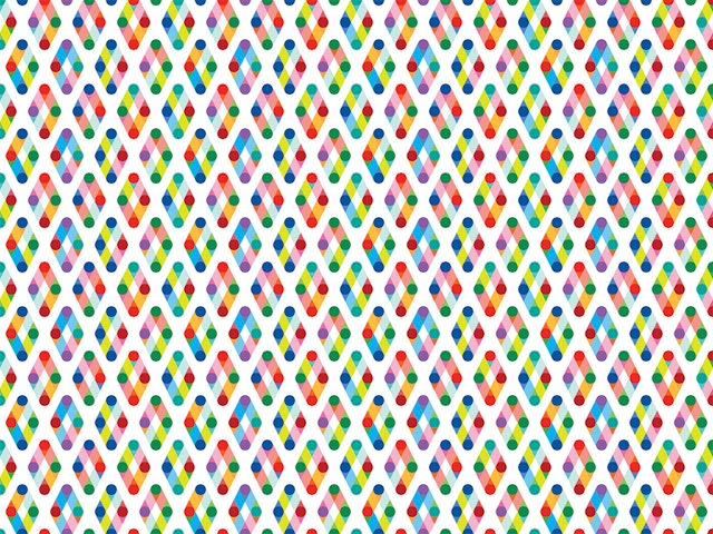

To meet the challenges facing the paper industry in recent years, Mohawk leveraged connections in the digital, design and photo spaces to develop new web-based offerings. To accompany this transition, and a name change to “Mohawk” from Mohawk Fine Papers, the company approached Pentagram to redesign their identity. The new logo serves as a monogram for the name Mohawk, but is also inspired by the papermaking process and the printmaking process, both of which involve paper moving around cylinders. Applied to advertising, swatchbooks, brochures and ream wraps, the logo is a building block in a flexible branding system that includes more than a dozen color variations and countless patterns based on the mark. The identity system adapts in countless ways depending on the application and intended audience, emphasizing the company’s desire to connect with its customers.
