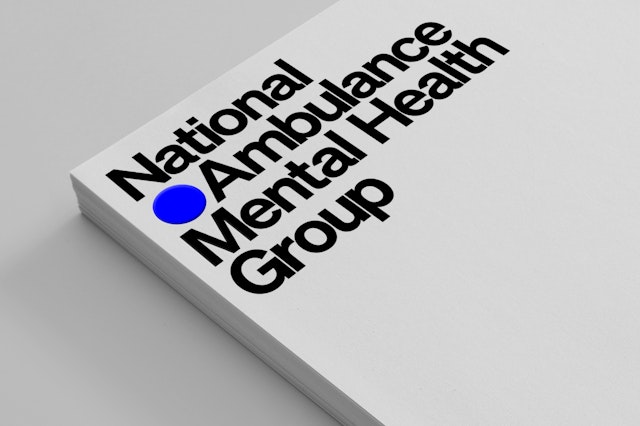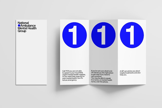

The NAMHG wanted an identity that would both raise awareness for the work it does and help promote the agenda for this often-overlooked group of patients.


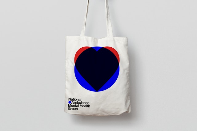
When used on its own, the monogram references the harmony that’s needed between mind and body, which is the focus of the NAMHG. When repeated, it represents community and becomes a graphic element which can be used to visualise infographics.


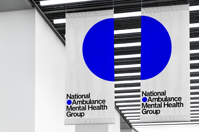
The new identity was designed to work across all platforms and sizes, from social media icons to large-scale environmental graphics.


It was important that the logo would work on its own, as well as alongside the iconic blue NHS, and the more traditional Ambulance Service logos.
Pentagram has created the new brand identity for the National Ambulance Mental Health Group (NAMHG). Members of the NAMHG represent ambulance trusts from across the country to promote best practice in pre-hospital mental health care.
The Ambulance Services play a crucial part in providing care and support—during times of a mental health crisis people often contact 999 for help, with 13,000 calls related to mental ill-health received every month in London alone. Mental Health care is a priority area for the National Health Service; up to 1 in 4 adults experience mental illness, with 46% of people with a mental health condition also having a long term physical health condition. The life expectancy of those with severe mental illness can be up to 20 years less than the general population.
London Ambulance Service Mental Health Lead and NAMHG co-chair Carly Lynch explains: “Ambulance Services often see people during time of crisis and distress. We play a vital role in mental health care and are working hard to deliver the best care to our patients. In 2018 6,507 people in the UK died by suicide—we need to continue to work together to support mental health.”
Pentagram created a new identity to help bring a cohesive feel to the Group and help it to promote its valuable work promoting best practice for mental health care within the respective trusts and nationally across all ambulance services. Representatives from NAMHG are often asked to speak at events, and the organisation wanted an identity that would both raise awareness for the work it does and help promote the agenda for this often-overlooked group of patients.
The new identity was designed to work across all platforms and sizes, from social media icons to large-scale environmental graphics. It was important that the logo would work on its own, as well as alongside the iconic blue NHS, and the more traditional Ambulance Service logos.
The monogram depicts a person in pictogram form—the blue circle representing the person’s head (and also their mind). The circle also references the blue lights used by ambulances, and this reflects the mobile nature of the new Joint Response service. The concept is carried through in the logotype, where the typography is arranged around the monogram.
When used on its own, the monogram references the harmony that’s needed between mind and body, which is the focus of the NAMHG. When repeated, it represents community and becomes a graphic element which can be used to visualise infographics, such as statistics about mental health.
The logotype is set in Söhne Halbfett, a modern sans-serif typeface designed by Kris Sowerby’s Klim Type Foundry. Infused with the spirit and heritage of the typography used on the New York subway, the typeface expresses the analogue materiality of the letterforms in a digital font. Söhne’s warmth, versatility and high legibility proved to be the perfect choice for the subtle yet striking identity.
The NAMHG is a shining example of innovation and changing practice, and is making a real difference to peoples’ lives. The design team has created an identity which will raise awareness, embodies resilience and inspires confidence in its services.
Office
- London
Partner
- Astrid Stavro
Project team
- Nicoletta Belardinelli
- Jake Gilbert
