
The National Gallery’s new identity reaches out to be welcoming, inclusive and is connected the old and the new, the classic and the modern.


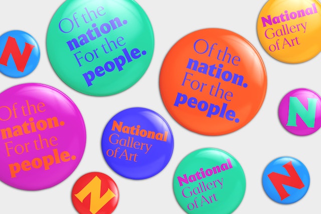
A full spectrum color palette portrays the National Gallery's energy and vibrancy, the immense range of the collections, and expresses the diversity of its visitors.

The identity program supports the museum’s mission to serve the nation by welcoming all people to explore and experience art, creativity, and their shared humanity.
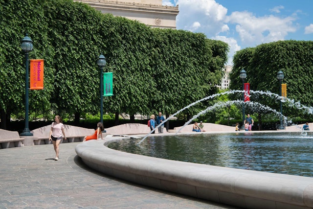


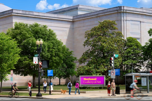
The National Gallery of Art in Washington, DC, is one of the most beloved and visited museums in the U.S., with a world-class collection of more than 150,000 paintings, sculpture, decorative arts, photographs, prints, and drawings that span the history of Western art. Located on the National Mall, the institution encompasses John Russell Pope’s neoclassical West Building, I. M. Pei’s iconic modernist East Building, and the National Gallery of Art Sculpture Garden.
A team led by Pentagram Partner Michael Gericke, with Michael Bierut, have created a bold and contemporary visual identity for the National Gallery that reflects the vibrancy of the institution and its diverse collections, programming, and audiences. The reimagined brand supports the museum’s mission to serve the nation by welcoming all people to explore and experience art, creativity, and their shared humanity. Inspired by the monumental architecture of the National Gallery campus, it connects the old and the new, the classic and the modern.
Pentagram collaborated closely on the project with the National Gallery’s Director Kaywin Feldman and the institution’s leadership team. The two-year process included the development of a new logo and visual language, brand strategy and positioning, messaging, and verbal identity. The launch of the identity coincided with the reopening of the National Gallery’s West Building on May 14, 2021 after a six-month closure due to the pandemic, signaling a renewal for the institution as it welcomed back visitors.
The brand strategy, developed with AEA Consulting, sharpens and defines the National Gallery’s vision, mission, and values. The museum sought to better reflect the country, make the institution more accessible and inclusive, and position it as the nation’s primary resource for art and creativity. This vision will be carried out throughout the museum’s public programs, exhibitions and collections, and research and scholarship.
The previous logo was visually muted and reserved, appearing in an all-uppercase serif font that was elegant but formal and imposing. By contrast, the new identity is lively and dynamic, joyful and optimistic.
When the National Gallery was originally dedicated in 1941, its patron Paul Mellon described it as a “living institution, growing in usefulness and importance” over time. This sense of history informed the identity, which combines the past, present, and future.
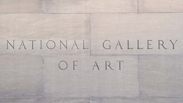
“We sought to create a broad identity for the National Gallery that reaches out to be welcoming, inclusive and is connected the old and the new, the classic and the modern. The new logo is quite contemporary but derived from the essence of the carved letterforms that have been embedded in the facades of the West and East Buildings for decades,” says Gericke.
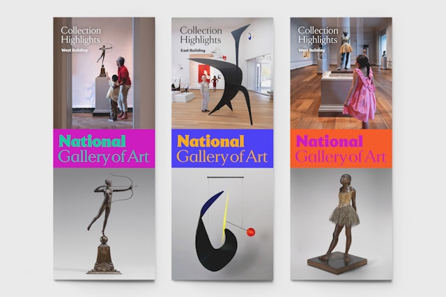
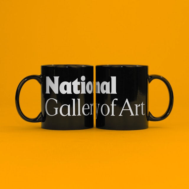
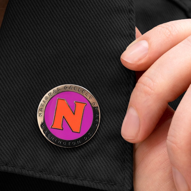
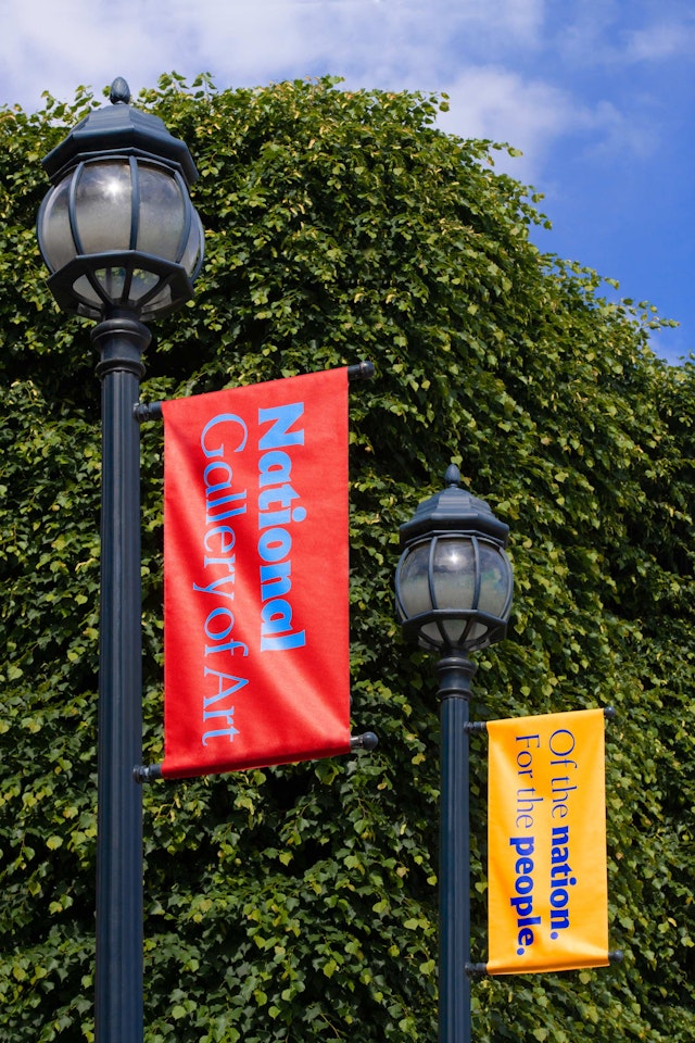
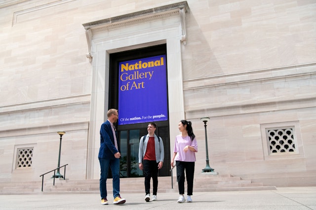
Pentagram developed specially drawn typography for the logo inspired by the incised inscriptions of the National Gallery’s name. The new wordmark is tailored from a bespoke version of Empirica, a new serif typeface designed by Tobias Frere-Jones and Nina Stössinger at Frere-Jones Type. The wordmark has stature but is friendly and welcoming, conveyed in the deliberate shift to upper and lowercase type. Highlighting “National” in the logo reflects the commitment to serve as the nation’s art museum.
The identity also features a unique “N” letterform that combines both graceful serifs and simple geometry, reflecting both the classicism of Pope’s West Building and the modernity of Pei’s East Building masterpiece. The icon is a recognizable avatar for social media and an imprint for National Gallery publishing. Supporting typography is set in the sans serif Mallory typeface, also by Frere-Jones.
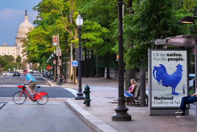
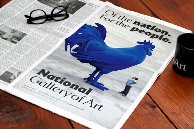
Along with the visual identity, the program introduces messaging developed by Pentagram that is friendly, distinctive, and welcoming. This is captured in the new tagline, “Of the nation. For the people.” The word “of” plays an important role in the museum’s brand messaging, serving as a connector to various ideas and activities and allowing the National Gallery to express the full range of what it does.
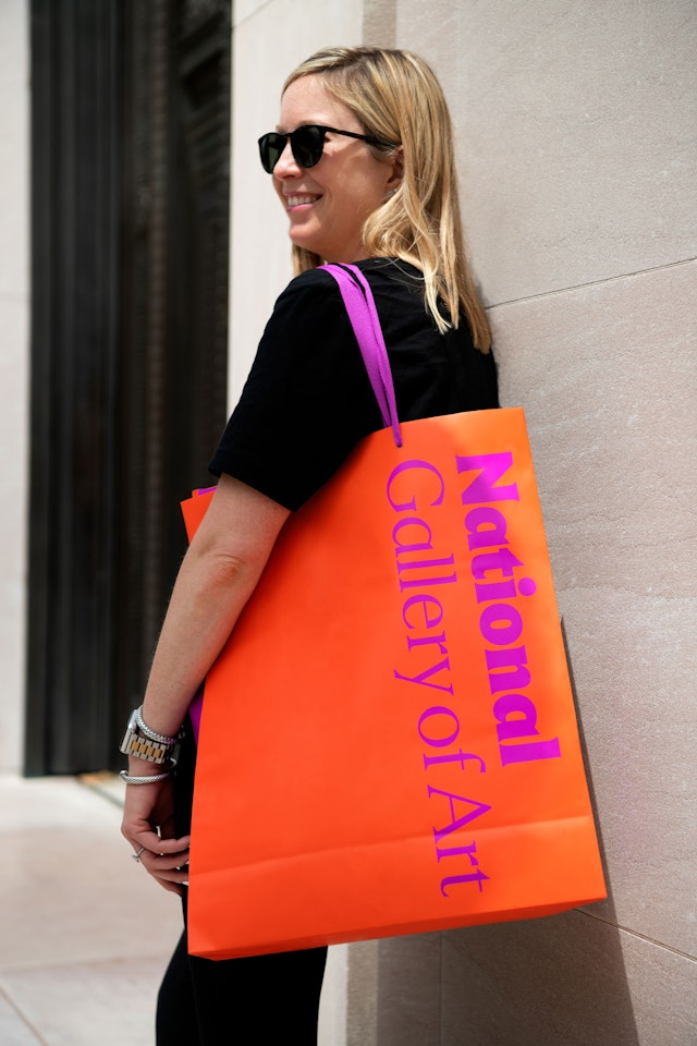
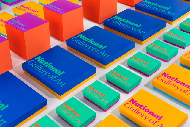
“The National Gallery is not a monochromatic place or experience. A full spectrum color palette portrays its energy and vibrancy, the immense range of their collections, and expresses the diversity of its visitors,” says Gericke. The colors are used in unexpected combinations that give the museum a bright and vivid presence.
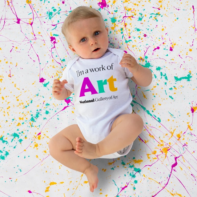
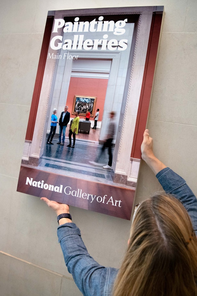
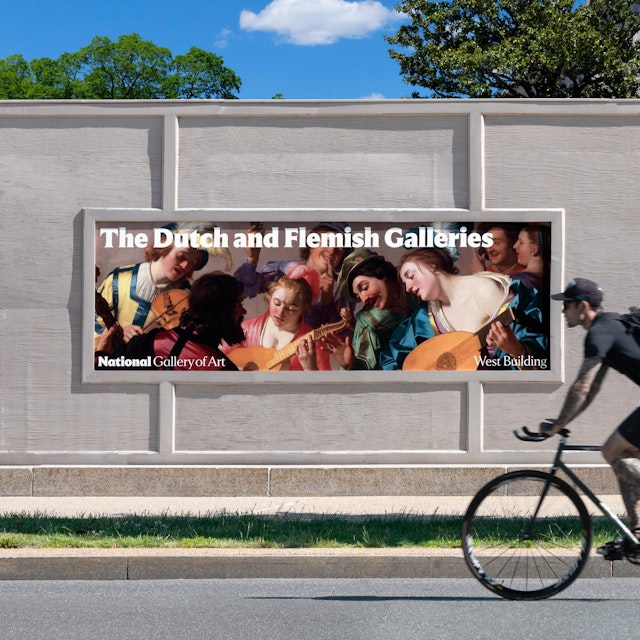
The flexible system comes to life in brand expressions that range from elegant and refined to bold, fun, and creatively playful. Environmental graphics unify the National Gallery campus, including banners on the façades and landmark signage at the entrances; interior signage and wayfinding, and banners at the Sculpture Garden. The new look brings an approachable and easy to navigate relaunched website, and the designers developed cohesive formats for exhibition posters, advertising campaigns, and social media. Packaging, bags, and products for the Gallery Shops are bright, colorful, and stylish.
“With our doors finally open, we re-present to our public how the National Gallery will meet our mission of welcoming all people to explore and experience art, creativity, and our shared humanity––with generosity, inclusivity, and joy,” says Feldman.
Office
- New York
Partners
Project team
- Marielle Gross
- Yeryung Ko
- Reid Parsekian
- Amanda Walter
Collaborators
- Frere-Jones Type, typeface design
