

The program sharpens the graphics to their essentials, revealing an accessible, elegant identity that also reflects the center’s long history and scientific capabilities.


Typography is also used as a vehicle for expression and experimentation in applications like invitations and programs for special events.


Founded in 1891, the New York Botanical Garden in the Bronx is one of the oldest and largest botanical gardens in the world. Pentagram has designed a new identity for the institution that launched to coincide with its 125th anniversary this year. The branding celebrates the heritage of NYBG while also establishing a fresh and contemporary look that positions the Garden for the future.
NYBG is a museum of plants that gives the public the opportunity to explore nature over 250 acres of grounds. A beloved New York attraction, it is also a respected scientific institution and working center for botanical research that utilizes the latest technology in its International Plant Science Center. The Garden needed a cohesive institutional identity that could encompass all of its programming and initiatives. The previous identity existed chiefly as a logo without a comprehensive system of guidelines. Graphic applications were designed on a case-by-case basis, resulting in a variety of styles that blurred the brand identity overall.
The designers worked closely with leadership at the Garden to develop the new system. The goal of the project was not to manufacture a wholly new brand, but rather to cultivate clarity and logic in how the existing elements should be used—to refine the brand, and in the process, create a logo that felt natural to the institution. The program sharpens the graphics to their essentials, revealing an accessible, elegant identity that also reflects the center’s long history and scientific capabilities.
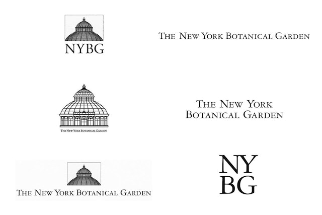
The New York Botanical Garden name and full logotype are long and a challenge to use, graphically. The institution had a familiar acronym, “NYBG,” that it was already using frequently in official communications and that functioned well, but did not exist as an official logo. This iconic acronym has been crafted into the new logotype, distilled from the full name into a unique, modern wordmark that allows for more flexibility. The approach also lends itself to the modular aspect of the new identity system, where the simple structure of the logo is echoed in the grid-based design of applications.
Over the years, the typeface Garamond 3 has been used in the institution’s logotype and has become closely associated with NYBG. The previous logotype reworked the font to give it a quality that suggested the Garden’s heritage. The new identity embraces this beautiful typeface to create an iconic wordmark, built around the acronym, that represents the next logical step in the brand’s evolution. The simple logo adds “/125” in the same typeface and highlights it with a natural green color. When the anniversary year is over, the numbers will be removed and the wordmark will transition into a new institutional identity for NYBG. Akzidenz Grotesk is the secondary typeface.
The NYBG wordmark is one element in a balanced system that is simultaneously rigorous and flexible, to allow for growth. The logo strictly yet effortlessly sits at the top left corner of all applications. The typography is offset by plenty of open white space—almost like gallery space—that lets the lush, beautiful photography of the Garden breathe and shine. Together, the type and imagery work together to create a simple and effective system that is instantly recognizable and that elevates the look and feel of the brand.
The Garden is known for its Enid A. Haupt Conservatory building, the largest Victorian glasshouse in the U.S. and the defining element of the Garden complex. Over the years, the structure has been used as an icon to brand the institution. The previous identity paired an illustration of the Conservatory with the logotype. The new system uses this symbol sparingly, mainly for special applications outside of the central identity.
Typography is also used as a vehicle for expression and experimentation in applications like invitations and programs for special events. On invitations for the Conservatory Ball, the Garamond is outlined, deconstructed and delineated into a skeletal framework, visually correlating with the Conservatory building. An invitation for the Winter Wonderland Ball scatters the Garamond on the wind like seeds or snowflakes.
As part of the project, the Pentagram designers created comprehensive guidelines that the in-house design team at NYBG will continue to follow as they build consistency across all communication materials.
Office
- New York
Partner
Project team
- Joseph Han
- Belinda Chen
- Xinle Huang
- Sue Lee
- Jang Hyun Han


