‘No Man’s Land’ brings the smart, edgy sensibility and welcome diversity of The Wing to a broader audience.
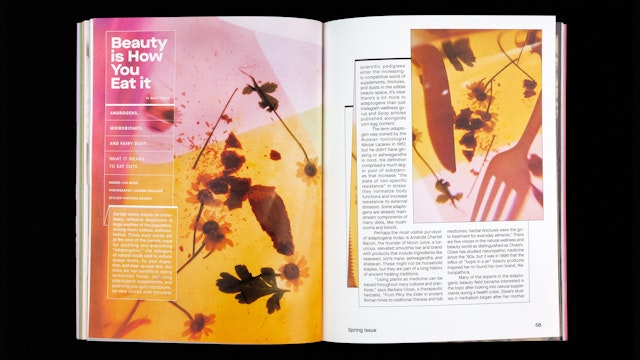
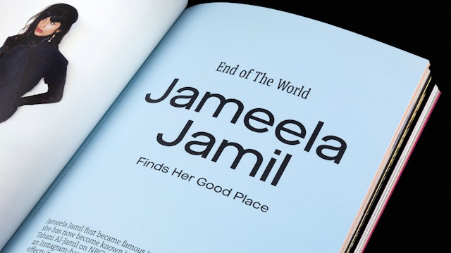

Graphically, ‘No Man’s Land’ feels like part of the Wing brand universe without being exactly like The Wing.


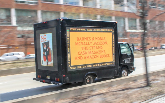

The ‘No Man's Land' brand identity puts readers on notice that what's inside celebrates womankind in all forms.
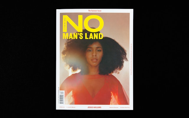

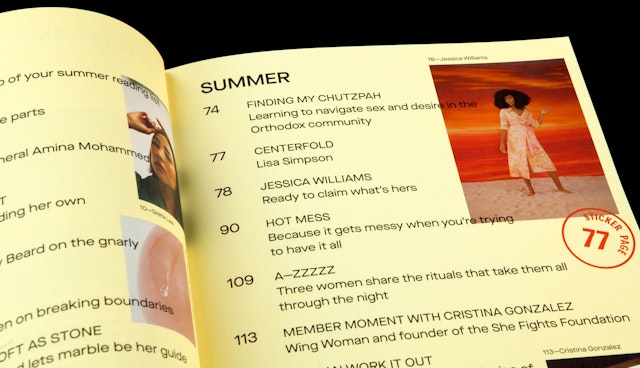

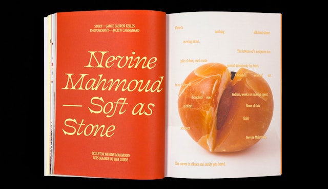
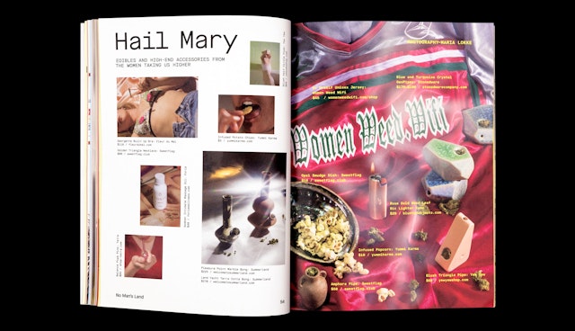
The designers’ challenge was developing a cohesive framework that could hold all of this editorial content together and still feel loose and improvisational.
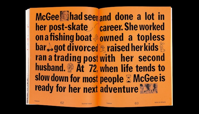

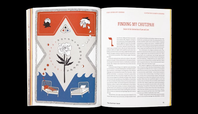
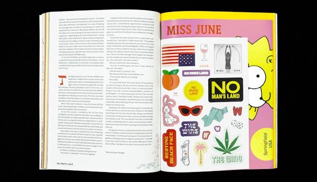


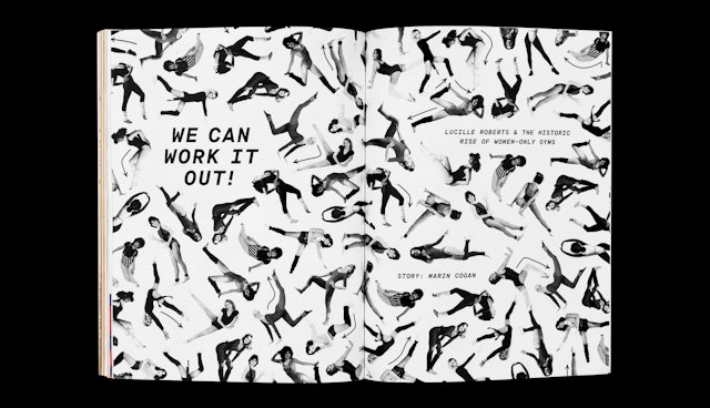

In keeping with the spirit of The Wing, the magazine’s personality is smart, friendly and outspoken, as well as empowering and resourceful.
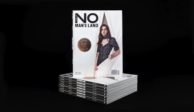




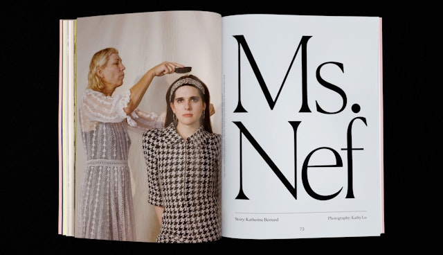
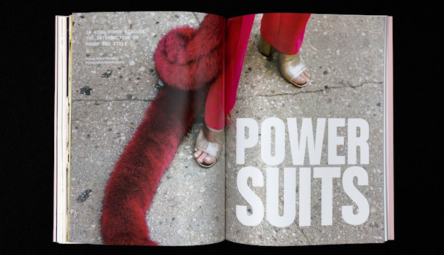

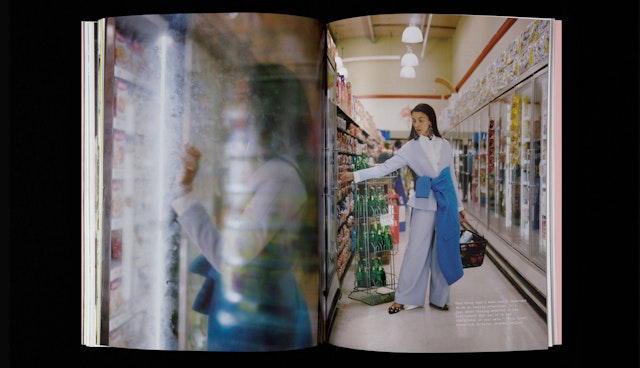
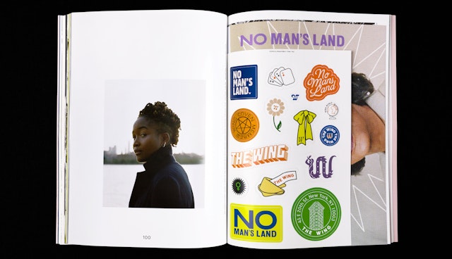
The Wing spreads its wings with No Man’s Land, the first magazine from the network of co-working and community spaces for women. Pentagram has created a brand identity and editorial design for No Man’s Land that builds on their branding for The Wing, bringing the smart, edgy sensibility and welcome diversity of the women’s club to a broader audience. The design liberates itself from the conventions of typical magazine formats―and women’s publications in particular―to express The Wing’s maverick point of view.
Published biannually, No Man’s Land is the beginning of The Wing as a force for women all over the world―and at a time when it feels like being female is a political act in itself. The platform gives The Wing a place to voice different thoughts and perspectives outside its life as a physical space―a mix of essays, profiles, conversations and features about everything from current events and politics, to art, design and fashion. It’s a vehicle where The Wing can take off to build another kind of community beyond its members and explore what it wants to be.
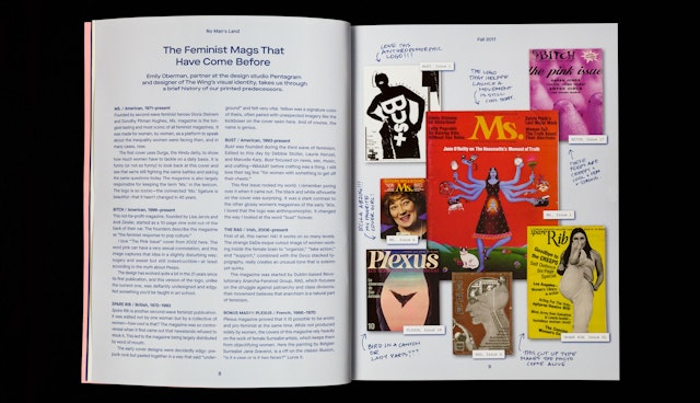
The Pentagram designers collaborated closely with the magazine’s leadership, including Wing Co-Founder Audrey Gelman, No Man’s Land Executive Editor Deidre Dyer, Deputy Editor Laia Garcia, Photo Editor Emily Keegin, and Wing Brand Director Alex Covington, to develop a visual personality and tone of voice that felt just right. To start the creative conversation, the group looked at historical and contemporary women’s magazines, feminist publications and zines, activist graphics, and a variety of other sources, including a visit to the invaluable Herb Lubalin Study Center at Cooper Union. (In an article in the launch issue, Pentagram partner Emily Oberman writes about some of the feminist predecessors that influenced No Man’s Land.)
The team carefully considered what it means to be a women’s magazine at this moment, keeping in mind they were designing for not just one specific kind of woman. In the spirit of The Wing, the magazine’s personality is smart, friendly and outspoken, as well as empowering and resourceful. No Man’s Land is created for women, by women, about women: All of the writers and photographers are women, and the publication is committed to featuring subjects and models who represent a wide range of ages, races, body types and gender identities in a context that is positive and affirming.
The design reflects this diversity with a multifaceted, highly visual approach that is fun, witty and self-referential. It draws on the sassy voice of The Wing branding to put an unexpected, feminist-centric twist on standard magazine tropes―but is not a parody. The Pentagram designers helped develop the structure and framework of the publication, including the various departments and sections. These include the “Q+A” interview well in the front-of-book, photo-driven recipe features, a pullout centerfold mini-poster (featuring Congresswoman Maxine Waters in the first issue, followed by Lisa Simpson in the second), and a sheet of stickers in every issue.
Features in the first two issues include a high-fashion shoot showcasing Wing women in power suits, a visit with the bra-fitting ladies of New York’s old-school bra shops, a profile of California’s first female overpass designer, a “Hot Mess” fashion shoot inspired by wardrobe malfunctions, and a history of the trailblazing business of women’s gym Lucille Roberts.
Talented women featured (so far) include, among others, comedian Jessica Williams (cover star on Issue 2), U.S. Senator Elizabeth Warren, pioneering trans model-actress Hari Nef (featured on the cover of the launch issue), Oscar winner Brie Larson, rapper Remy Ma, DJ-musician J.D. Samson, editor-turned-actress Tavi Gevinson, activist Chelsea Manning, skateboard legend Patti McGee and scholar Mary Beard.
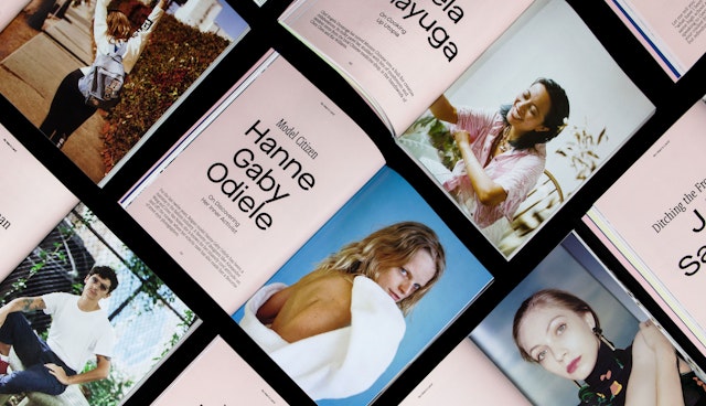
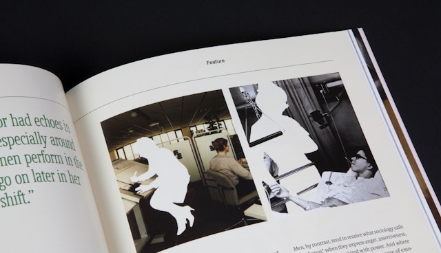
The designers’ challenge was developing a cohesive framework that could hold all of this editorial content together and still feel loose and improvisational. A strong, flexible 12-column grid provides a solid foundation, and type and color are used as organizing elements. The issues are packed with content, but the layout offers multiple entry points for readers, with pull quotes, spot illustrations and visual jokes. The clean, ordered design of the “Q+A” section in the front-of-book is a breath of air before diving into the visual chaos of the features well.
The launch issue was fairly traditional in its structure, to feel like a “real” magazine and serious endeavor. With the second issue, No Man’s Land has grown more confident and less beholden to the tropes of a magazine―it’s more intuitive, vibrant, and zine-like, trusting the reader to find her way around. The design is loosened up for a more dynamic feel, with non-symmetrical margins and folios moved to the bottom of pages. Everything feels like it belongs in the feature well, so readers can drop in anywhere in the pages and have a good time.
The use of color in the magazine ties into the distinctively colorful interiors of the Wing spaces, and transitioned from the pastels of the launch issue to the brighter, lighter, sunny colors of the Summer Issue. Little details ground the magazine in authenticity and the heritage of print: For instance, a recipe by Nora Ephron in Issue 1 was recreated on a typed-up notecard; the centerfold poster image of Maxine Waters is a halftone from the office printer. It was also important that the magazine not feel physically precious; the dimensions are a handy size that makes it easy to carry on the go, but thick enough to feel substantial, and the issues are produced with high-quality printing and papers.
Graphically, No Man’s Land feels like part of the Wing brand universe without being exactly like The Wing, an approach that helps keep both looking flexible and diverse. The magazine holds its own with its own typography, utilizing two typefaces, Maison Neue and Berlingske Serif, both available in a wide variety of weights and styles, from super condensed to extended. The sans serif Maison Neue has a strong visual impact and clean geometric harmony that echoes the Bureau Grotesk used in the Wing identity, without being a direct typographic crossover. For more variety, hero typography in feature openers may use custom type treatments or lettering specific to the content. Berlingske and Maison Neue are also used for text and body copy.
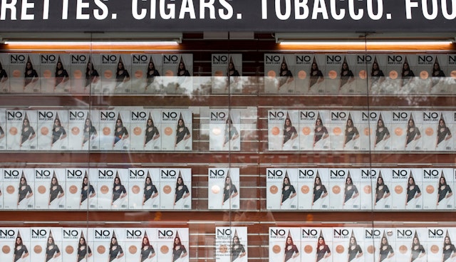
The No Man’s Land brand identity also stands apart from The Wing with a strong logotype that puts readers on notice that what's inside celebrates womankind in all forms. The designers worked through over 60 cover concepts and logo explorations before deciding on a robust stacked logotype that centers on a big “NO.” The custom-drawn wordmark is loosely based on Bureau Grotesk, the brand typeface for The Wing, and is open to variety of treatments, including using the “O” as a container for imagery. No Man’s Land was not originally conceived as a newsstand magazine, so when traditional distribution became a possibility, the logo and its cover placement were retooled slightly to function more like a masthead.
The magazine launched with an eye-catching campaign of sniped posters that branded sections of NYC streets as “No Man’s Land,” and the logo is featured in a brilliant neon sign installed at The Wing Soho. To attract a wider readership, The Wing is partnering with other digital platforms to integrate No Man’s Land content, including New York Magazine’s The Cut.
No Man’s Land is available for purchase online at the-wing.com, Barnes & Noble stores across the country, and at select boutiques, bookstores and magazine shops.
Client
The WingSector
- Entertainment
- Publishing
- Arts & Culture
Discipline
- Brand Identity
- Publications
Office
- New York
Partner
Project team
- Laura Berglund
- Shira Inbar
- Elizabeth Goodspeed
- Christina Hogan
- Joey Petrillo
- Anna Meixler
