The new identity both repositions the charity as a champion for the social value of music, and helps raise awareness of music therapy in society overall.
The symbol reflects both the freedom of expression that music gives and the connections found through music therapy.
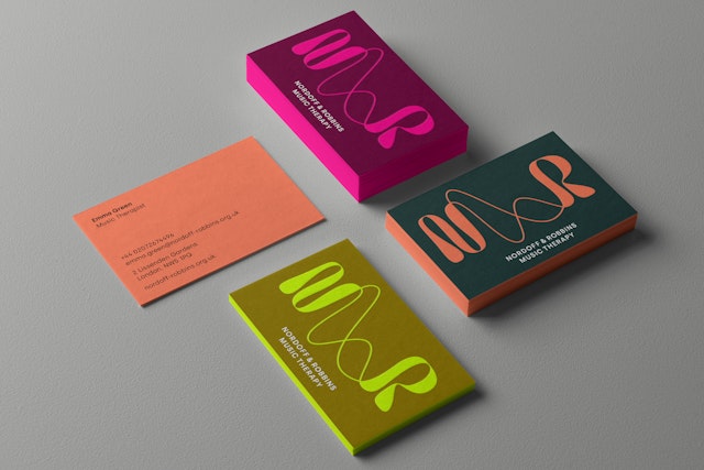
Colour is central to the new brand identity, and the design team chose a carefully curated colour palette of vibrant and more natural muted colours, which allows for many different personalities.
Pentagram has designed a new visual identity for Nordoff Robbins, the UK’s largest music therapy charity shaped by more than 60 years of practice. The charity has music in its DNA, and they use music to break through barriers, creating space for people to express themselves and find connection in society.
Alongside music therapy, Nordoff Robbins educates the music therapists of the future, and carries out research into music therapy and the wider social value of music. Its aim is to create a world where, through music therapy, human potential is recognised regardless of profound disability, illness, or social exclusion. These can all lead to isolation, but music therapy can be a powerful tool, helping people to connect and communicate. It can also help create connections within families and in the wider world. What starts with a community of two can ripple outwards, changing perceptions and shifting how others view those with disabilities.
Nordoff Robbins was founded in 1959 by American composer and pianist Paul Nordoff and special education teacher Clive Robbins. Together they developed a new form of collaborative music-making, created to engage vulnerable and isolated children. They found that music therapy could help with children's concentration, self-control and increased social and self-awareness. The pair then began training programmes and set up their first centre in Kentish Town, London. In 1995 Nordoff Robbins launched its master of Music Therapy Programme to train music therapists and partnerships were developed with the Andrew Lloyd Webber Music Therapy Unit and the Royal Albert Hall.
Today, Nordoff Robbins helps thousands of people of all ages each year across centres in the UK, and works in partnership with over 300 organisations. Despite all of this good work, in order to reach its ambitious fundraising objectives and reach more people with music therapy, the charity needed to increase brand awareness and re-engage with the music industry.
Pentagram was approached by Nordoff Robbins to create a new identity which would both reposition the charity as a champion for the social value of music, and raise awareness of music therapy in society overall. The new brand needed to help redefine key audiences and increase impact and awareness, particularly among young people.
The central idea ‘Break through with music’ proposed by Pentagram, summarises the charity’s unique offer, helping those who might have spent most of their lives in isolation.
One of the key questions for the brand was if a name change was needed. The name Nordoff Robbins reflects more than the two founders’ names, it also represents the methodology which they introduced, and which has made their work so important.
Pentagram proposed to build on the well-established name but adding a twist by changing it to Nordoff and Robbins, using an ampersand in the logo design. The ampersand works as a bridge and also reflects the strong connection between the therapists and their clients.
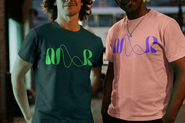
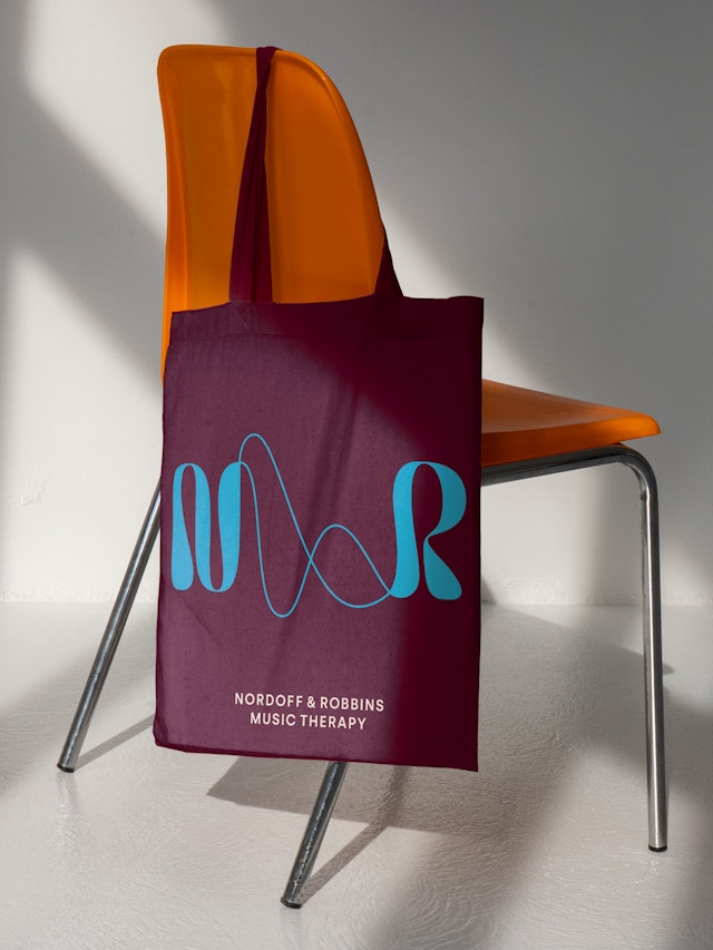
The new logo comprises a symbol and wordmark. Inspired by visualisations of sound waves which join the two letterforms, the symbol reflects both the freedom of expression that music gives and the connections found through music therapy.
The charity’s work is a result of the synergy between therapist and client, an experience that explores sound in unusual ways beyond the classic conventions of music. The new logo perfectly expresses this through a specially drawn symbol. In contrast, the wordmark is direct and grounded, and represents the charity’s rich heritage and expertise in the field of music therapy.
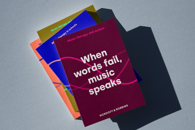
Messaging is always real, honest and straightforward through a tone of voice that is clear and consistent, expressing the brand idea of ‘Breaking through with music’. For the primary typeface, the design team chose Silka, a modern geometric sans serif. With minimal contrast of strokes and simple geometric shapes, it allows clear communication combined with high accessibility while always feeling approachable.
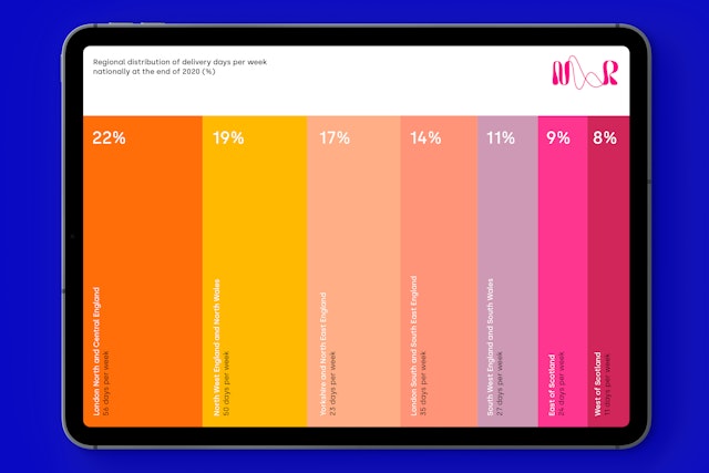
Colour is central to the new brand identity, and the design team chose a carefully curated palette of vibrant and more natural muted colours, which allows for many different personalities.
As part of the graphic language, a selection of wave-like abstract patterns were created by the team. These include a graphic wave crop, a series of abstract patterns and a series of sound waves. A family of bespoke icons were also created to easily visualise some of the integral parts of Nordoff and Robbins’ work.
Photography is an important way to communicate the work that music therapists do, and images show both the progress and connection that music therapy brings and the difference Nordoff and Robbins can make in someone’s life. Candid shots taken in a music therapy session or in the client’s own space capture real moments of joy, wonder and engagement.
With its striking new brand identity for Nordoff and Robbins, Pentagram has perfectly captured the extraordinary transformation that working with the charity can bring about for many people who have felt disconnected from the world and their loved ones.
Office
- London
Partner
Project team
- Kate Blewett
- Marta Gaspar
- Cleber de Campos
- Jeremy Downes
- Charlotte Harmsworth
Collaborators
- John Grant (strategy)