
The shape of the leaf was streamlined to give it a more modern appearance.


The modular signage system replaces a cacophony of signs and messaging in the parks.


For New Yorkers, and visitors to the city, the green leaf of the New York City Department of Parks and Recreation is a welcome symbol of relaxation and enjoyment. The Parks Department manages and maintains one of the world’s largest urban park systems, 29,000 acres of land that include more than 5,000 individual properties—from iconic New York landmarks like Central Park, Coney Island Beach, Prospect Park and Flushing Meadows Corona Park, to neighborhood playgrounds, pools, community gardens, historic houses, monuments, athletic fields and stadiums—that serve millions of New Yorkers. In peak season, the Parks Department has 10,000 employees across the five boroughs.
Pentagram has collaborated with the Parks Department on the design of a brand identity that creates a unified, accessible and modern image for the agency. The program includes the design of a cohesive program of signage, wayfinding and environmental graphics for the more than 1,700 parks, playgrounds and recreation facilities in the Parks system.
The graphic program for NYC Parks is designed to meet several objectives. The Parks Department was initially looking for standards for the consistent application of its identity across agency materials. Despite having one of the most familiar logos in the city, many of the department’s communications for the public were not immediately recognizable as “Parks.” At the same time, Parks Commissioner Adrian Benepe was looking for a system to visually link Parks and its partnerships with high-profile community initiatives such as the High Line and Madison Square Park, which have their own distinct identities. And Parks needed a cohesive system of signage and environmental graphics in the parks themselves.
The Parks leaf logo is one of the most iconic symbols in New York. The logo’s exact date of origin and designer are uncertain; it was first introduced to the department’s letterhead and official documents in 1934, when the five independent borough Parks Departments were unified into one agency, and Robert Moses was put in charge of the agency. (Moses was New York City Parks Commissioner from 1934 to 1960.) The type of leaf has never been officially identified; it most closely resembles the leaf of a sycamore, London plane, maple or sycamore maple. It is known to the agency as “The Parks Leaf” and has been periodically updated over the years, most recently in the early 1980s. The leaf and circle motif was developed in 1978, when it was introduced on Parks trucks, and widely disseminated on Parks signage in the 1980s under former Parks Commissioner Henry J. Stern.
In the new identity, the designers have tweaked the leaf logo to give it a more modern appearance. The shape of the leaf has been streamlined slightly to smooth out the edges, and the line of the surrounding circle has been made thinner. The color has been changed to a more contemporary shade of bright green that can be uniquely associated with NYC Parks—as opposed to the more generic fern or forest green associated with parks services in general—and may be updated according to fashion. (This change in the color green is for print, web and merchandising materials only, because they change continually and can be influenced by fashion. The signage program will retain its original green color.) The logo can also be used in black and white, where its distinctive silhouette makes a powerful mark.
The signature has also been changed, shortening the name from New York City Department of Parks & Recreation to the more colloquial NYC Parks. The type is set in Akkurat, the primary font of the identity; the secondary typeface is Chronicle. The new program asserts the symbol as an icon, and the leaf can be adapted to fun and stylish patterns that can be used in brand merchandising for Parks.
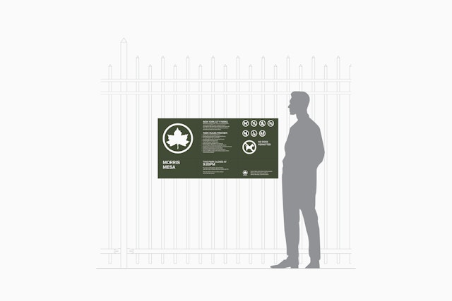
The most visible application of the new program is signage in the parks themselves. Previously, signage in most parks appeared as a confusing patchwork of information. Entrances to Parks properties are announced by the familiar green identification signs that feature the Parks leaf logo; these are accompanied by rules and regulations on separate signs, many of them containing only one message each, resulting in a crowd of directives and distracting visual clutter in the natural environment. This evolved out of necessity: signs were added as new regulations were introduced, or in response to the communities the parks serve; for instance, most signage appears in multiple languages. The sizes and colors of the signs varied, and they were produced using three different methods—routing, vinyl and silkscreen—creating a cacophony of signage types.
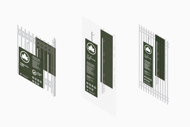
The new system consolidated all of this into modular signage that can be expanded with additional panels to accommodate further information. The signs can be arranged in horizontal or vertical orientations for various locations—at park entrances, dog runs, pavilions, etc.—and to accommodate the different heights of fences and other fixtures. On fences, the signage is double-sided, with panels clipping together at the same spot to be seen from both sides.
The new identity establishes a system for promotional and communications materials for the Parks Department programming in various categories: Arts and Culture; Sports, Fitness and Outdoor Adventure; Kids; and Nature. In the past these materials—brochures, advertisements, posters and postcards—were designed by different freelancers and studios, with little standardization between them and no consistent treatment of the Parks identity.
The system simplifies the graphics and makes them look more contemporary, establishing a unique look for each category and at the same time branding it as Parks. This is achieved through different logo treatments, types of imagery and distinctive color palettes. For instance, Arts & Culture brochures announce their titles on nameplates placed over images of Parks landmarks; Sports and Fitness materials feature icons of various activities, set in patterns of circles and a bright palette of blue, green and orange. Nature division posters combine flat graphics and photography of the natural environment; for Kids, the Parks logo is used in colorful patterns that form animals and objects.
An important part of the program is the creation of graphic standards to link NYC Parks with its partnership parks—the community initiatives, alliances, trusts and conservancies such as the High Line, Times Square Alliance, Bronx River Alliance, NYC Greenway and Madison Square Park that have established their own high-profile identities. The system pairs the Parks leaf with the logos of these groups, producing a cohesive and iconic system that works in both horizontal or vertical orientations and in various applications like signage and promotional materials.
Sector
- Civic & Public
Discipline
- Brand Identity
- Signage & Environmental Graphics
