

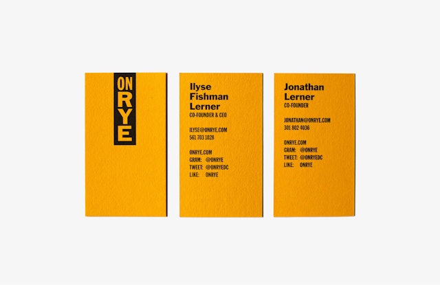


The branding puts a contemporary spin on the straightforward, no-nonsense graphics and imagery found in traditional Jewish delis, with a side of humor for the messaging.


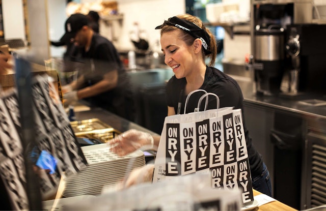
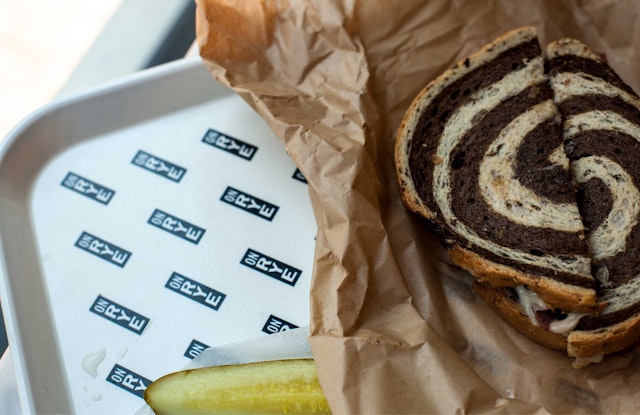




On Rye, a new sandwich shop in Washington, D.C. updates Jewish deli classics with natural, wholesome ingredients and unexpected recipes. The fast-casual restaurant gives traditional dishes a modern twist, serving up a tasty menu that includes Wagyu pastrami on gluten-free bread, vegetarian smoked beet and portobello Reubens, oven-roasted vegetable latkes, and a babka ice cream sandwich (which Zagat recently named one of D.C.’s Essential Dishes), as well as standards like matzo ball soup and an egg cream that’s to die for.
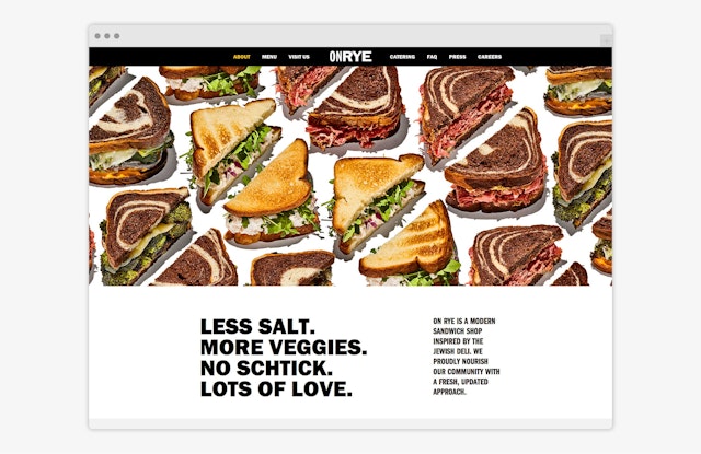
Pentagram has designed branding for On Rye that puts a contemporary spin on the straightforward, no-nonsense graphics and imagery found in traditional Jewish delis, with a side of humor for the messaging. The program extends to the restaurant website, environmental graphics and swag, now available online.
The designers worked closely with On Rye founders Ilyse Fishman Lerner and Jonathan Lerner to develop the brand identity. The owners first introduced the food concept at a highly successful pop-up at Washington Nationals Park, which led them to launch their first brick-and-mortar location, recently opened in D.C.’s Chinatown. The team wanted to create a visual personality that both referenced the cuisine’s unique heritage and signaled the boldness of the new menu.
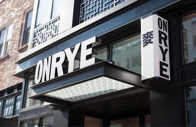
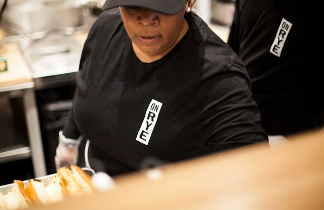
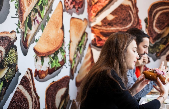
The pragmatic approach of traditional deli graphics inspired an elemental logotype set in a strong Franklin Gothic (in Extra Condensed and Regular), in stacked or horizontal configurations. The simple black-and-white color palette is set off by vivid photography of the menu items. For the images, the designers enlisted the photographer Bobby Doherty, known for his colorful food photography in New York magazine. The detailed, almost hyper-real shots put the food front and center, celebrating the healthful ingredients. The images appear in patterns on the menus, the website and on wall-coverings in the restaurant interiors.
Pentagram worked with local D.C firm HapstakDemetriou to assist with signage and environmental graphics for the 2,550 square-foot space. Franklin Gothic is used for signs throughout the restaurant, save for the behind-the-counter display menu, which is hand-written on sheets of butcher paper, clipped to the wall. The appetizing food is showcased in wall-coverings in the dining areas. The exterior signage on the façade also features the name as a Chinese symbol, a requirement of the district.
Diners are welcomed with a “Rye, hello there!” inlaid in tile at the entrance, and this friendly, chatty messaging is carried throughout the packaging, menus and swag. Coffee cup sleeves declare they are “So hot right now”, and the egg cream cup clarifies that “No eggs or cream were harmed in the making of this drink.” The t-shirt made to order for design fans stacks menu items in an arrangement à la Experimental Jetset. Get yours here.
