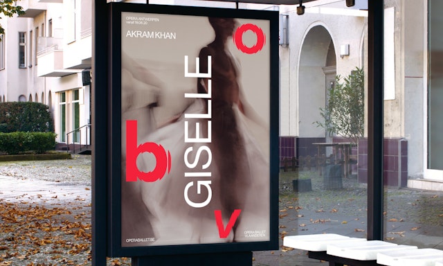
One of the most active companies in Europe, Opera Ballet Vlaanderen has built a reputation for their extensive and forward-thinking programs.
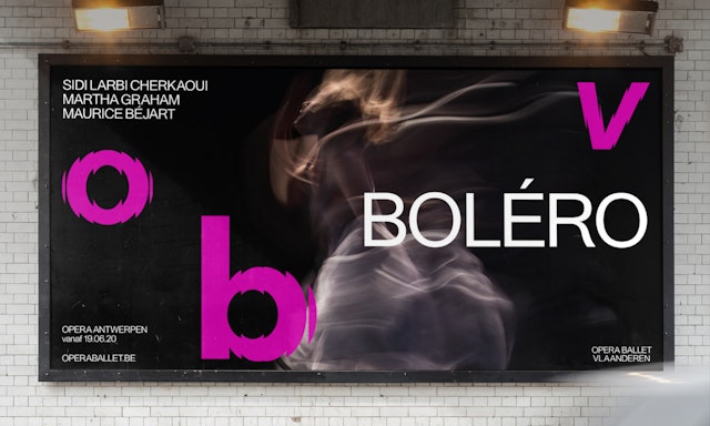
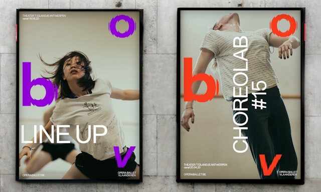

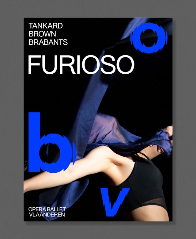
Pentagram has worked closely with the directors to create a new visual expression of their mission statement – 'Never the Same'.
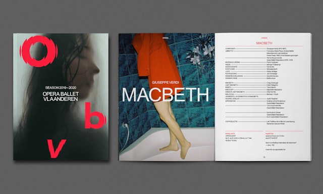

While built around typography, the new visual system is designed to express movement and transformation and embrace the transitory nature of performance art.
Opera Ballet Vlaanderen is the largest cultural institution in the Flanders region. Created in 2014 by the merger of Opera Vlaanderen, Flanders only opera company, and the Royal Ballet of Flanders, the company operates the opera houses of Ghent and Antwerp as well as the dance theatre ´t Eilandje in Antwerp. The company tours the world as well with both ballet and opera productions.
One of the most active companies in Europe, Opera Ballet Vlaanderen has built a reputation for their extensive and forward-thinking programs. Performing works from the baroque period up to more modern works, the company is committed to bringing contemporary lens to all of its productions. This dedication for creative excellence and innovation has recently seen OBV pick up the coveted International Opera Award for Best Opera Company – beating fierce competition from the likes of Opera national de Paris, Deutsche Oper am Rhiem and the Houston Grand Opera.
The award also sees OBV opening up a new chapter. With longstanding artistic director Aviel Cahn stepping down after the 2018/2019 season, Jan Vandenhouwe has joined as the new artistic director of ballet, Sidi Larbi Cherkaou and new General Director, Bart Van Der Roost to create a unique, unified program. Alongside this move to consolidate both programs, Opera Ballet Vlaanderen has also embarked on a refresh of their brand identity to reflect their highly innovative and exuberant vision.
Pentagram has worked closely with the directors to create a new visual expression of their mission statement – 'Never the Same'. Opera Ballet Vlaanderen prides itself on being a constant generator of new ideas and remarkable collaborations. The new identity had to reflect these ideas, as well as embodying the institution's role in the wider community and its work to develop talent, participation and education across and beyond the Flanders region.
To emphasise Opera Ballet Vlaanderen's dual role in expressing and promoting global cultural exchanges while strengthening and celebrating Flanders’ strong, regional sense of identity, the new brand identity centres on the institution's Flemish name. By focusing on the abbreviation 'OBV', the goal has been to create a clear, concise symbol; easily recognised across the world.
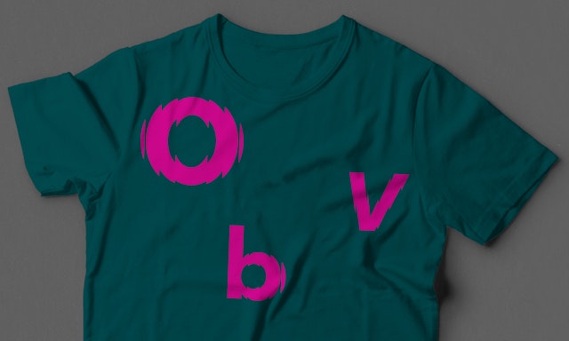
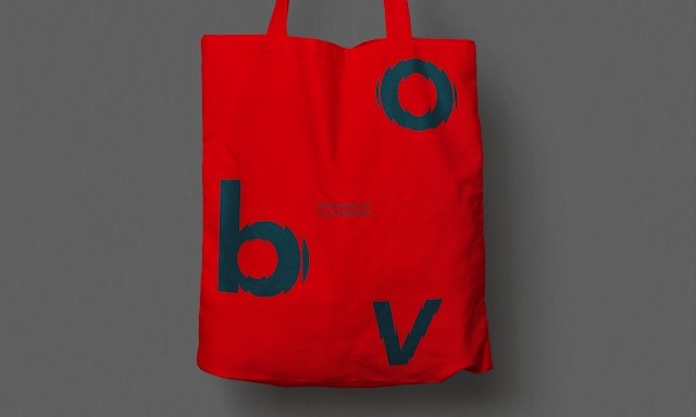
There was also a strong desire to create an identity that reflected the movement and vitality that came with the merger of the Opera and Ballet companies. While built around typography, the new visual system is designed to express movement and transformation and embrace the transitory nature of performance art. It is both a response and a tribute to words of ballet director Larbi Charkaou - "dance is essentially transience. One movement disappears in the other. It is a temporary sketch of reality. Transience is a pacesetter for new hope."
The key concept of the new identity, however, is flexibility. Although designed to be deployed in a bold, confident manner and appear in large proportion, the three letters are always accompanied by the full name of the company — Opera Ballet Vlaanderen, allowing OBV to speak in a subtler tone if required.
Office
- London
Partner
Project team
- Hamlet Auyeung
- Marta Gaspar
- Cleber de Campos
- Kate Blewett
- Jenni Kaunisto
