
Phenology is rooted in science yet embraces powerful, natural ingredients and holistic wellness practices. This duality informs many of the Pentagram team’s design decisions for the brand.


Phenology’s visual language is bold, sleek, and timeless—a nod to the balance it strikes between ultra-medicinal and luxury self-care brands.


The idea was to create stylish products that users would be proud to display on a nightstand or countertop, not keep hidden away like other menopause products.


Phenology ushers in a new conversation around women and their needs in the beauty industry, and stands out through a design system that is confident, smart, and unafraid, much like the women who use the brand.

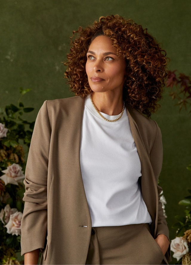

For a long time, menopause has been an uncomfortable, hush-hush phase of a woman’s life—and this is reflected in the design and positioning of most menopause products. Transforming this experience was the inspiration behind Phenology, a science-backed, holistic menopause relief brand designed to help women go through this complex, natural transition with the confidence and support they need. Emily Oberman and team worked on the brand strategy, naming, identity, and packaging design for Phenology, building a welcoming yet sophisticated brand for smart, discerning women, who, as the brand tagline states, “weren’t born yesterday.”
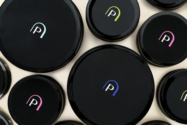
Phenology is rooted in science yet embraces powerful, natural ingredients and holistic wellness practices. This duality informs many of the Pentagram team’s design decisions for the brand. With modern typefaces, vibrant colors, and detailed botanical illustrations, Phenology’s visual language is bold, sleek, and timeless—a nod to the balance it strikes between ultra-medicinal and luxury self-care brands. The identity design refers to the brand’s pioneering approach through an elegant doorway that arches across the logo, inviting users to begin their new journeys. When paired with Phenology, a name that is inspired by the scientific term for life cycles in nature, the brand’s identity stands out as one that champions scientific expertise, positivity, and inclusion. The Phenology type family comprises two complementary typefaces, the elegant sans-serif Basis Grotesque paired with the classic serif Domaine Text.
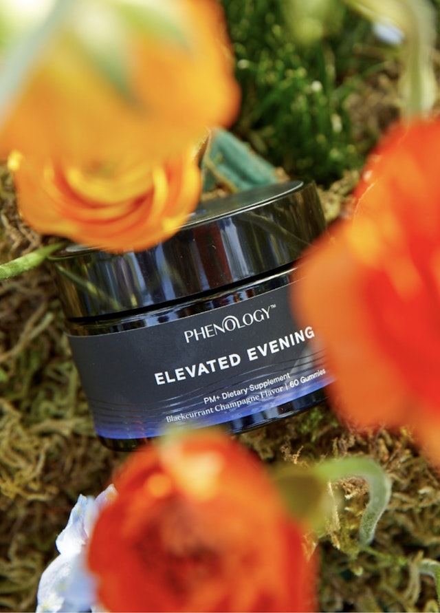
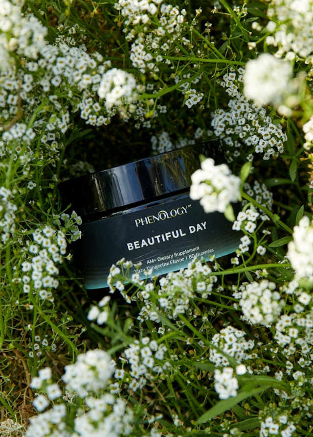
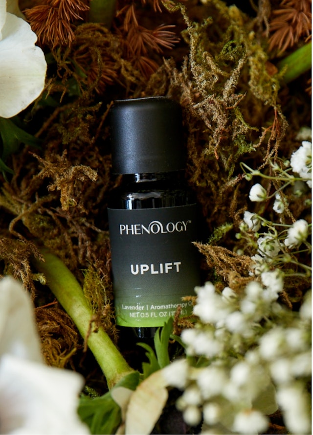
The brand colors are not the delicate colors typically used to market a women’s health brand; instead, they are made up of an elegant primary palette of black, white, and beige, with a vibrant secondary palette that includes hot neon accents. The color system indicates different products for a day or nighttime regimen, as well as treatment types like “rescue green” and “beauty pink.” The contemporary nature of the colors is reflected in their evocative names, such as blackberry, yuzu, elderberry, hibiscus, aloe vera, and seashell.
The designers also assembled a library of royalty-free illustrations of plants, flowers, and other life forms that were then treated with the brand colors and a graphic texture to make them feel scientific. The drawings highlight specific ingredients in Phenology products and are used to make visual puns in a friendly, knowing way, like a cactus for dryness and a butterfly for transformation.
The brand's packaging is another touchpoint that was developed to reframe the conversation around menopause. Designed by Pentagram’s Jon Marshall and team, the packaging system features sleek, elegant jars that ship directly to the home in custom-designed kits. The idea was to create stylish products that users would be proud to display on a nightstand or countertop, not keep hidden away like other menopause products. Made of black glass with plastic lids, the jars set off the vivid colors of the branding and establish a consistent visual form across multiple sizes and formats.
The designers developed a unique unboxing experience for the kits that introduce the products and welcomes users to Phenology. The brand’s direct-to-consumer business model means multiple bottles and jars of varying sizes are usually shipped together in a single box. To avoid excessive packaging, these are held tightly in the shipper with adjustable dividers (made of paper pulp, with a custom shape that echoes the logo) that neatly present the contents when opened. The recipients are greeted with an introductory insert card that can be updated seasonally to support the overall idea of the brand—that cycles, and change, are a natural part of life.
Phenology ushers in a new conversation around women and their needs in the beauty industry, and stands out through a design system that is confident, smart, and unafraid, much like the women who use the brand.
Pentagram previously developed the identity for the parent brand, Hologram Sciences.
Client
Hologram SciencesSector
- Fashion & Beauty
- Health
- Technology
Discipline
- Brand Identity
- Packaging
- Brand Strategy
Office
- New York
Partners
Project team
- Mira Khandpur
- Greg Morrison
- Renee Freiha
- Katherine Killeffer
- Lisa Grant
- Yemima Lorberbaum
- Vincent Fan
- Chifen Cheng
- Steph Hamilton-Jones
- Gabrielle Knowles
Collaborators
- Roxanne Fequiere, writer
- Claire Leahy, lifestyle photography
- Haley Bergsgaard, product photography
- Claudia Mandlik, case study photography
