

Every detail was meticulously chosen, from the materials used to the cuts and accessories, to make his wakesurf boards feel like ocean surfing on the wake.


The Pentagram team landed on a simple black icon of a flying, swallow-tail surfboard that resembles a cross but also incorporates the distinctive wings of a crow – a bird with a lot of religious symbolism.


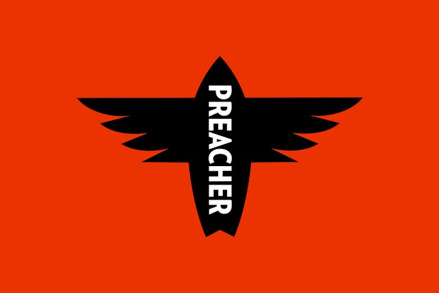


The symmetrical flying surfboard icon, which can be used by itself, locked-up with the wordmark or with the name PREACHER knocked out of it, looks great centered on the thin, black center-stripe that runs the length of the new wakesurfboards.


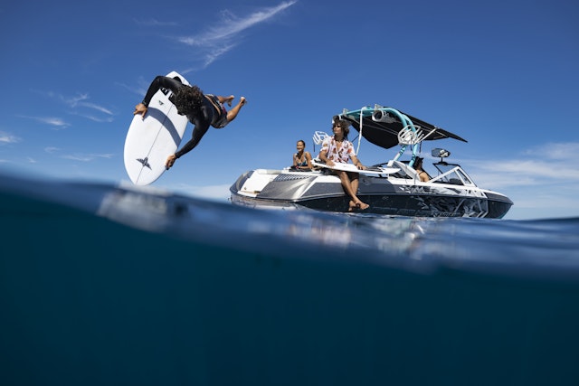
Wakesurfing is a relatively new water sport created by landlocked surfing enthusiasts who don’t live near a coast with naturally occurring waves but have access to lakes and other large bodies of water. Wakesurfing is made possible by the invention of the wake boat or wakesurfing boat, a specialized ski boat designed to leave large wakes. Wakesurfing is different from wakeboarding in that wakesurfers let go of the towrope once they’re positioned on the wake and surf the manmade waves untethered to the boat.
Pentagram’s Austin office has developed a comprehensive new brand identity for Preacher Wakesurf Boards based in Toronto, Canada. Preacher currently offers three custom wakesurf board models designed and shaped by world-renowned ocean surfboard makers.
Preacher Wakesurf Boards was founded by Stephen Scragg, a fan of ocean surfing who lives in Toronto, far from the coast. He does, however, live near Lake Ontario – a Great Lake and one of the largest bodies of water in North America – a perfect spot for the sport of wakesurfing.
Once Scragg started wakesurfing, he quickly realized that the wakesurf boards available to him were nothing like ocean style boards. They were heavy, clunky and lacked the smoothness of regular surfing, so Scragg set out on a mission to bring ocean style surfboards to wakesurfing.
His idea for the company started as his college thesis. With the support of his family, particularly his sister, a marketing professional, he formed a business plan and started working with top ocean surfboard craftsmen based in Oceanside, California. The goal was to develop boards that are light, fast, agile and “give you a smile you can’t wipe off your face.”
Every detail was meticulously chosen, from the materials used to the cuts and accessories, to make his wakesurf boards feel like ocean surfing on the wake. Then he reached out to Pentagram.
Pentagram Austin’s first task was to name the new company. After several rounds of exploration, the finalists were “Loon,” a bird with a haunting call found in northern lakes, “Bessie,” the name of a mythical sea monster (like the Loch Ness Monster) that supposedly lives in the Great Lakes, and “Preacher,” a name that reflects the spiritual passion surfers have for surfing. In the end, Scragg chose Preacher because the name reflected his own religious fervor for the sport as well as the fanaticism that drives wakesurfers to make their own waves where there are none.
With the name finalized, the design team began working on the brand identity for the startup. Scragg wanted Preacher’s identity to feel more sophisticated than the typical wakeboarding company. Wakeboarding culture, in his mind, is more akin to skateboarding culture, whereas wakesurfing appeals to a more upscale crowd. The price of a wake boat alone sets the tone for the well-heeled, more exclusive wakesurfer club. Scragg wanted his brand to be more down to earth and accessible.
For Preacher’s logo, the Pentagram team landed on a simple black icon of a flying, swallow-tail surfboard that resembles a cross but also incorporates the distinctive wings of a crow – a bird with a lot of religious symbolism.
The symmetrical flying surfboard icon, which can be used by itself, locked-up with the wordmark or with the name PREACHER knocked out of it, looks great centered on the thin, black center-stripe that runs the length of the new wakesurfboards. The Preacher wordmark is set all-caps in Verlag, a handsome san serif typeface originally designed for the Guggenheim Museum by Hoefler & Co. In addition to the brand identity, the Pentagram team also weighed-in on the look and feel of the new wakesurf boards.
Preacher offers three models of boards – Kokomo, Psychedelia and Point Panic – with distinctive contours and tail shapes. All three of the sleek white boards, designed to be minimal and classy, feature the new Preacher icon prominently on their noses. Each model is given their own personalities with additional graphics. A different artist was commissioned to create a signature illustration and typographic interpretation of the Preacher wordmark for each board. Will Bryant did the graphic for the Kokomo model, Jon Contino for Point Panic and Mark Ward for Psychedelia.
Additionally, each artist was given free rein to create custom board socks – an idea borrowed from high-end golfclubs. The socks protect the pricey boards in transit and storage and add a quality, collectible aspect to the Preacher brand experience.
Office
- Austin
Partner
Project team
- Stu Taylor
- Tyler Cogburn
- Roxy Torres
Collaborators
- Troy Lyndon Massey, Photography
- Kateryna Markush, Photography
- Ben Thouard, Photo and Video
- Cooper & O’Hara, Photo and Video
- Morgan Maassen, Photo and Video
- Caroline Lee, Brand Strategist
