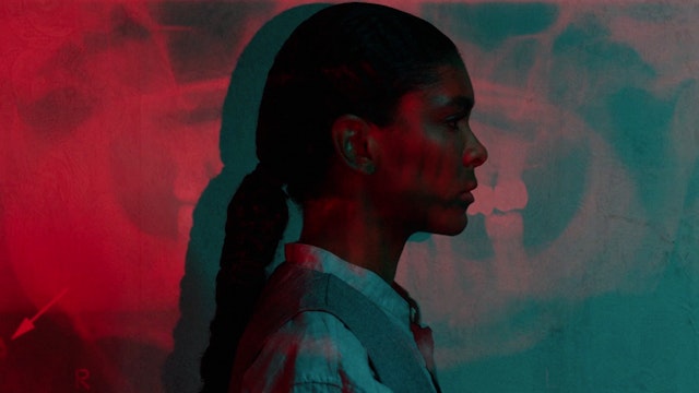
For each episode a bespoke sequence was created, composed of layered collages, projection and type that echoed the nature of a ragdoll—a thing taken apart and pieced back together.
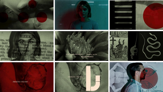

In keeping with the show’s aesthetic, the designers wanted to produce a sequence that was as analogue and hand-crafted as possible.
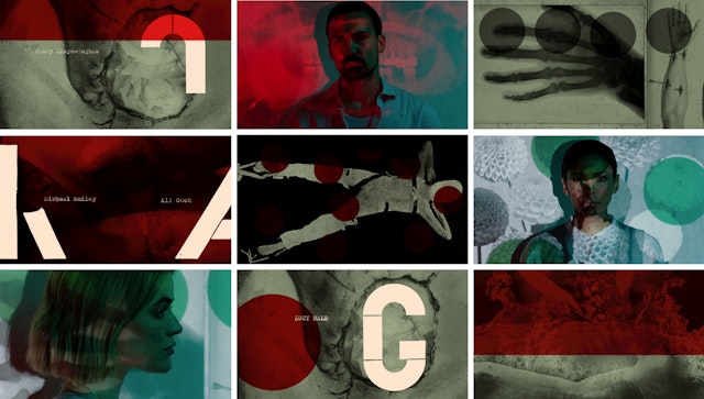
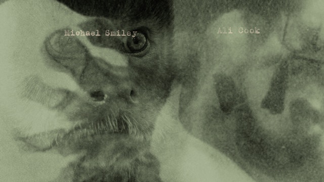

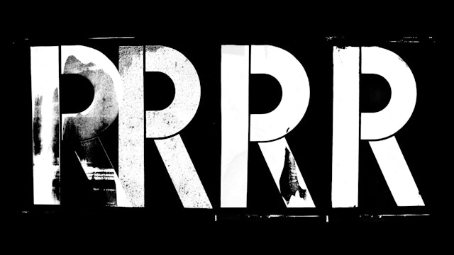
An irregular stencil typeface was built out of parts, with pieces of letterforms carved out of linoleum and printed.

In the new limited six-episode series “Ragdoll,” London detectives pursue a serial killer who dismembers his victims for parts to make a grotesque, sewn-together body—a human ragdoll. Pentagram partner Matt Willey and team have created an opening title sequence that uses custom typography and layered images to capture the tone and complexity of the show, taking viewers into its twisted world.
The project reunited Willey with Sid Gentle Films, the producers behind the award-winning “Killing Eve,” for which he designed the graphic identity and opening titles. “Ragdoll” is based on the bestselling novel by Daniel Cole and stars Henry Lloyd-Hughes as a newly demoted Detective Sergeant who falls into the mystery of the killer and is aided by fellow detectives played by Thalissa Teixeira and Lucy Hale. The show is co-produced by AMC Studios and distributed by BBC Studios, and airs on AMC+ in the US and Alibi in the UK.
Willey worked on the titles with his frequent collaborator, the graphic designer and art director Pablo Delcan. In keeping with the show’s general aesthetic, the team wanted to produce a sequence that was as analogue and hand-crafted as possible—making almost everything away from the computer and embracing the unpredictability of combined imagery, projections and hand-printed type.
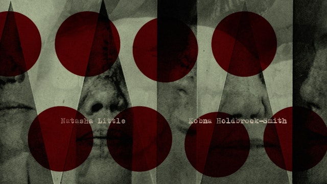
For each episode a bespoke title sequence was created, composed of layered collages, projection and stencil type that echoed the nature of a ragdoll—a thing taken apart and pieced back together. Projecting these images onto the cast members, Willey and team explored the idea of seeing things through other things, both disorienting the viewer and drawing the eye to unexpected details, in the way that the scattered clues in the show both disorient and sharpen the insights of the main character. Throughout the sequence, pieces of the title typography appear on screen but it is not until the word is resolved at the end that its nature becomes evident. The music was created by the jazz drummer and composer Moses Boyd.
To develop the titles, the designers read the scripts and sourced a mix of imagery including 17th-century anatomical drawings, medieval torture techniques, Biblical references, pacts with the devil—Faust figures in the plot—and other items that hint at the methods of murder in the series. These were then combined into eerie and enigmatic collages, and a selection were animated for projections that were played across the face and shoulders of the main cast members. The goal was to create still-but-alive portraits––with the actors breathing and blinking, eyes reacting to the light—that evoked police mug shots or booking photographs.
The stencil type too is a nod to the idea of component parts coming together to make a rough, seamed whole. The designers drew an irregular typeface that, like the Ragdoll, was built out of parts. These were carved out of linoleum and printed, a reference to a woodcut theme in the show. The cast names were generated by typing each name up to 50 times on a typewriter (the Ragdoll murderer types his “kill list”), then animated frame by frame by carefully overlaying each scan on top of the next.
Office
- New York
Partner
Project team
- Bina Thorsen
- Chantal Jahchan
- Nick Marabella
- Avery Cross
Collaborators
- Pablo Delcan, designer and art director
- Delcan Company, editing
- Moses Boyd, music
- Nadav Kander, photographer
- Ariana Gupta, assistant animator
- Dominique Marchini, assistant animator
