
As a new smartphone amongst a sea of others, Realme needed an identity that would set it apart and firmly establish it as a brand that young people could identify with.


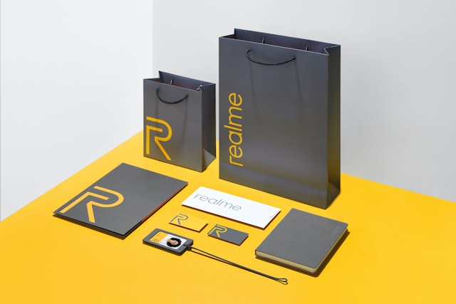
The visual identity system and logo are all based on the unmistakable ‘Realme Yellow’—a vibrant golden yellow color that pulses with energy.
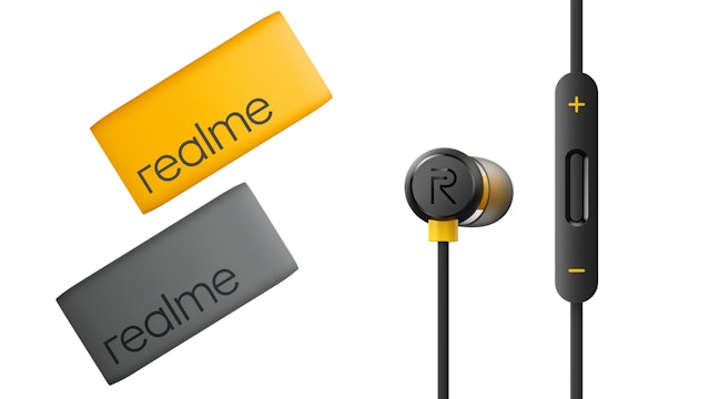


With a growing portfolio of products including laptops, tablets and wearables, Realme’s identity needed to work across a variety of platforms.


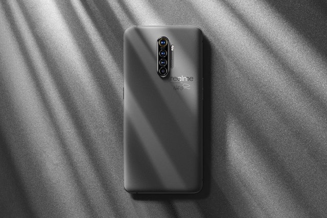
Realme is a smartphone brand designed for a generation like no other: the driven and dynamic youth in the world’s rapidly developing economies. With stylish devices and powerful performance at budget prices, Realme’s meteoric rise is a testament to its brand value. But as a new smartphone brand amongst a sea of others, it needed an identity that would set it apart and firmly establish it as a brand that young people could identify with. Pentagram designed a refreshed brand identity system for Realme that speaks to its Gen Z audience—one that had been largely underserved before the brand emerged in 2018.
Realme smartphones regularly feature among the highest-rated mobile phones on Amazon and it is the fastest brand to sell 100 million handsets globally. And with a growing portfolio of products including laptops, tablets, and wearables, Realme’s identity needed to work across platforms and products.
“As a global, youth-facing smartphone brand, Realme hopes to create a symbol for young people through the new brand logo—one they can identify with, and where they see a visual symbol of their emotional identity and belonging,” said Sky Li, Chief Executive Officer and Founder of Realme.
The Pentagram team worked closely with Realme leadership to incorporate the brand’s vision for the future into the new identity and understand the nuances of its young target audience. Realme planned to launch across Southeast Asian markets including Malaysia, Thailand, the Philippines, Cambodia, and countries in South Asia, the Middle East, and North Africa, by introducing themselves as a youth-oriented brand that posed a confident challenge to other smartphone brands.
The Pentagram team started the design process with an unusual first step: colors. The upgraded visual identity system and logo are all based on the unmistakable “Realme Yellow”—a vibrant golden yellow color that pulses with energy—which is paired with a grounded yet magnetic warm grey. Yellow as the brand’s primary color was a strategic choice because of its versatility. While most other colors are associated with either positive or negative connotations in different parts of the world, yellow is universally regarded in Eastern and Western cultures as optimistic, energetic, and friendly. The grey tone imparts soothing professionalism, while also balancing out any legibility or scalability issues that might occur with the yellow shade.
Realme’s logotype displays a humanistic perspective lacking in the old one, which was a staid wordmark in red-and-black. The nested lowercase “r” under the uppercase “R” represents the brand’s dual focus on high-performance and self-expression. It also features a few Easter eggs: the nested Rs resemble the profile of a person using a smartphone, as well as forming an arrow symbolizing the passion and zeal embodied by the brand and its users. The typeface Gilroy Sans ties these graphic shapes together with its modern, geometric framework.
As a brand that prides itself on being young, Realme values organic marketing and interacting closely with its community of users. But as an ambitious new smartphone brand, it understands that design has the power to propel its growth as it competes with other brands—and Pentagram’s brand identity system was designed to serve both these needs.