


Most of the individual logo tiles can stand on their own, and within the system can be used in various combinations to form still more abstract compositions.

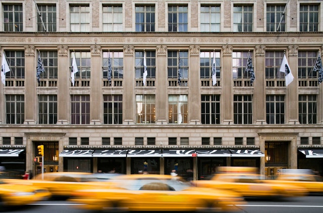
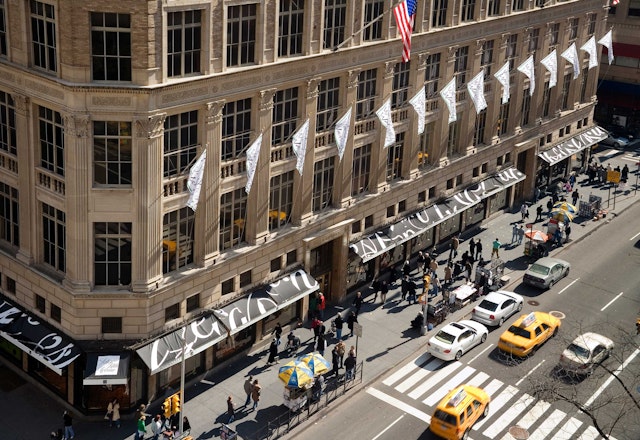
Pentagram was approached by Saks Fifth Avenue to design a new identity for their stores, along with a graphic program that would encompass signage, advertising, direct mail, website and packaging design.
It was immediately understood to be much more than a logo design project. The previous Saks logo had been in use since the mid-nineties, but had done little to create a profile for the brand, particularly as part of a gray-on-gray packaging program. Terron Schaefer and the leadership at Saks were looking for something that could be ubiquitous and iconic, immediately identifiable when glimpsed across a busy street. But, unlike Tiffany, the store never had a signature color; and unlike Burberry, no signature pattern. The one theme the designers found when researching the retailer's history was cursive writing, sometimes casual, sometimes Spencerian.
One previous iteration of the logo stood out in particular, the 1973 one by Tom Carnese, adapted from a signature introduced almost twenty years before. In many people's minds, this was the Saks logo. But simply reinstating a 30-year-old logo wouldn't be enough. Saks was happy to emphasize its heritage, but it was even more eager to signal that it was looking to the future, a place of constant change and surprise with a consistent dedication to quality.
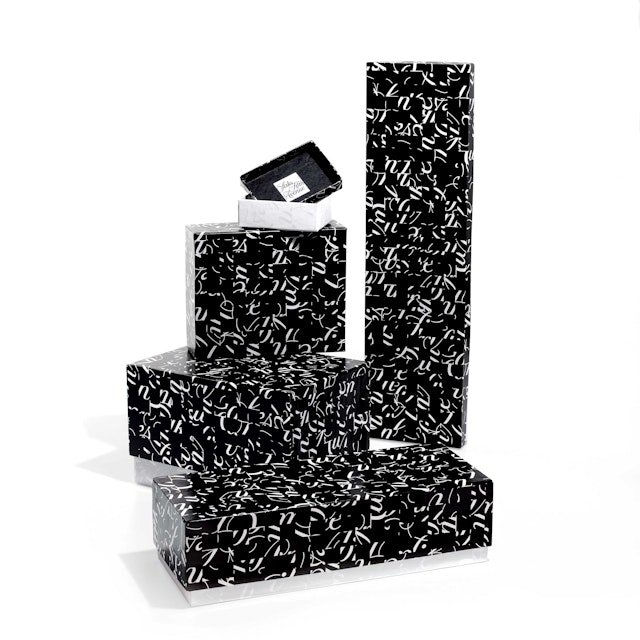
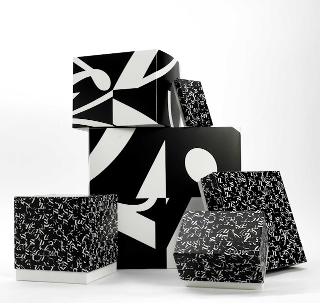
The new logo takes on the cursive of the 1973 one, redrawn with the help of font designer Joe Finocchiaro, but places it in a black square. That square is then subdivided into a grid of 64 smaller squares. The 64 tiles can then be shuffled and rotated to form an almost infinite number of variations. Most of the individual logo tiles can stand on their own, and within the system can be used in various combinations to form still more abstract compositions. Each of these suggests within its detail the graphic character of the new logo. Enlarged, they have a kind of energy and drama that contrasts nicely with the original mark from which they were derived.
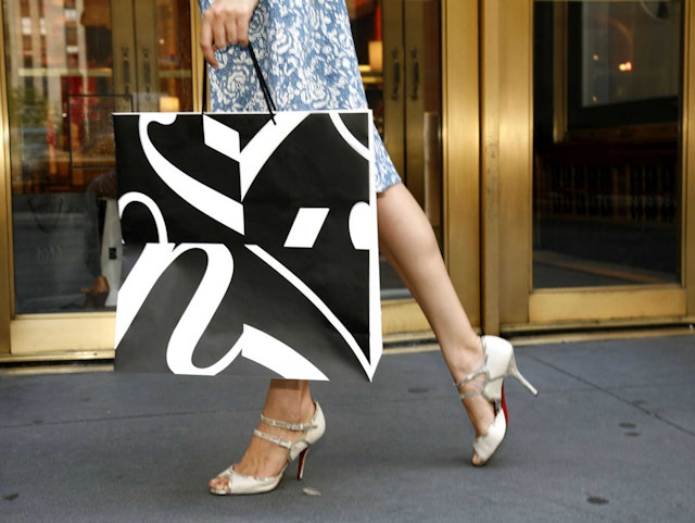
The advantage of the program, deployed in black and white like the store’s holiday “snowflake” packaging, is that it creates recognizable consistency without sameness. The logo elements will be used in signage and direct mail and advertising. Most importantly, there are over forty different packages in the program, from jewelry boxes to hat boxes, and four sizes of shopping bags. In the new program, no two of these are alike, yet they all go together.
Client
Saks Fifth AvenueSector
- Fashion & Beauty
- Consumer Brands
Discipline
- Brand Identity
- Packaging
Office
- New York
