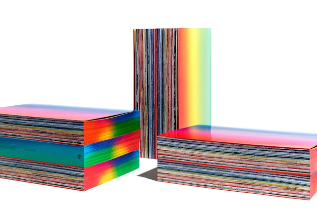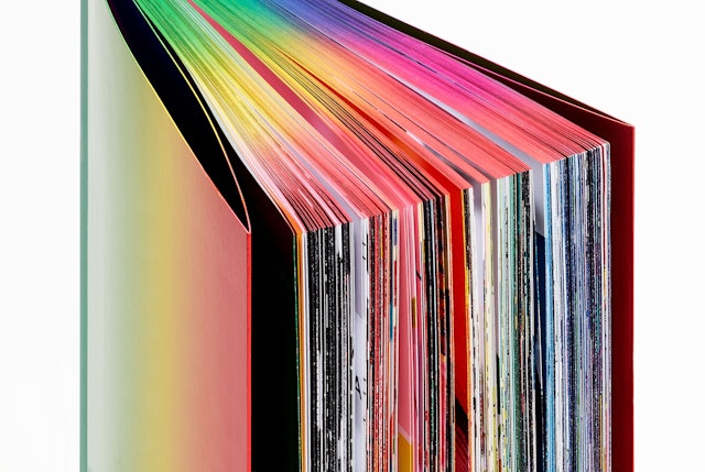


The book is a celebration of color, with work sorted into a structure inspired by the color spectrum.


Each of the pieces has been analyzed through an algorithm to identify its predominant color, then sequenced in a continuous flow over the pages to create a color spectrum.

Each year the School of Visual Arts in New York publishes the SVA Senior Library, a compendium that showcases the work of the graduating designers in the BFA Design and BFA Advertising departments. One of the school’s Senior Portfolio faculty instructors is selected to create the book, which is distributed to the department’s 950 students, its faculty and the industry at large. Pentagram partner Natasha Jen, who has taught the course since 2013 and is an SVA BFA Design graduate herself, was invited to conceptualize, design and edit the publication’s 15th edition, covering the class of 2018.
The challenge in designing the Senior Library is finding a way to organize the wide-ranging work of 250 students, whose disciplines span advertising, graphic design, interaction design, interdisciplinary design, motion graphics and 3D design. The 2018 edition uses color as its organizing element, with work sorted into a book structure inspired by the color spectrum. The concept ties into the broad spectrum of education offered at SVA and the diversity of the work. Jen also chose color for its unique power as a design element. In the book’s preface, she writes:
“Color is arguably the greatest paradoxical property of graphic design. Compared to more abstracted fields such as typography, proportion, composition and shape, color is backed by the most scientific research. However, it remains perpetually subjective, mysterious and impossible to meaningfully critique.”
Each of the 204 pieces in the book has been analyzed through a customized algorithm that produces a summarized color breakdown based on the HSL (hue, saturation, lightness) system. The program identifies the predominant color, then assigns the work a numerical value, or code, on the HSL scale. The work is then sequenced through a linear color spectrum, starting with black.
The works are presented in a continuous flow over the book’s pages, making their own color spectrum. There are no pauses between the works; the spreads vary depending on the dimensions of each piece. A sidebar with the HSL code, student’s name, project’s title and instructor’s name runs alongside each work and separates it from the next. The book is printed with a French fold, reinforcing the idea of an unbroken stream of color.
The front and back cover wraps the book in the complete spectrum, and the coloring carries over to the top and bottom fore-edges, printed with a custom airbrush application. Bits and pieces of the works are revealed on the book’s principal fore-edge, creating another spectrum. An index of the works arranged by color appears at the front of the book, paired with a key of the student designers at back.
