The updated identity and streamlined brand architecture establish a consistent system that positions the magazine as a contemporary, authoritative voice on science.

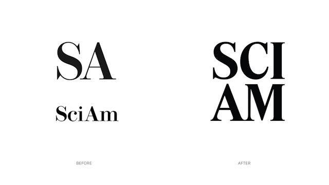
The full name, previously abbreviated as both ‘SciAm’ and ‘SA,’ is now set as ‘SCI AM,’ stacked and justified as a verbal and graphic contraction of the full word mark.


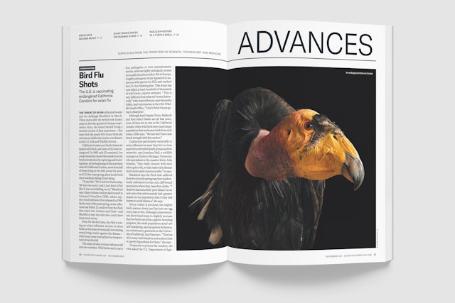
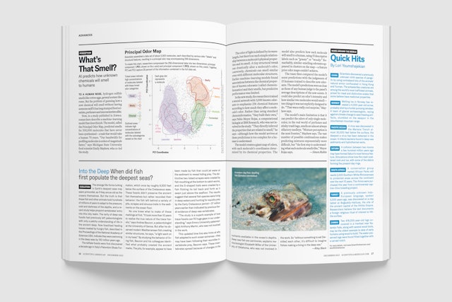
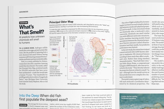
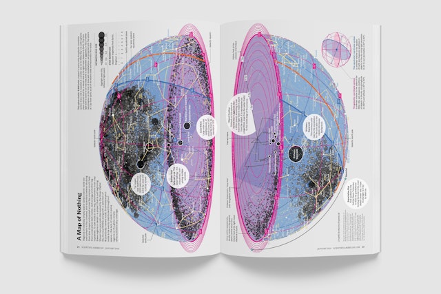
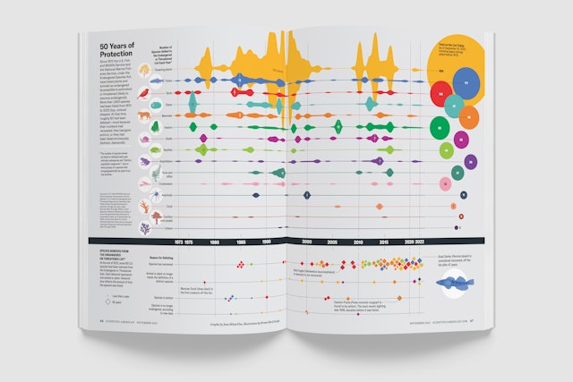
Changes to the print edition enhance the magazine’s readability, with a new typography system that provides clarity and serves as a foil for the often spectacular imagery.








Founded in 1845, Scientific American is the oldest continuously published magazine in America, widely regarded as a trusted source for scientific research and notable for publishing more than 200 Nobel Prize winners, including Albert Einstein, Marie Curie, Stephen Hawking and Nikola Tesla. Now an essential guide to the latest advances in science and technology, it has grown beyond its print and digital editions to include sub-brands including conferences, podcasts and custom media.
Scientific American is a legacy brand that has an evolving, modern presence—it currently reaches more than 10 million people around the world each month. To strengthen this position, Pentagram has updated the identity and developed a streamlined brand architecture that provides a consistent system for communications and reinforces the magazine as a contemporary, authoritative voice on science.
Strategically, the changes are intended to convey seriousness and gravitas of the topics covered but in an up-to-date and accessible manner. To enhance functionality for readers, Pentagram redesigned the magazine’s logo, grid, structure, and typography system. Many of the changes have increased readability and the system overall provides a crisper palette of typography and color.
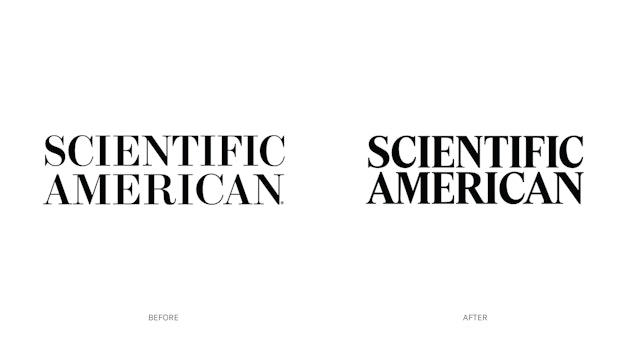
The masthead, customized by Commercial Type, retains the basic construction of the former logo but is now more space-efficient with lower contrast between thick and thin strokes providing a bolder mark. The full name, previously abbreviated as both “SciAm” and the acronym “SA,” is now set as “SCI AM”—stacked and justified as a verbal and graphic contraction of the full word mark.
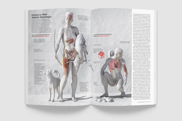
Updates to the print edition were designed for readability: narrower margins and a more space-efficient font allow for a significantly larger point size of text while still retaining the number of words per page. Typefaces were chosen for legibility and to provide clear hierarchy with the intention of serving as a foil for the often spectacular imagery.
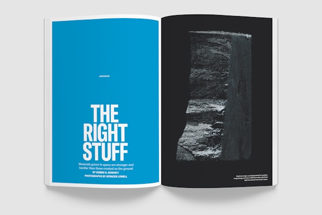
The new design also needed to allow for efficient production by a small team. The templates and choices for the front and back of the book are heavily formatted. However, feature openers break through this structure, allowing freedom and flexibility for more unique and expressive designs that compliment the imagery.
Office
- New York
Partner
Project team
- Shigeto Akiyama
- Rob Hewitt
- Ben Law
- Avery George
Collaborators
- Christian Schwartz, custom nameplate design
