

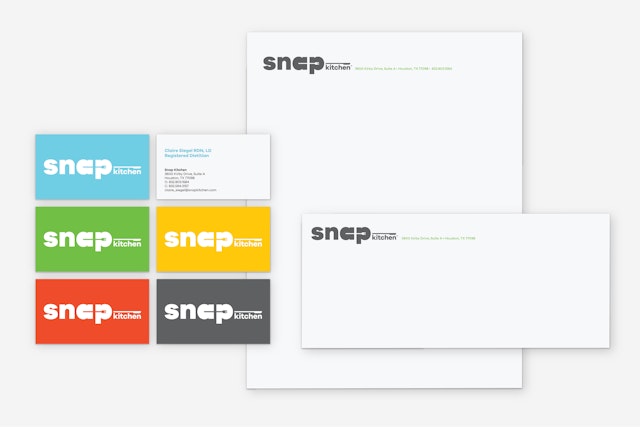
The new identity is composed of simple graphic ingredients that provide a kit of parts for applications ranging from menus to environmental graphics.



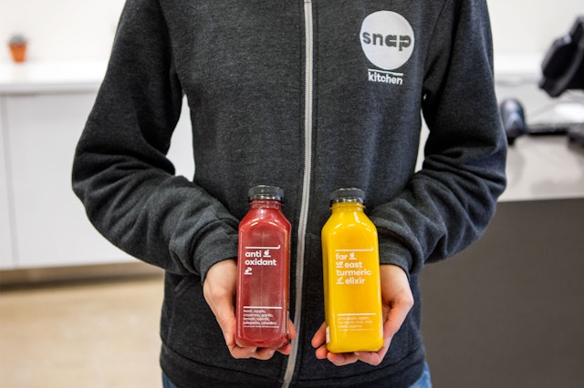





Fresh, natural ingredients and delicious chef-designed dishes come together at Snap Kitchen, the innovative take-away chain that offers healthy prepared meals to go. Pentagram has created a new brand identity for Snap Kitchen that spotlights the unique food concept in a clean, contemporary system of tasty graphic iconography. The launch of the new identity is being introduced with the Austin-based company’s expansion to the East Coast, where it is opening seven new locations in Philadelphia this year.
The designers worked closely with the brand’s newly appointed Chief Executive Officer David Kirchhoff and his team to develop an identity that would help illuminate the retail concept. Snap Kitchen's meals are made fresh locally and delivered to stores daily. The options are ideal for any dietary lifestyle, from Paleo, gluten-free and vegan to carb and sodium conscious, and are perfectly portioned to grab and go for breakfast, lunch or dinner, or to stock up at home for the week.
The Philadelphia expansion comes at time of significant growth for the company. Founded in 2010, it currently has 40 locations throughout Austin, Houston, Dallas, Chicago and now Philadelphia, with more to come. The company was looking for an identity that was flexible and dynamic, so as to fit in a number of different store types and locations. At the same time, the branding needed to help the company stand out in the marketplace, and to highlight the convenience and freshness of the product.
“We had three primary objectives in the redesign effort,” says Kirchhoff. “First, we wanted a brand identity that could become iconic across all of the major markets we intend for Snap Kitchen. Second, we wanted a visual system that was consistent and strong across medium, whether it be signage, packaging or digital. Third, we wanted a system that made our stores much more intuitive and usable—particularly in packaging and shelf labeling.”
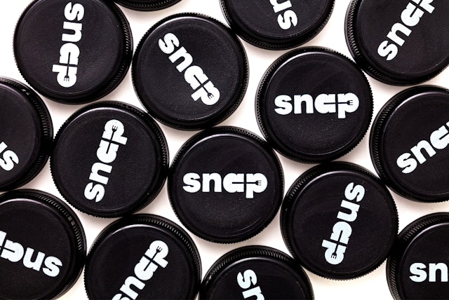
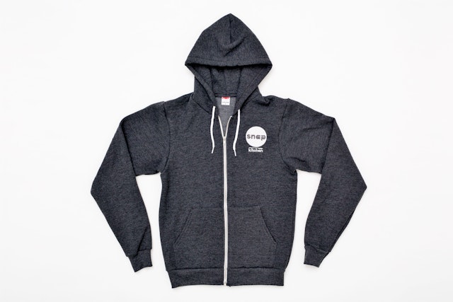
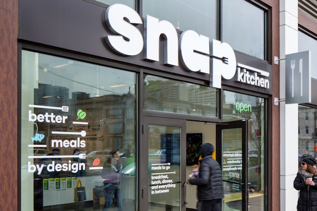
The new identity is composed of simple graphic ingredients that provide a kit of parts for applications ranging from menus to environmental graphics. The branding is built of elements that are used in the preparation of meals. The new Snap Kitchen logo pairs an iconic wordmark with utensils found in a kitchen: the circular letterforms of the “a” and “p” are connected by the handle of a fork, while "kitchen" is anchored by a knife. The logotype is set in Galano Grotesque, a modern, geometric sans serif designed by Rene Bieder that is especially easy to read. The secondary logo features “Snap” knocked out of a plate-like circle, with “Kitchen” stacked underneath the form.
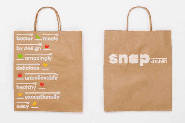
Throughout the system, the lines of the handles extend to suggest spaces that can be filled with various ingredients, almost like an equation or balance of options. The lines and bars of the utensils are part of the visual language, a graphic device that helps organize the elements and reinforce the brand. The logo can accommodate different subsets of the brand, like Snap Blog or Snap Nutrition, by anchoring the name to different utensils. The lines of the handles can hold text, or they can be used to form architectural patterning in stores.
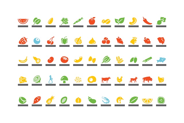
While the utensils allude to the preparation, the icons depict the ingredients. Food items like fruit, vegetables, and meat are represented with friendly, playful graphic icons. The objects sit in place on bars next to the typography, and along with the utensils, are used to create patterns in stores and on packaging.
Convenience is key to the Snap Kitchen brand—hence the name—and the stores are designed for quick visits of usually three minutes or less. Consumers run in and out to grab breakfast, lunch or dinner, or to stock up on a series of meals for the week. The food is displayed in grocery-style refrigerated cases, and organized by meal type.
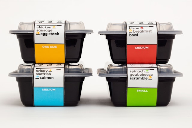
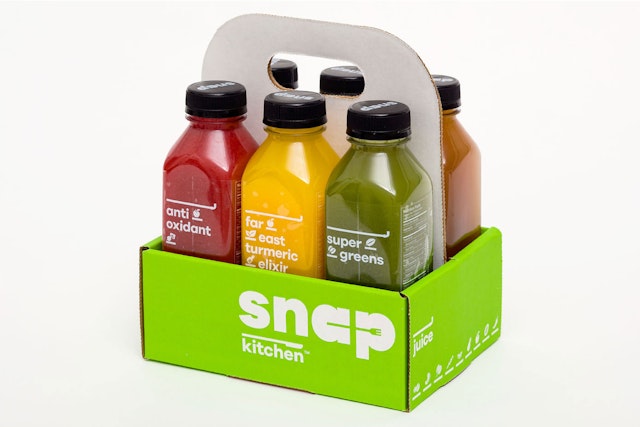
The new packaging extends this easy accessibility and transparency. Meal types are color coded by protein: yellow for poultry, green for vegetarian, blue for seafood, and red for meat. The packaging graphics have been designed to help consumers understand what the product is and what it has to offer. The labels are organized into individual “compartments” that help with the flow of information and reinforce the brand’s unique look.
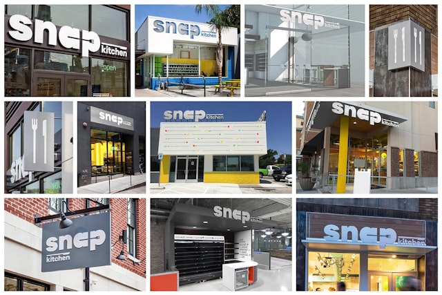
Pentagram also designed a comprehensive program of environmental graphics for the stores, which are located in a wide variety of areas and required a flexible system that can be adapted accordingly. The interior and exterior signage can be customized for urban storefronts or stand-alone shops, and may be adjusted for factors like size, lighting, and retail mix.
The new look has been welcomed by consumers at the opening of new locations in Philadelphia. “First and foremost, the new design system has made our stores massively more user friendly and shopable,” says Kirchhoff. “The clarity of information, such as nutritional, is exceptional.”
