
The identity captures the ‘made-in-DC’ culture of the non-profit theater company and expresses its creative ambitions as a force for engaging, socially relevant, and artistically daring performances.


The type-driven identity hints at the industrial past of Studio’s home, as well as the creative spirit and resourcefulness of Studio as a theatrical company.

One of the goals of the revitalization was to make Studio a more open and welcoming space for the community, and the redesigned façade announces the theater as a vibrant personality within its neighborhood.


For almost five decades, Studio Theatre has produced the best of contemporary theater in Washington, DC. Pentagram has developed a new identity for Studio and a program of signage and environmental graphics coinciding with a major architectural renovation of its four-theater complex in the 14th Street corridor near Logan Circle. The identity captures the “made-in-DC” culture of the non-profit theater company and expresses its creative ambitions as a force for engaging, socially relevant, and artistically daring performances.
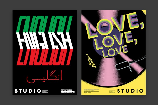
The Pentagram team worked closely with Artistic Director David Muse to develop the new identity. Founded in 1978, the well-respected Studio is “where local audiences will find today’s edgiest playwrights” (Variety) and produces original productions of award-winning plays such as “Fun Home,” “The Hot Wing King,” “Fat Ham” and “English,” as well as world premieres of new works by emerging playwrights. The company has played an important role in establishing the vitality of local and regional theaters in the US. Along with its artistic programming, it serves the wider community through educational partnerships and other engagement initiatives.
Studio has been in its current building, a converted car showroom at 14th Street and P Street, since 1987; over the years it has progressively expanded to encompass three adjoining buildings that include the conservatory, four theaters, full production shops, offices, and public amenities. Designed by Hickok Cole Architects, the $20 million revitalization completed in April 2022 opened more public space and included a re-engineering of the venue’s largest theater.
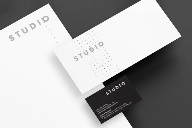
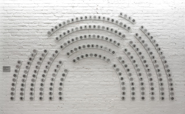
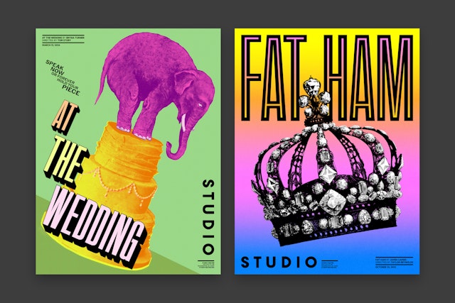
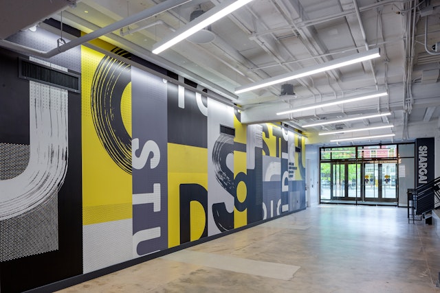
The type-driven identity hints at the industrial past of Studio’s home in a former factory, as well as the creative spirit and resourcefulness of Studio as a theatrical company. The wordmark and primary typography are set in a non-stencil version of the utilitarian heavyweight font AType (designed by Pentagram partner Matt Willey); secondary type appears in the geometric sans Metric (from Klim Type Foundry) and the serif Publico (from Commercial Type). The primary brand palette is a striking yellow, black and white.
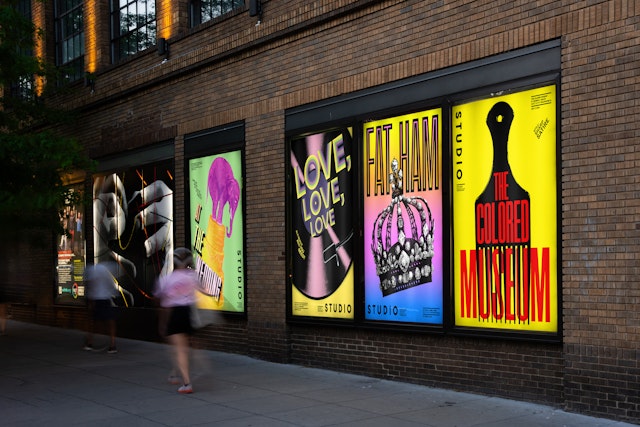
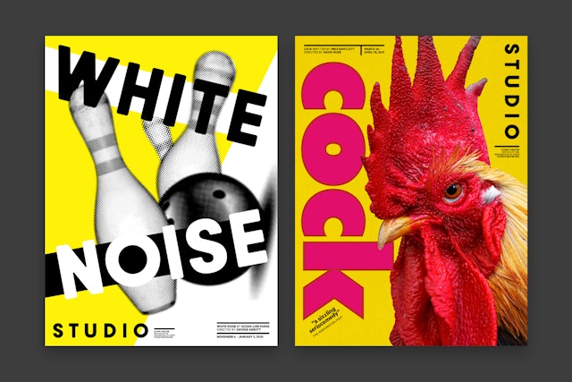
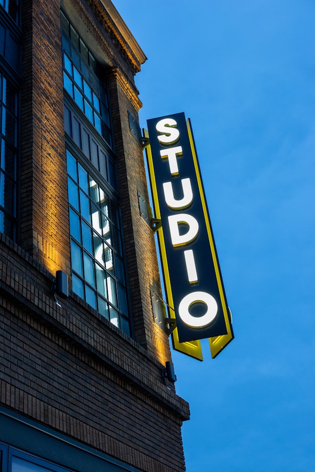
This bright yellow creates a dramatic presence along the 14th Street corridor. One of the goals of the revitalization was to make Studio a more open and welcoming space for the community, and the redesigned façade announces the theater as a vibrant personality within its neighborhood. A super scale “Studio” in 6-foot-tall illuminated freestanding letters sits atop the marquee entrance, while a vertically oriented blade sign at the corner of P Street brings further visibility and evokes the building’s past life. New murals are installed along the street, joined by poster campaigns for each season’s productions that mix eye-catching images and strong type.
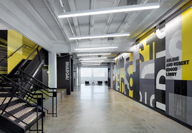
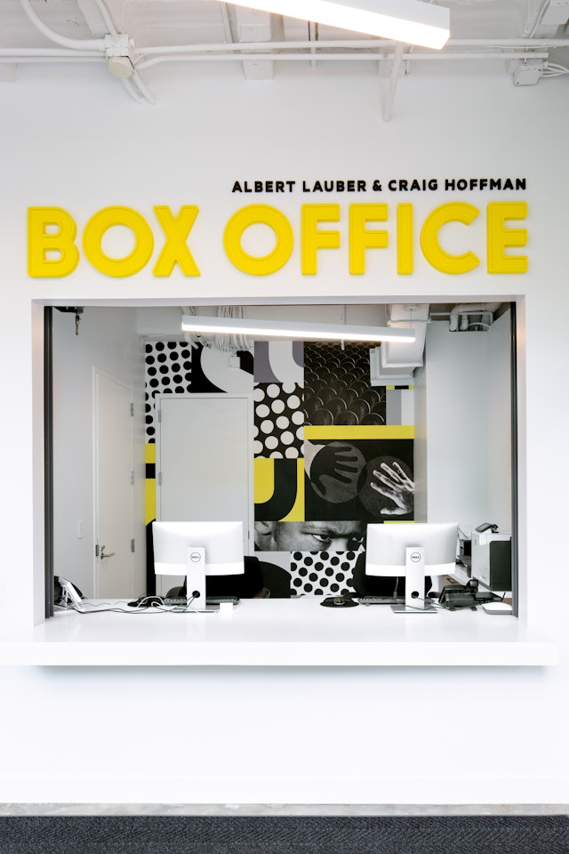
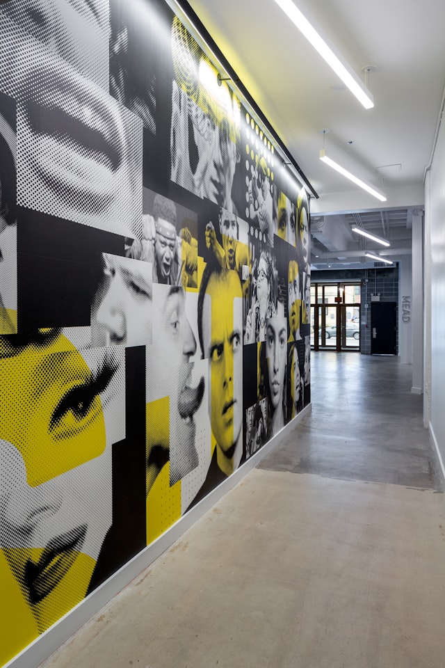
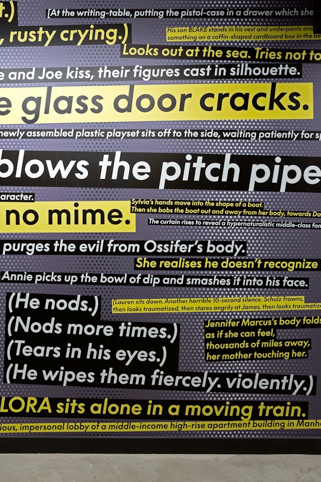
The bold look extends to the interior, where environmental graphics cover the walls in a textural and design-driven remix of elements—type, color and patterns—integrating the identity with the architecture. The program includes two large-scale murals utilizing visual materials researched from the Studio archive. A wall of type features stage directions and set descriptions taken from plays presented at Studio, while the second mural collages photographs from past productions. Signage for each of the individual theaters, the box office and other areas appears as wall-mounted letterforms, echoing the dimensional marquee outside. The donor recognition wall organizes its names in the distinctive semicircle shape of the Milton Theatre’s seating arrangement.
Client
Studio TheatreSector
- Arts & Culture
Discipline
- Brand Identity
- Signage & Environmental Graphics
Office
- New York
Partner
Project team
- Kim Walker
- Kirsty Gundry
- Daniel Varillas
- Michelle Brown
- Tengmo Han
Collaborators
- Hickok Cole, architects
- Bilyana Dimitrova, photographer
