


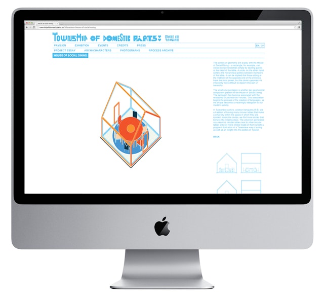
The designers adapted these cartoons into a system of icons that complement and augment the exhibition typography.
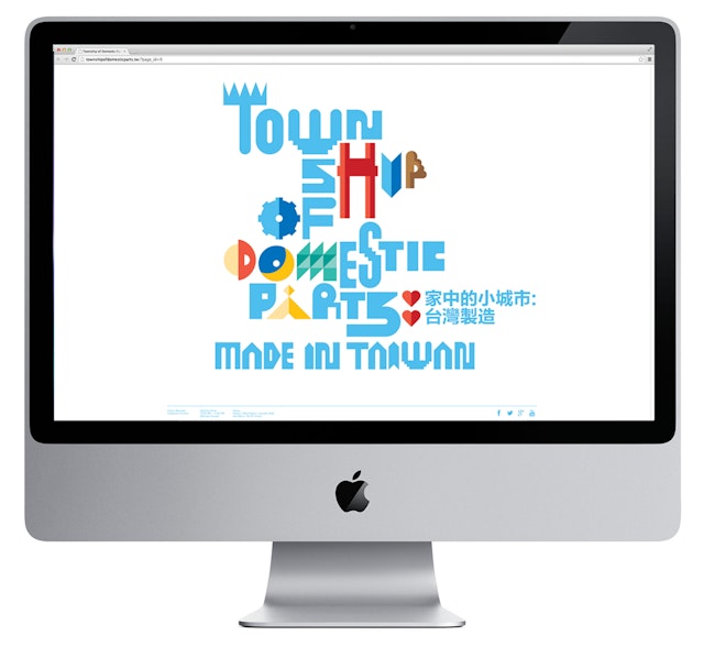


Domesticity is perhaps one of the most fundamental beginnings of architecture—realized as bedrooms, dining rooms, bathrooms, dressing rooms, etc.—each devoted to a programmatic specificity. The Taiwan Pavilion at the 2014 Venice Architecture Biennale explores the idea of private domesticity inverted as public space in the exhibition Township of Domestic Parts: Made in Taiwan. Curated and designed by the noted architect Jimenez Lai, the pavilion is a collection of nine small houses, each embodying one domestic program. Pentagram has designed an identity for the exhibition that showcases the theme in a lively mix of colorful graphics and custom typography, both in English and Chinese, as well as its accompanying website.
Lai’s pavilion design is a response to the official Biennale theme of “Fundamentals,” set out by the Biennale’s chief curator, Rem Koolhaas. Scattered within the gallery of the Palazzo delle Prigioni, the pavilion's collection of small houses forms an interior township of misfit parts. Each structure stands for one domestic activity or program, such as the House of Sleep (the bedroom), the House of Social Eating (the dining room), the House of Shit (the bathroom), and so on. The various houses are embodied by frame-like, freestanding structures that Lai calls “superfurniture.”
The designers worked closely with Lai on the development of the pavilion graphics. The pavilion is a commentary on weijian, an urban phenomenon that is common in Taipei and other cities in Taiwan. Buildings are augmented with illegal add-ons—houses built on top of houses, or “hats on buildings”—forming unusual structures that extend beyond their typical forms to purely embody function. The custom letterforms for the identity are an expression of weijian, expanding to fill the space of posters and other collateral.
Lai is perhaps best known as the author of Citizens of No Place, an groundbreaking graphic novel that uses comics as a lens to investigate architecture and urbanism. For the pavilion exhibition, Lai developed "archi-characters" that represent and resemble each of the structures. The designers adapted these cartoons into a system of icons that complement and augment the exhibition typography. Used in the manner of weijian, the icons supplement the letterforms in both the English and Chinese versions.
The designers also created the website for the exhibition, which uses the colors of the identity system as a method of navigation. Each section—“Pavilion,” “Exhibition,” “Events,” et al—has a different color path, leading visitors through the website.
Pentagram previously designed the identity and graphics for OfficeUS, the U.S. Pavilion at the Venice Architecture Biennale.
Office
- New York
