


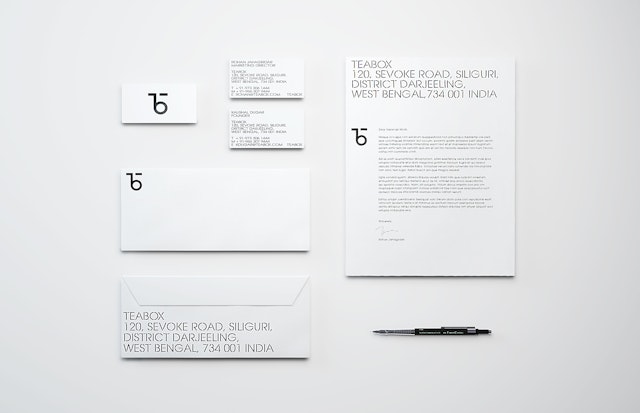
The authentic feeling of the typography is juxtaposed with a contemporary mark that artfully joins the letters “T” and “B” to form a distinctive monogram.




This elegant simplicity carries through to the new Teabox website, which features a streamlined, easy-to-use format that quickly surfaces information about the incredible range of teas.


The most widely consumed beverage in the world next to water, tea is still largely produced and distributed much as it was two centuries ago, often at the expense of freshness. Teabox is a tea-commerce company that is seeking to revolutionize the experience of one of the oldest drinks in history by bringing it directly to the consumer. Pentagram has designed a bold new identity, packaging and website for the online retailer that will help establish it as a global brand.
Founded in 2012 and based in India, Teabox is transforming how tea is sold around the world. Many of the practices around tea production have been in place since the colonial era, including antiquated machinery and an inefficient auction process that typically delays the product from reaching consumers until up to two years after it is harvested. Teabox bypasses the intermediaries to get tea from its fields to drinkers just days after it is picked. The startup has been remarkably successful so far, providing an estimated 25 million cups of tea to 100,000 users in 75 countries since its launch. The company raised $6 million in backing this year and wanted to develop a new brand identity that would better help it compete in the $40 billion tea industry.
At the same time, Teabox wanted to demystify tea and present it in more approachable way, so consumers can explore different varieties, regions and flavors. Like wine, tea is incredibly complex, but it is seldom represented that way, usually just narrowed down to a few well-known types. The company sought to elevate the tea-drinking experience, treating tea like fine wine, but building in an element of accessible connoisseurship that would help educate consumers, attract new generations of tea lovers, and appeal to the booming artisanal food market.
The designers worked closely with Teabox founder Kaushal Dugar and marketing director Rohan Jahagirdar to develop the new identity. The company is located in Siliguri, Darjeeling, in the heart of India’s tea-growing regions, and the designers had the opportunity to visit several tea estates in the area and see how tea is created and transported. Taking cues from the rich visual history of tea production, including the colonial-era typography that is still commonly used on tea crates, the designers developed a custom-made typeface called Teabox Stencil that emulates the traditional tea-crate aesthetic.
The authentic feeling of the typography is juxtaposed with a contemporary mark that artfully joins the letters “T” and “B” to form a distinctive monogram. Together, the logo and type create an identity that straddles old and new, bringing fresh vibrancy to the brand while anchoring it firmly in the history of the product. The designers developed a color system for the different tea types and a series of custom icons that are used to represent things like steeping methods (dry leaf or infusion) and factors like time and temperature. This flexible kit-of-parts provides a visual language that will allow Teabox to grow organically and continuously add to its line of products while still staying true to its core identity.
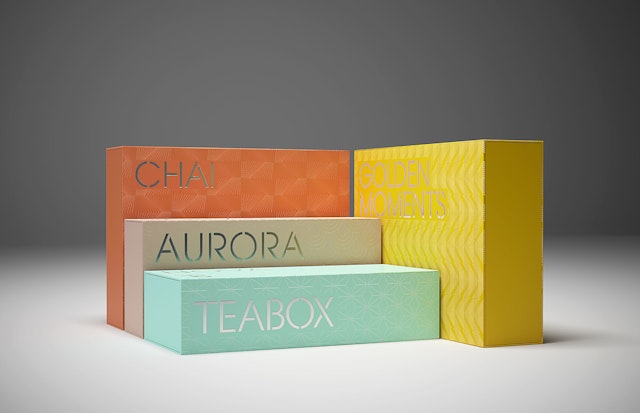
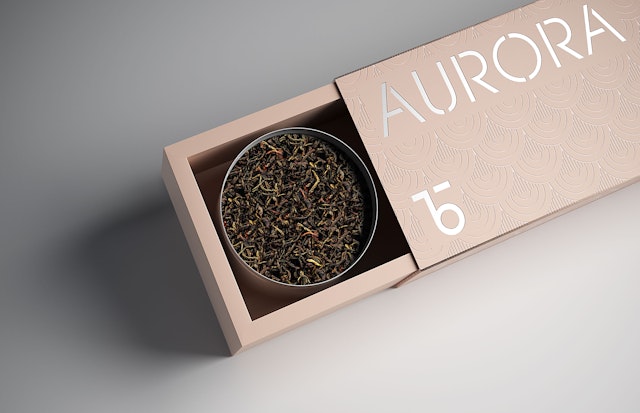
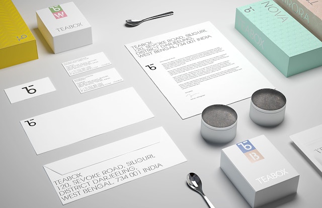
The freshness of the tea is reflected in the packaging, which appears in crisp, clean white and a palette of bright colors. The industrial look of the typography is set off by special papers and colors that create a luxurious, tactile, personal experience of the brand. The Teabox tagline is “Every cup a journey,” and the typography turns every box into a mini-crate with special foil-stamped stencil lettering. The surfaces of the containers are further covered in a different custom textured pattern in a clear gloss varnish.
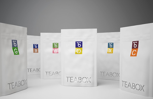
The color system pops on the white boxes and bags, indicating the specific type of tea: black, green, white, oolong, chai, blends, and so on. Each tea packet features a thorough description of the tea, including the packaging date, brewing instructions, and notes on the flavor profile. These details help elevate the drinking experience to a higher level of enjoyment, almost akin to a wine tasting. The simple graphic approach extends to boxes for sample kits, gift sets and accessories like mugs and teapots.
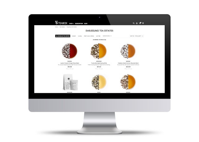
This elegant simplicity carries through to the new Teabox website, which features a streamlined, easy-to-use format that quickly surfaces information about the incredible range of teas. When it came to designing the product catalog, the Pentagram team assumed that things like caffeine levels and tea options for different times of day would be important. But in conversations with consumers, the designers learned that what really aided decision-making were factors specific to leaves and liquor.
The site accommodates tea novices and connoisseurs alike with appropriate levels of information. The engaging interface is organized around 53 tea profiles, each visually represented by a circle that pictures both the leaves and brew, and accompanied by detailed notes about the aroma, taste and appearance, and suggestions for food pairings. The descriptions are inspired by the in-depth notes that traditionally accompany wine, but written in friendly, accessible language that help make any drinker an expert. To enhance the personalized experience, the Teabox developers have created algorithms that make custom recommendations, and users can sign up for subscriptions with personal tea selections.
