
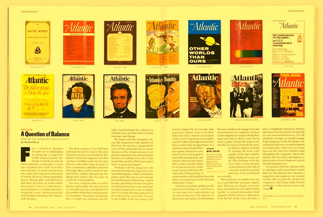

In the end, the redesign team came back to a nameplate that was an adaptation of a design that had appeared on the magazine for more than 35 years in the mid 20th century.
The 151-year old general interest magazine The Atlantic is known for championing the “American idea” in all its diversity and for exhibiting a curiosity for topics ranging from politics to design. The result can range from Andrew Sullivan's prescient and influential essay "Why Obama Matters" to Corby Kummer's 2,300-word treatise on apples. When Pentagram undertook a redesign of The Atlantic—the eighth in its history—the goal was to establish an intelligent and striking framework for the magazine’s wide-ranging editorial voice. Working with the magazine’s editor James Bennet, publisher Justin Smith, and art director Jason Treat, Pentagram embarked on a quest to discover the right visual analogue for a distinctive editorial voice.
To begin the process, the design team looked at the nameplate, the way the magazine’s name appears on the cover. This is seldom a selling point for a magazine, but as a place to start the design process, it can provide important clues about the publication’s overall direction. The designers considered many possibilities, including dozens that they created anew.
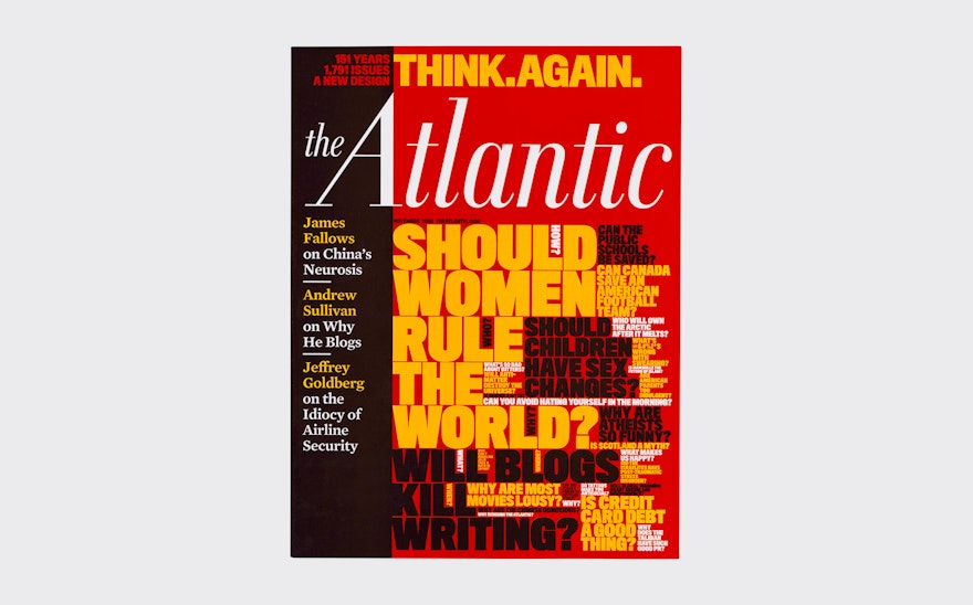
Each direction that was considered implied a possible position for the magazine. The designers explored approaches that reinforced the magazine's literary traditions on one hand, and others that promoted its contemporary relevance on the other. In the end, the redesign team came back to a nameplate that was an adaptation of a design that had appeared on the magazine for more than 35 years in the mid 20th century. (An issue from that era made an appearance as a prop on “Mad Men.”) The designers weren’t tempted by its nostalgic characteristics; rather, they were struck by how it managed to look both contemporary and timeless. Based on the 18th century typeface Bodoni, it featured an italic A that was distinctive and perfectly captured the idiosyncratic character of the magazine.
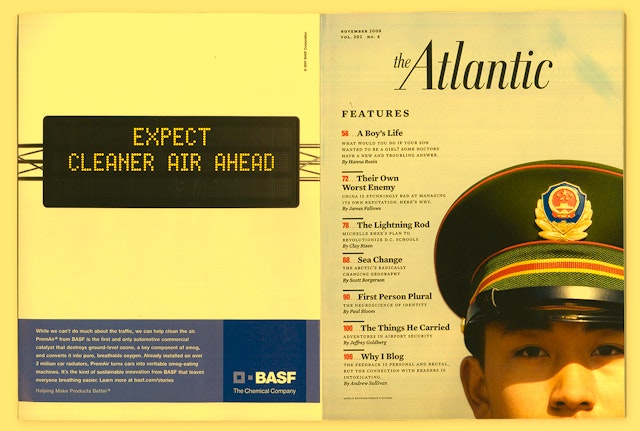
With the nameplate nodding to the magazine’s heritage, the designers were free to try out some very contemporary approaches to the cover. The Atlantic demands a careful balance between intellectual engagement and entertainment, and the challenge with the cover was to navigate a course between the look of an academic journal and a newsweekly. The two fonts that were settled on for the cover provided the necessary mix of ingredients: Mercury, an elegant serif typeface, and Titling Gothic, a bold sans serif. A vertical information band aligned with The Atlantic’s distinctive A on the left of the cover provides a place to highlight important writers and stories for the benefit of subscribers and newsstand browsers. It also eliminates the wasteful cover flaps currently endemic to newsstands. The magazine is now perfect bound for the first time in its history.
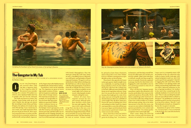
The magazine’s departments have been substantially restructured. Prior to its first redesign in 1947, the magazine displayed its table of contents on its cover, and the new design refigures the table of contents as an interior cover of sorts, listing the contents over a single image. The Dispatches section at the front of book has been restored and filled out with a more varied range of topics, in addition to its political commentary and coverage of current events. Pieces about food, travel, technology and other lifestyle topics that were formerly in the back of book have been moved forward and added to the mix. Following Dispatches is a new Columns section that features regular columnists Virginia Postrel, Michael Hirschorn and James Parker. The Books section remains in the back of the magazine where it has an established presence, and the back page is now home to "What’s Your Problem?", a humorous advice column by Jeffrey Goldberg.
The core of the magazine remains its long features. The two typefaces of the cover provide the main font families used throughout the magazine, and the balance between ideas and urgency is played out in ways that are surprising and engaging. Titles and drop caps in Titling Gothic and subheads in Mercury are used create a sense of variety and accessibility, and more breaks for points of entry have been placed into the magazine’s trademark long features. The serif of The Atlantic A is used as a graphic device to ground elements and appears extended in section headings.
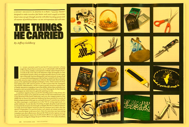
The team established Gallery, a series of stand-alone illustrations that provide incidental flourish throughout the magazine; the first issue of the redesign includes Paul Sahre, Laurie Rosenwald and Istvan Banyai, among others. Felix Sockwell created a set of icons for the table of contents. Photography has an enhanced presence, and is more journalistic and real-life in execution. The use of photoillustration or montage has been reduced: illustrations are illustrations, and photos are photos.
Office
- New York
