


The redesign helps organize the journal’s creative anarchy, establishing a cohesive and democratic platform that simultaneously supports various perspectives and guides readers through the lively exchange.





True to its name, The Baffler loves to confound expectations. The literary magazine has been tweaking established dogma in politics, economics, art and culture with smart journalism for almost three decades. Pentagram has developed a new identity and editorial design for the magazine that reflects its unconventional point of view. The new look launches with Issue No. 33, out now.
The redesign helps organize the journal’s creative anarchy, establishing a cohesive and democratic platform that simultaneously supports various perspectives and guides readers through the lively exchange. This is the second time Pentagram has redesigned The Baffler, having worked on a previous incarnation when the magazine was relaunched by Thomas Frank in 2010. The new redesign coincides with the introduction of a different owner and editorial team, led by the new editor-in-chief Chris Lehmann, and a move from Cambridge, MA, to New York.
The designers worked closely with the new Baffler leadership to develop the refresh. Founded in 1988, the ad-free quarterly is published independently, and much of the existing design sensibility was necessarily born of expediency. The magazine had a sense that it wasn’t resonating with a new, younger readership, and that the tradition of zine-like DIY illustration wasn't supporting the sophisticated content or connecting with audiences like it once did. The magazine believes in publishing as a vehicle for social change, and with the remarkable developments in the political landscape, as well as its own internal changes, it seemed like the right time to evolve. The Baffler wanted a design that would engage readers and enhance its journalism, and still feel true to the nonconformist Baffler brand.
“We faced the conundrum that all print publications do in our digital world: giving readers a compelling reason to sit down and commit to a tactile reading experience when it’s so convenient, and generally so much cheaper, to encounter the same editorial content online,” says Lehmann.
The Baffler has a reputation of being an acerbic liberal voice. But in many ways, it is a generalist publication, really in the center of the political spectrum, targeting the left and the right alike with good, smart journalism and writing. Before the designers started the redesign, they conducted an analysis with The Baffler about its positioning and looked at the other publications in its category, journals or general interest magazines with a literary, political or cultural focus, including titles such as Jacobin and Cabinet.
As an experiment, the team charted where the identities of these publications fell on the liberal-conservative spectrum, if sans-serif fonts can be considered as being on the left and serif faces on the conservative right. They then tried to make an identity that might successfully scramble all that to accommodate every point of view.
Keeping in line with The Baffler’s tongue-in-cheek perspective, past identities have had a nostalgic feel, almost reaching back to the quirky period typography of humor and satire magazines like Punch. Previous Baffler logos had an element of jest—The Baffler being a bit of a clown or crank.
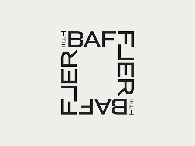
The designers wanted to find a more contemporary way to convey this sensibility. The Baffler calls itself “the journal that blunts the cutting edge,” and the designers crafted a new logotype that is all angles. Customized from the sans serif Graphik Bold, the logo flips the “L” to make a kind of jumble. Inverting the letter forms a square shape at center of the logo, simultaneously giving it balance and a bit of surprise. With its sharp lockup, the new logo can be used in different configurations—to frame one corner of the cover, as in the first issue of the redesign, or it might appear in a continuous pattern.
Each reader walks through a magazine in their own way, and the designers wanted to create a system for the editorial redesign that would accommodate for multiple possible outcomes. Among its many editorial strengths, The Baffler breaks abstract, complex ideas into human-scale, digestible terms, and it defends imagination. The design needed to do the same, bringing a functional but expressive framework to the mix.
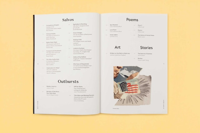
The designers worked with the editorial team to reorganize and rename the departments, including Salvos for essays and non-fiction reporting, Outbursts for opinion pieces, and the self-explanatory Poems, Art and Stories. These content types are shuffled throughout the publication, rather than grouped in specific sections. Instead, typography is the organizing element, with a diversity of typefaces used to signal different kinds of content. The various fonts are used in combination to provide a distinct voice for each category, an approach that reflects the magazine’s wide-ranging viewpoints and borderline-unruly personality.
The myriad typefaces include Stanley for essays and non-fiction reporting related to the issue theme, Domaine Sans for opinion, and Euclid for art pieces like poetry and stories. Graphik is employed for elements of the Baffler identity, such as the editor’s letter, page numbers and other identifying information. Text appears in Lyon, Euclid or Domaine Sans, depending on the content. Other fonts that play a role are Post Grotesk and Knockout.
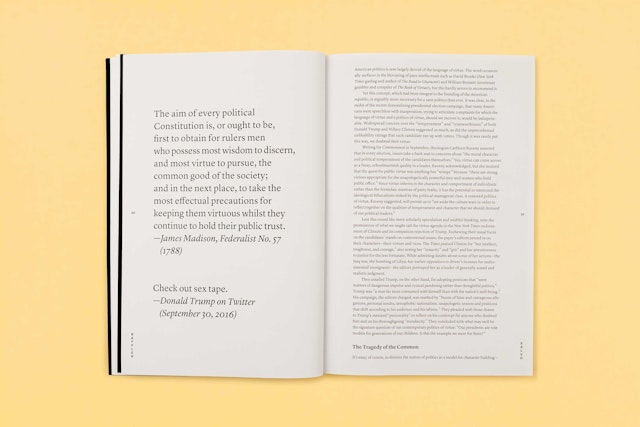
The magazine’s grid has been redesigned for greater flexibility. In the previous design, articles started in a largely uniform fashion, with a headline, a rule, or a drop cap, followed by a two- or three-column river of text. The new template offers more freedom to utilize illustration and photography in the opening spreads, encouraging a dialogue between the visuals and the written pieces. More dynamic type treatments are also an option; for instance, the type size of an opening paragraph can be blown up to grab a reader’s attention, and pull quotes and factual tidbits can be used to break up blocks of text.
“I love the dramatic play we can now give to the opening spreads of our features,” says Lehmann.
Color is also used for organization: short stories appear on pages that are sky blue, while poetry runs on daffodil yellow. Additionally, the grids for the various sections and types of content have been calibrated to relate to and support the material at hand. For instance, the design for poetry is spacious, giving the lines room to breathe. On short fiction pages, the font size of text is increased to set the stories apart and put them on a different plane.
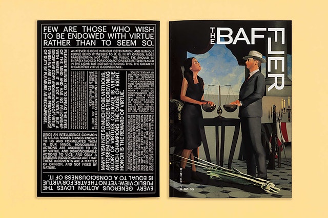
The designers created comprehensive guidelines for the identity and a style guide for the art direction of the magazine, which has been brilliantly implemented by The Baffler’s new art director, Lindsay Ballant, in the first issue of the relaunch. The cover features an eye-catching illustration by Clay Rodery that plays off Hans Holbein’s famous painting The Ambassadors to capture the issue’s theme, “The Virtue Cartel.” Inside, commissioned illustration plays a greater role throughout the issue, and a new arts section includes a visual piece by James Lawrence Hughes.
“Initial feedback on the new look has been overwhelmingly positive,” says Lehmann. “My favorite anecdote so far concerns our publisher, Noah McCormack, who was getting lunch with a publishing colleague in New York, and had brought along a copy of the redesigned magazine to give to his friend. As the magazine sat on the table, a passerby was so taken by the cover, and the overall look of the magazine, that she asked to take a photo of it on her phone. It’s not clear whether this person had prior familiarity with The Baffler, but in either case, that’s pretty much exactly the response you want when you invest all the work, resources and time that go into a major redesign.”
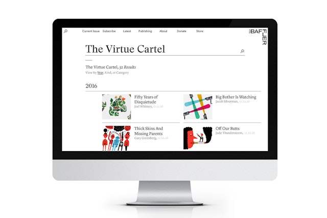
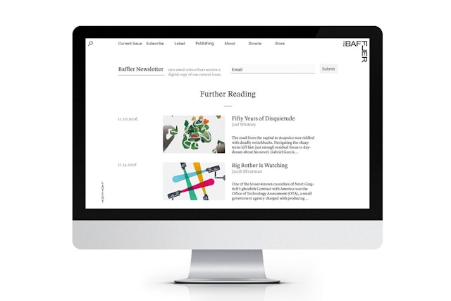
The refresh extends to The Baffler website, which will launch a new design in February. The site echoes the experience of the print journal in its use of clear navigation, open space that lets visuals breathe, and the use of various typefaces to help signal different kinds of content.
Lehmann is thrilled with the overall result of the redesign: “A clean, elegant Baffler, that delivers its trenchant, head-spinning content in a whole new visual idiom.”
Additional coverage: AIGA Eye on Design.
Office
- New York
Partner
Project team
- Brankica Harvey
- Megan Bowker
- Shannon Jager
- Jonathan Rinker
