
Built around a dynamic logomark and color palette, the identity conveys Mellon’s commitment to social justice in all of its grantmaking in the arts and humanities.


Mellon needed a distinctive visual language that would stand out from the traditionally staid look of philanthropic institutions and resonate with the communities it serves.




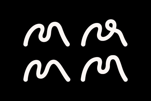
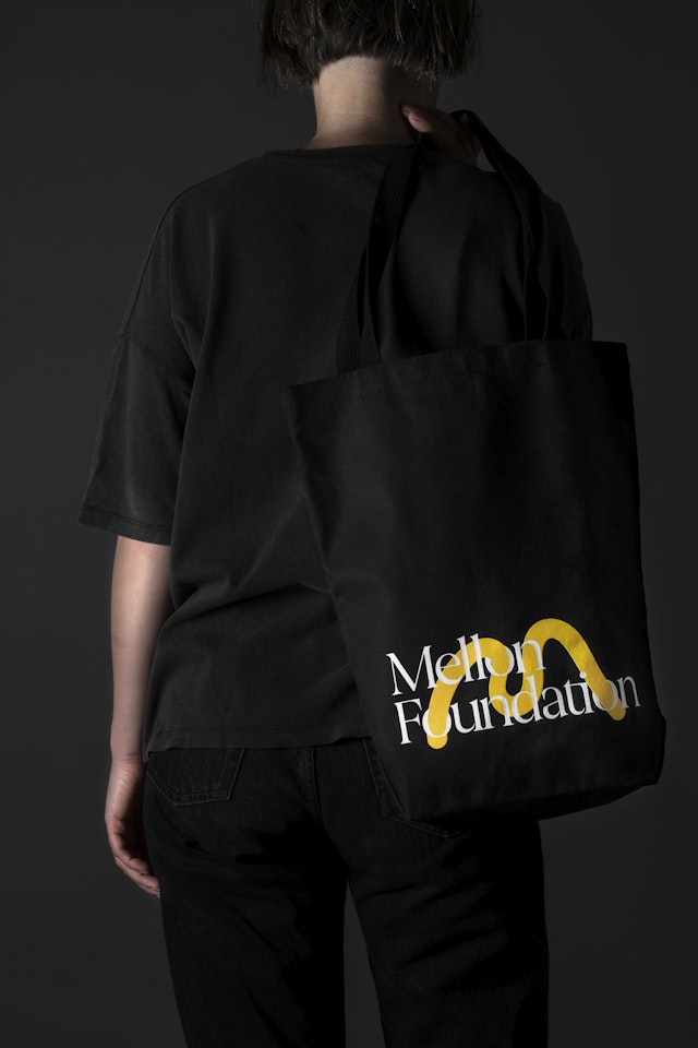
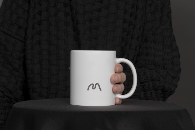
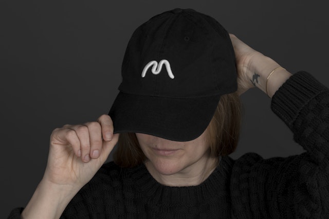
The flexible letter ‘M’ has the gestural quality of the human hand and can adapt and transform to represent different aspects of the Foundation.



The sonic identity is inspired by the pioneering Black American composer Florence Price and her Symphony No. 1 in E Minor.

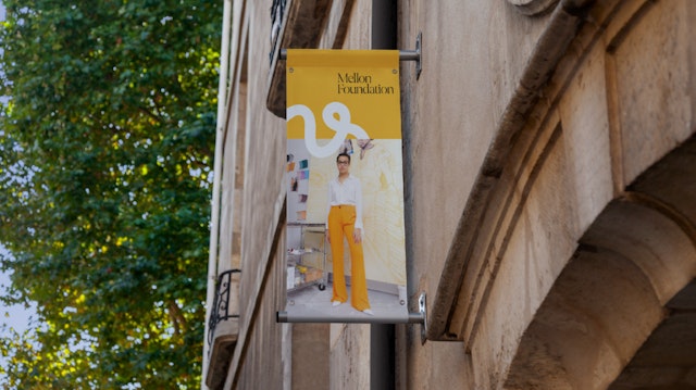
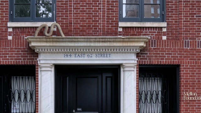
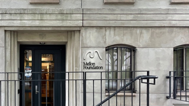




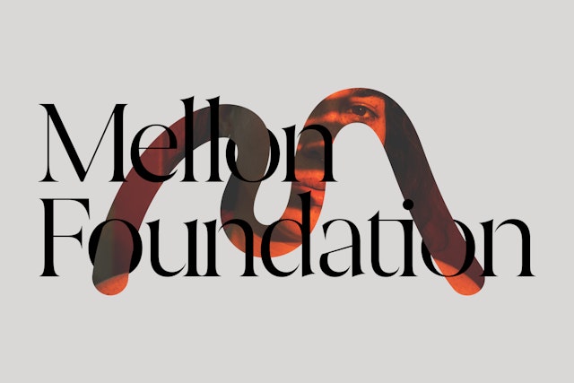
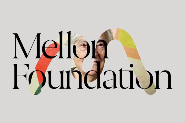
The logomark can be integrated with content in surprising ways, foregrounding Mellon’s grantees and their work while reinforcing the identity as a whole.







The Mellon Foundation is the largest funder of the arts and humanities in the US, with a mission to build just communities enriched by meaning and empowered by critical thinking, where ideas and imagination can thrive. With an endowment of over $9 billion, the Foundation makes grants in four core program areas: Higher Learning, Arts and Culture, Public Knowledge and Humanities in Place.
Pentagram’s Eddie Opara and team have created a new visual identity framework for the Foundation that powerfully conveys its commitment to social justice in all of its grantmaking in the arts and humanities. Built around a flexible and dynamic logomark and color palette, the platform signals a link between the remarkable legacy of the Foundation and its ambitions for the future. As part of the project, Pentagram’s Yuri Suzuki and team composed sonic elements that extend the concept to an aural signature for the identity.
Pentagram collaborated closely on the project with Mellon Foundation President Elizabeth Alexander, Chief Communications Officer Vanessa Corrêa, and other leadership. A celebrated poet and renowned academic, Alexander has helped guide the Foundation through transformational change since joining in 2018. The visual identity reflects a major strategic evolution, first announced in June 2020, that prioritizes social justice in all of the Foundation’s grantmaking.
Developed through a rigorous process, the new identity brings communicative depth and clarity about the work the Foundation and its grantees do, all the while embodying Mellon’s core values. The organization needed a distinctive visual language that would stand out from the traditionally staid look of philanthropic institutions and resonate with the communities it serves. The new identity—graphically audacious and forward-looking—embodies authenticity, approachability and responsiveness.
“Artists, scholars, and other cultural visionaries shape our collective understanding of who we are, help us make sense of challenging times, and drive us to imagine a more beautiful, more just future,” said Elizabeth Alexander, president of the Mellon Foundation. “Our new identity makes visible, memorable, and accessible not only the remarkable creativity of our grantees in the arts, culture, and humanities, but also a Foundation that has become bold, directional, and deeply connected to the vital efforts of justice work.”
The Mellon Foundation first enlisted strategists twoxfour and the data research firm Finsbury Glover Hering to help define its values and positioning. This process identified five key principles that Pentagram would use as the basis for the design system: openness, clarity, ambition, partnership and leadership. The designers then developed visual corollaries for these institutional attributes—the platform is adaptive, systematic and connective in function, with an approachable, empowering presence. These underlying themes mirror the Mellon Foundation’s mission at the intersection of the arts, humanities and social justice.
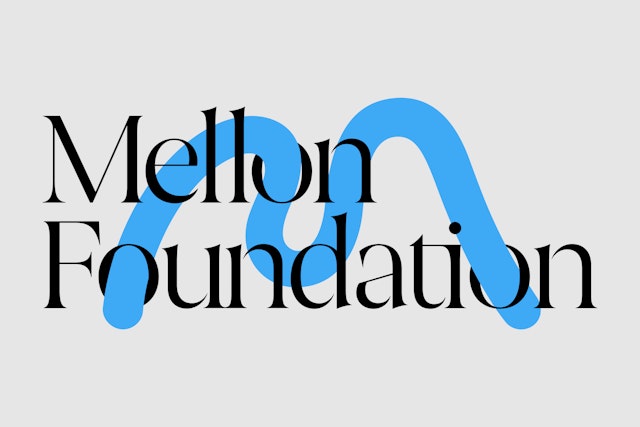
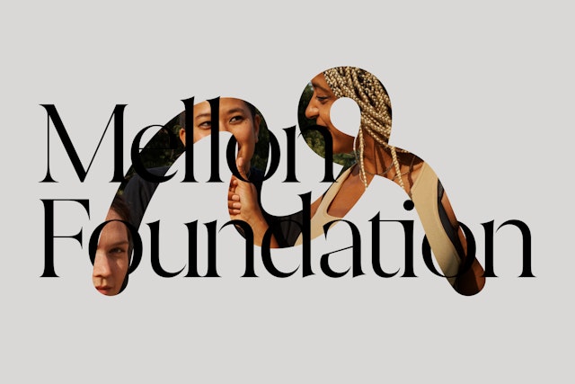
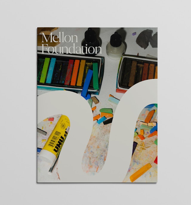
The identity proposes an agile, flexible approach to communicating philanthropic work. The logomark is a dynamic letter “M” with the gestural quality of the human hand. (To arrive at the final shape, the team explored making the mark in clay and ink.) As an icon, the symbol is both immediately recognizable and ever changing, with inherent variability in both form and material that reinforce the idea of many within one. It can adapt and transform to represent different aspects of the Foundation, shifting its tactile qualities while also gently moving within its fundamental shape. In alternate versions, it can lower and lengthen, stand tall, loop and intersect with itself. It can also be intertwined with the logotype, passing through the counterspaces of the letterforms.
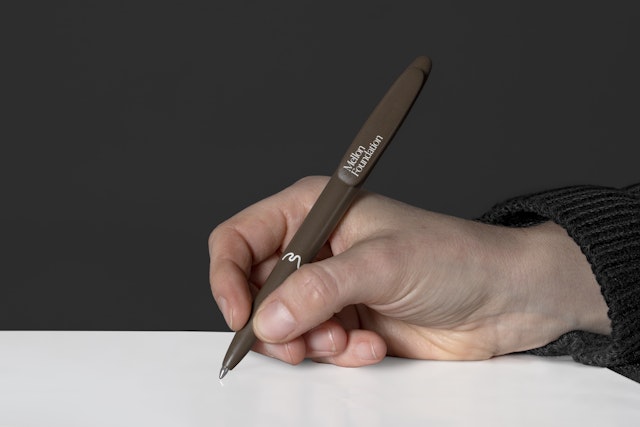
The symbol is paired with an elegant wordmark that introduces the shift from the more formal “The Andrew W. Mellon Foundation” to the more memorable “Mellon Foundation.” The identity utilizes two contemporary humanistic typefaces: the organic “M'' is complemented by the calligraphic curves of the logotype, which is set in the serif Joane from the Chilean W Type Foundry (WTF), with the primary brand typeface Halyard, a robust sans designed by the first Black American type designer Joshua Darden (with Eben Sorkin and Lucas Sharp).
The framework embodies multivocality and pluralism with a vibrant and adaptive approach to color and form. The logomark can adopt colors or materials outside of the identity’s neutral base to complement the featured content. Translated into different mediums and materials––rendered with textures, molded in three dimensions, or animated in motion—the symbol can playfully evoke art forms like sculpture, dance, painting and writing. The designers developed guidelines for how to position the pliable “M” into new shapes and permutations.
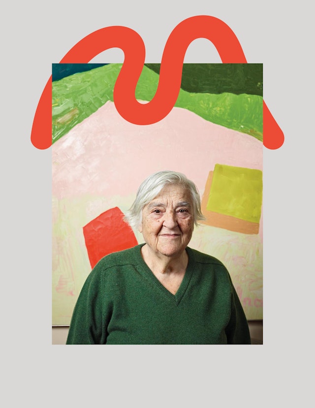
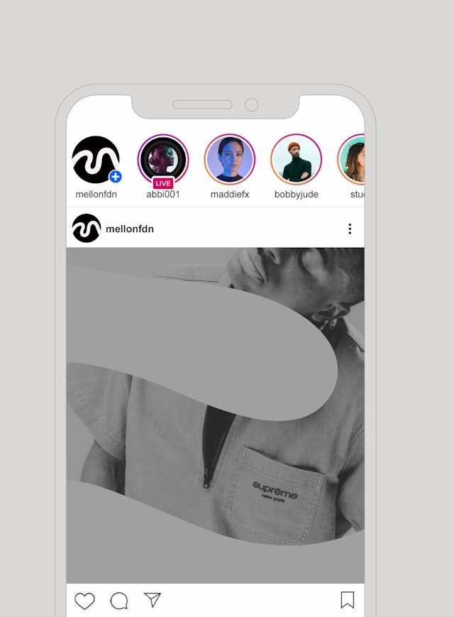
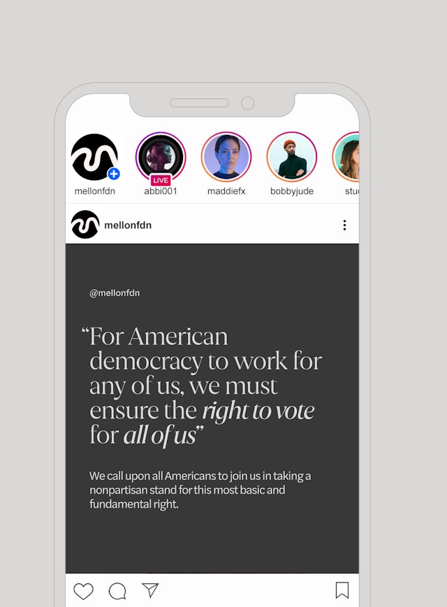
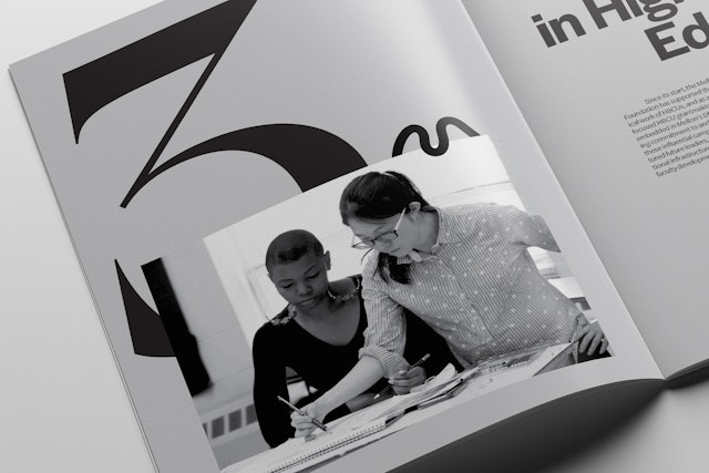
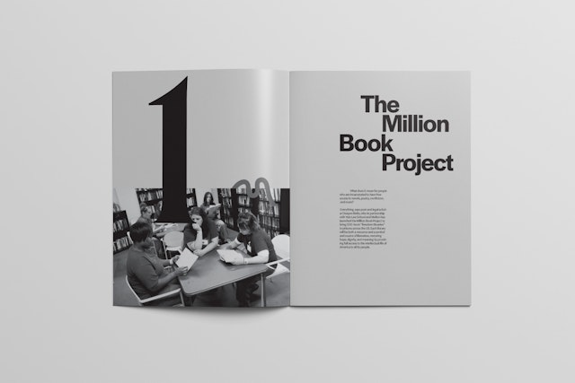
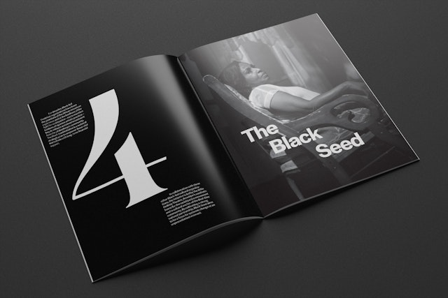
Employed as a graphic element or signature, the logomark can be integrated with content in surprising ways, foregrounding Mellon’s grantees and their work while reinforcing the organization’s identity as a whole. It can be treated as a frame or window for imagery, layered with other elements in a layout, or scrambled into experimental patterns. It also offers a scalable icon that can be used for everything from digital applications like social media to signage and environmental graphics at Mellon headquarters in New York.
Echoing Mellon’s social justice mission and the humanistic approach of the visual language, the sonic identity created by Yuri Suzuki and team is inspired by the pioneering Black American composer Florence Price and her Symphony No. 1 in E Minor—the first symphony by a woman of color to be played by a major American orchestra. The short sonic element uses harmonic techniques to recontextualize Price’s central melody, with traditional string and wind sections playing against the modern sounds of electric guitar and synthesized bass. Four sequences were developed to reflect the different variations of the core “M” mark, as well as the variety of disciplines supported by the Foundation.
Sector
- Education
- Arts & Culture
- Non-profits
Discipline
- Brand Identity
- Brand Strategy
Offices
- New York
- London
Partners
- Eddie Opara
- Yuri Suzuki
Project team
- Ken Deegan
- Pedro Mendes
- Mary Kate Henry
- Ruben Gijselhart
- Issabella Hindley-Cupper
- Lili Phillips
- Dana Reginiano
- Thomas Campbell
- Gabriel Vergara II
- Maxwell Sterling
- Tiffany Hultgren
Collaborators
- Joseph Törecki, 3D designer
- Justin Lawes, animator
