


The Old Vic’s Director, Matthew Warchus, briefed Pentagram to create a visual identity that was raw, honest and true to the theatre’s ambitious vision.


Pentagram took inspiration from the theatre’s home, borrowing the wall-painted typography style found on so many of London’s historical buildings.


The Old Vic is one of Britain’s best known theatres, staging over 300 performances a year, reaching more 275,000 audience members. At 198 years old, it’s an idealistic institution that firmly believes its purpose is to encourage tolerance, dissolve prejudice and promote empathy through the power of storytelling. At The Old Vic, theatre is an indispensable and unique force for good that deserves to be supported, shared and upheld.
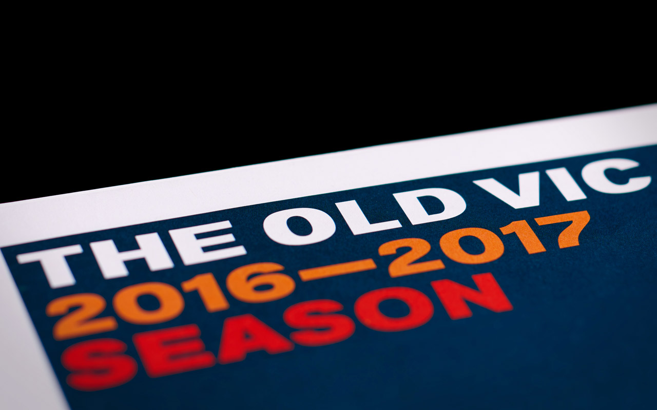
The Old Vic’s Director, Matthew Warchus, briefed Pentagram to create a visual identity that was raw, honest and true to the theatre’s ambitious vision. Pentagram took inspiration from the theatre’s home, borrowing the wall-painted typography style found on so many of London’s historical buildings. The logotype was designed using the theatre’s current colloquial, pub-like moniker rather than its original name, The Royal Victoria Theatre.
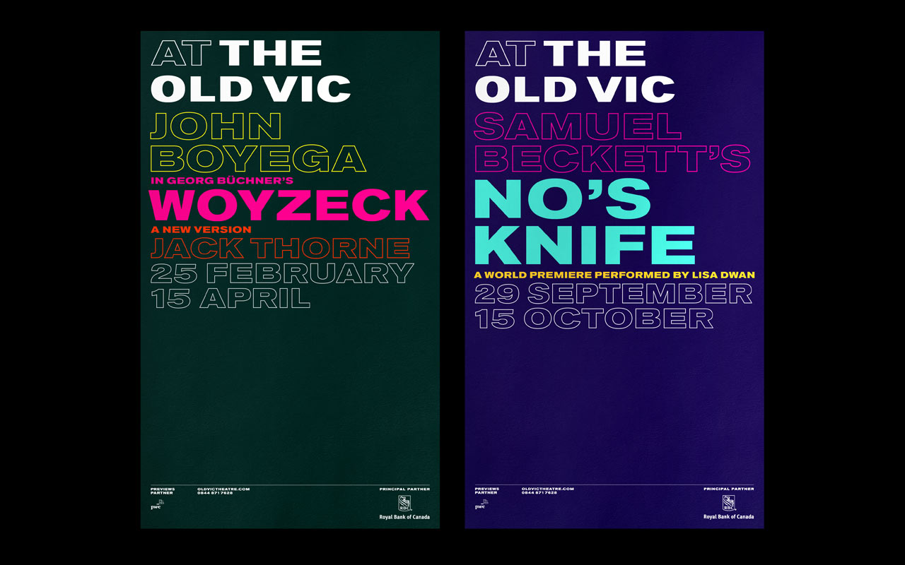
The full visual identity uses Akzidenz Grotesk Bold Extended, a font which dates back to the late nineteenth century. This type is applied to posters through a prescribed grid and typographic system that accommodates an ever-changing range of colour combinations. This grid is used for specific show posters and full seasonal posters, which are individually illustrated.
In addition to designing the identity, Pentagram shot a series of behind-the-scenes photographs of The Old Vic, which have been used on the theatre's website and non-show collateral.
Office
- London
