Inspired by the extended letterforms painted on roads, the title card has the stretched height and reverse contrast designed to compensate for a driver’s angle of vision.
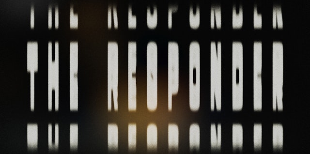
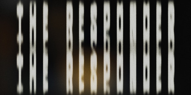


The animation distorts the type further to capture the sensation of seeing it while speeding across the tarmac.

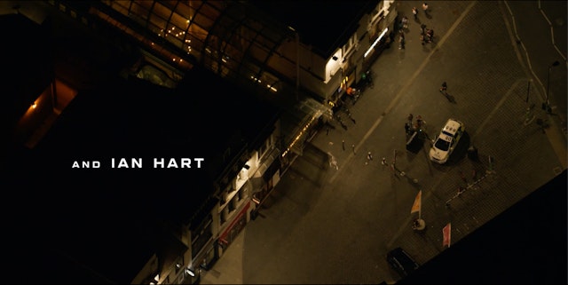

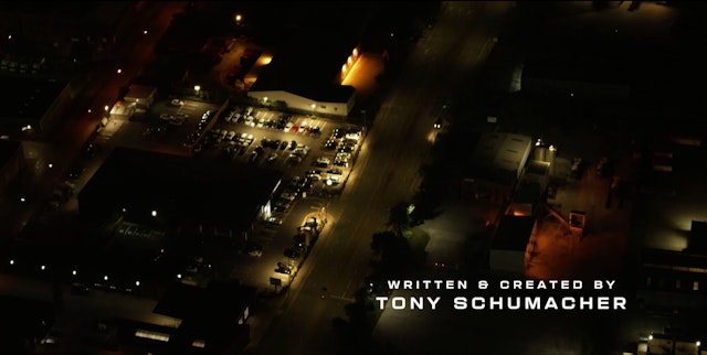
The second typeface used in the credits is inspired by the lettering seen on the police car and uniform.


In the new BBC One series “The Responder,” Martin Freeman stars as Chris Carson, an urgent response police officer in Liverpool who is trying to keep his head above water in both his personal and professional lives. Pentagram partner Matt Willey and team have created title sequences that set the scene with two custom typefaces inspired by the livery on police cars and the long, extended letterforms painted on roads.
Written by a former police officer and developed by Dancing Ledge Productions, the five-episode series follows Carson as he navigates night shifts on the gritty streets of Liverpool, with shots of rain-streaked roads and a grim darkness recurring throughout. Much of the action takes place in and around the police car and from Carson’s point of view as he answers emergency calls, the vehicle often taking viewers from one scene to the next.
The title card deploys the street paint inspired typeface, with the stretched height and reverse contrast designed to compensate for a driver’s foreshortened angle of vision. The animation distorts the type further to capture the sensation of seeing it while speeding across the tarmac. To convey the ever-present drizzle and the blurry headlights on nighttime roads, the letters are accompanied by graphic dots that reference light refracted in the rain-smeared car windshield at night.
The second typeface used in the credits is inspired by the lettering seen on Carson’s vehicle and uniform. A contrast from the condensed type of the title, the wide letterforms emphasize the show’s cinematic 2:1 aspect ratio and give the credits a bit of scale and presence without overpowering the accompanying imagery.
Office
- New York
Partner
Project team
- Nick Marabella
Collaborators
- Shira Inbar, animation
- Diana Ovezea, font engineer
