
The redesign introduces an entirely new template and a smaller size, more like a traditional printed book, that is easy to carry.
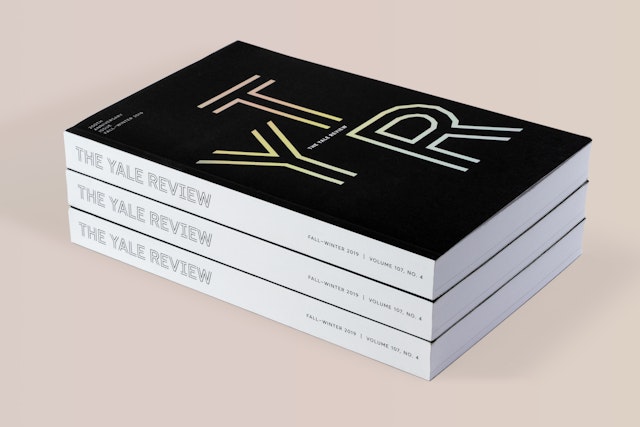


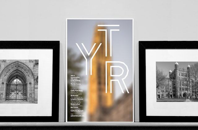


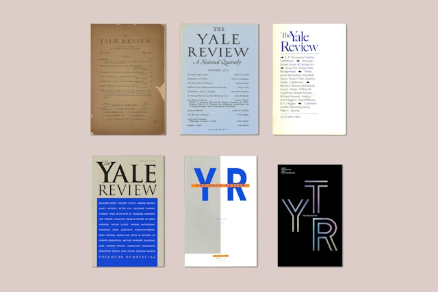
Founded in 1819, The Yale Review is Yale University's quarterly journal of poetry, fiction, nonfiction and criticism and the oldest literary quarterly in the U.S. Pentagram redesigned the publication for a relaunch timed to its 200th anniversary and the arrival of a new Editor-in-Chief, the celebrated poet and essayist Meghan O'Rourke.
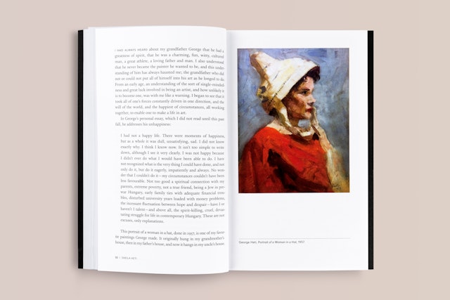
The Pentagram team developed an entirely new template for the journal and introduced a smaller size, more like a traditional printed book, that is easy to carry. Artwork and other visual elements are incorporated for the first time.
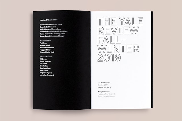
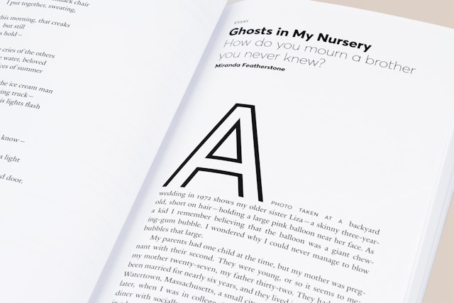
The new logo and nameplate are set in GT Cinetype (designed by Grilli Type), which is based on fonts created for the subtitles on early movie reels. The letterforms are built entirely out of straight lines, which the eye reads as curves, an optical effect that nicely ties into the idea of helping readers make connections and see something new. Text is set in Yale's custom serif font designed by Matthew Carter, faculty member at the Yale School of Art.
The Fall-Winter 2019 issue incorporates elements of the new look before the full redesign takes over in the Spring-Summer 2020 issue. The Review will also pivot to a greater digital presence with a new website launching in spring 2020.
Client
The Yale ReviewSector
- Education
- Publishing
- Arts & Culture
Discipline
- Brand Identity
- Publications
