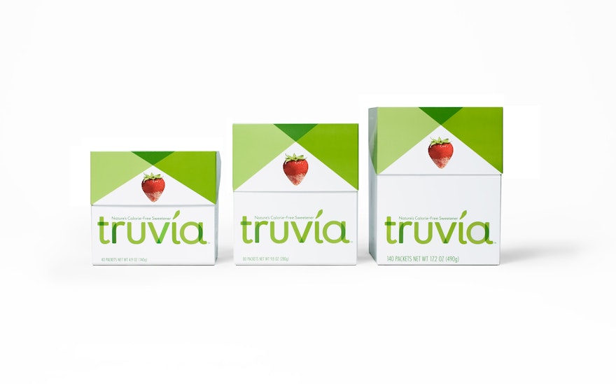
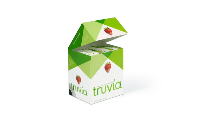
The attractive green and white carton is designed to be stored out on a kitchen counter or table, like a sugar canister, and the innovative structural design features a hinged lid that can be repeatedly opened and closed.
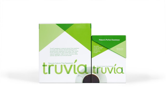
There are few products more ubiquitous in the world than the packets of sweeteners found on kitchen countertops and in coffee bars everywhere. Pentagram has designed its first project in this category, the brand identity and packaging for Truvia™, the natural, no-calorie sweetener that is being launched by Cargill. Naturally derived from the stevia plant, Truvia™ natural sweetener represents a genuine innovation in its category, and the brand has been designed to stand apart from its competition.
Truvia™ natural sweetener is made from rebiana, a well-characterized, high-purity ingredient derived from the leaves of the stevia plant. Stevia has been harvested and grown in South America for over 200 years, and Japanese consumers have been using it since the 1970s, but as a sweetener it is not widely familiar in the US. Rebiana is made from the best-tasting part of the stevia plant, and Truvia™ natural sweetener has a light, clean taste, without the bitter aftertaste associated with artificial sweeteners. It is formulated to match sugar in its granular form and can be used to sweeten coffee, tea, cereal and fruit.
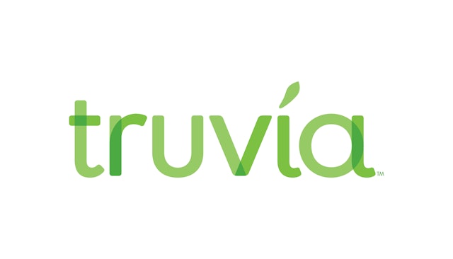
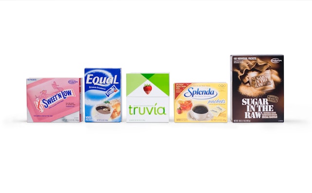
Pentagram worked with Cargill and The Coca-Cola Company from the beginning to develop Truvia™’s brand attributes. The graphic identity emphasizes the product as natural, pure and authentic, employing a color palette of green and white, elements of transparency and rounded, organic shapes. Lightness and transparency are a major part of the brand, and the letterforms of the logotype overlap in different shades of green that give the appearance of something natural and organic. The identity is markedly different from the synthetic appearance of brand competitors like Equal, NutraSweet and Sweet ‘N Low.
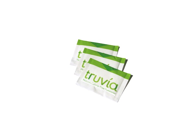
Truvia™ natural sweetener’s packaging also sets the brand apart as unique. The attractive green and white carton is designed to be stored out on a kitchen counter or table, like a sugar canister, and the innovative structural design features a hinged lid that can be repeatedly opened and closed. The packaging graphics reinterpret the standards of the product category—images of fruit, coffee—in a fresh, modern way. The photographic elements of a strawberry (lightly dipped in Truvia™ natural sweetener), a leaf and a cup of coffee are presented in a way that is simple, clean, crisp and natural. Overlapping angles of green reference the folds in confectionery packaging, and inside the box, Truvia™ natural sweetener is packaged in sachets that also use this graphic motif of overlapping angles.
Office
- New York
Partners
- Paula Scher
- Daniel Weil
