

The new identity deploys minimal graphic elements—the logo and a decisive color palette—that reflects the purity of the ingredients.


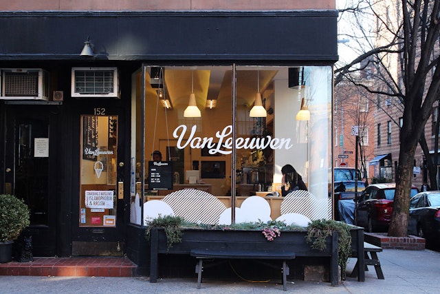


Van Leeuwen Artisan Ice Cream makes high-quality ice cream with the finest organic ingredients, prepared from scratch in Brooklyn and sold in both classic and vegan varieties via trucks and shops in New York and Los Angeles, as well as packaged pints at grocery stores.
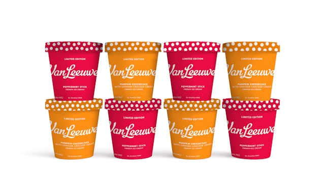
Pentagram has created a new brand identity system for Van Leeuwen that positions it as the ice cream of choice. Stripping off all the visual noise typically seen in ice cream branding, the new identity deploys minimal graphic elements—the logo and a decisive color palette—that reflects the purity of the ingredients, and colorful pints that stand out in stores and look great on social media. Since the introduction of the new packaging in the fall, retail sales have increased 50 percent.
The designers closely with company founders Ben and Pete Van Leeuwen and Laura O’Neill to develop the branding, which coincides with the company’s 10th anniversary this year. Originally established in a Brooklyn kitchen in 2007, Van Leeuwen started with a mission to “revive the classic American ice cream truck and the art of traditional ice cream making.” The tasty treat is available in a range of traditional flavors to more inventive combinations like Honeycomb, Passion Fruit Layer Cake and Peanut Butter Marshmallow Crunch, all made with natural ingredients like hormone and antibiotic-free milk and cream, egg yolks and cane sugar, and the best chocolates, fruits, cookies and nuts.
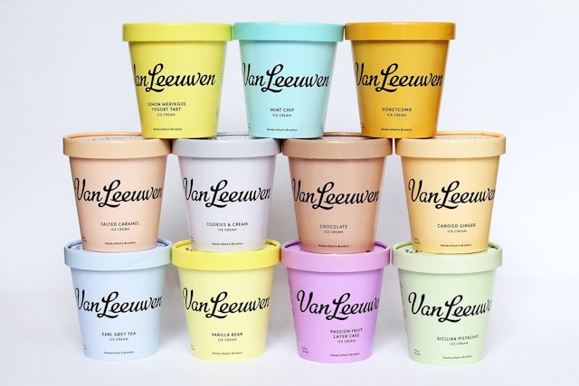
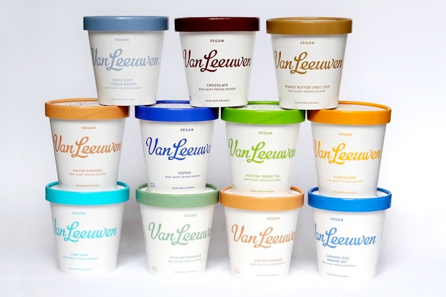
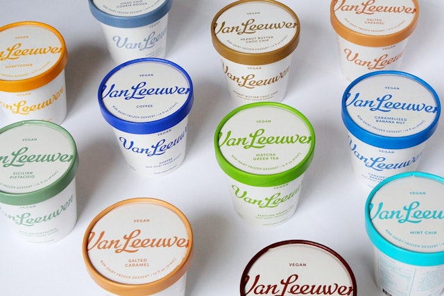
The market for artisanal products has exploded in recent years, and ice cream is no exception. The challenge for the designers was helping Van Leeuwen set itself apart in the crowded category. On top of the many brands, most cartons and pints try to communicate too much information. Van Leeuwen’s previous packaging suffered from this visual clutter, and adding to the confusion, the two product lines looked unrelated. The classic ice cream pints were yellow and featured an illustration of the truck, while the vegan varieties appeared in a range of colors and were covered with typography.
Van Leeuwen needed a design that would both unify and distinguish the two lines, while giving the name of the brand primacy. Jen and her team developed a packaging system that enhances the brand with a modern, minimalist approach using vivid hues inspired by the flavors.
The distinctive use of color help customers quickly identify flavors and differentiate between the regular and vegan lines from other ice cream brands. And perhaps most importantly, the packaging looks delicious: Like the ice cream, the colors are rich and luscious, and the pints practically demand to be Instagrammed.
Quiet, confident and appealing, the packaging design refines the brand to its essence of fantastic ingredients and flavors. At the same time, the simplicity feels homespun and practical. The clean look graphically conveys the wholesomeness of the ingredients, and highlights them without pictorial representations like illustrations of fruit or chocolate.
Like the packaging, the new identity elevates the brand with simplicity. The refresh keeps the familiar Van Leeuwen wordmark (originally designed by Cathe Holden), which has a lot of personality and is closely associated with the brand. Van Leeuwen’s signature buttercup yellow also been retained, but evolved to a pastel hue that feels more contemporary and is closer to the color of cream. The background palette has been expanded to add other ice cream-inspired colors to the mix, including pink, blue and purple, also in light shades. On the trucks and printed collateral like gift cards, the colors appear in cheery circular patterns that bring to mind ice cream scoops.
Pictorial icons have been stripped down and simplified with a uniform line weight, including the symbol of an ice cream cone that is used as a supporting element. The genial sans serif Sofia Pro is the new brand typeface, ideal for use across print and digital touchpoints. Strong and flexible, the system can be easily adapted for future brand extensions and product lines.
Office
- New York
Partner
Project team
- Joseph Han
- Ji Park
- Rhea Manglapus
- Georgina McDonald


