



A bespoke typeface was commissioned from Luke Prowse and comprises of two distinct cuts to enable the brand to adjust its visual tone of voice, Virgin Money Sans and Virgin Money Loop.

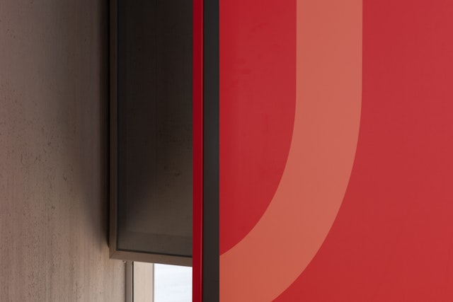
Three linear patterns based on the Virgin Money ‘M’ are used across the new identity, these can be used as a repeat element, scaled and cropped or overlayed on photography.


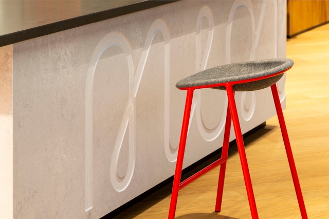
The bank has extended its progressive approach to its physical spaces too, creating Virgin Money Lounges (by IAM Architects) which include workspaces, recording studios and private meeting rooms for use by customers and their guests.


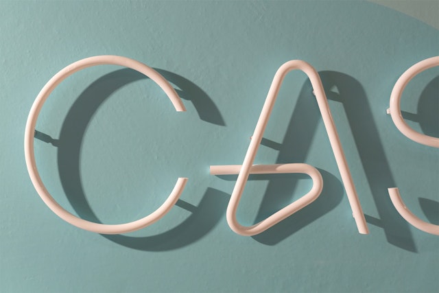
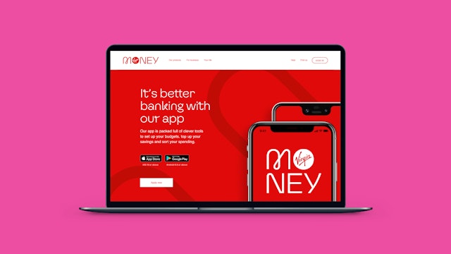
It was vital that the identity worked seamlessly across all applications and at all sizes, from mobile to storefronts.

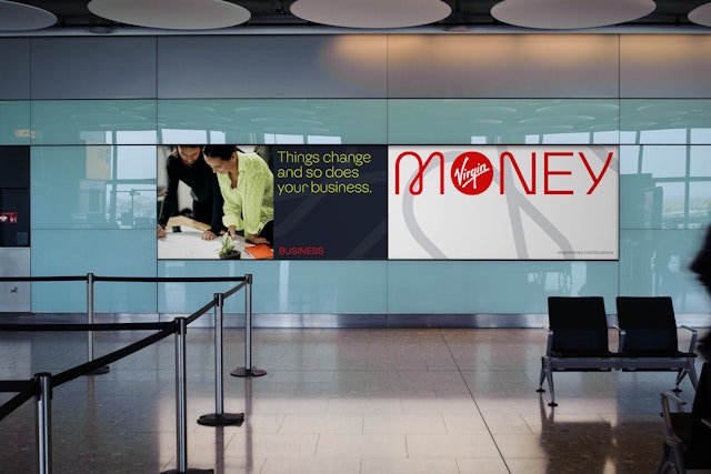
Based on the main retail brand, a distinct and sophisticated visual language was created for Virgin Money Business, featuring a lighter version of the Virgin Money pattern, and a streamlined colour palette of charcoal and bright lime.

Pentagram has designed a new brand identity for Virgin Money, the UK bank that’s disrupting the status quo.
After announcing its merger with CYBG plc (formed of Clydesdale Bank, Yorkshire Bank and B products and services), Virgin Money approached Pentagram to re-imagine its Virgin Money brand within the UK.
The merger brought together a consumer champion and iconic brand in Virgin Money with the full service, digitally enabled strength and security of the combined High Street names in CYBG plc, and presented an excellent opportunity to challenge the UK’s existing banking landscape. Positioning itself as a brand that shares Virgin's core values but happens to be in banking (as opposed to a financial brand that happens to be part of Virgin), Virgin Money’s aim is to make both individuals and businesses feel happier about their money.
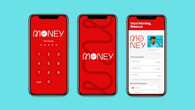
Pentagram’s brief was to create a new identity that would create a positive association with the Virgin brand, but position Virgin Money firmly away from the often faceless, corporate look favoured by most banks and financial services companies. The new identity needed to reflect its customer-focussed approach to banking, which has digital at its core. It was vital that the identity worked seamlessly across all applications and at all sizes, from mobile to storefronts.
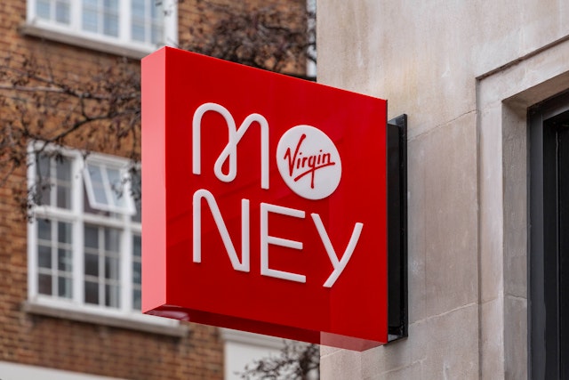
The design team created a bespoke mono-linear wordmark—a geometric logo from which the wider Virgin Money headline font family was built. The balance of curves and hard angles has been carefully crafted – its subtle humanist details reflect both the modern, forward-thinking values of the brand and the people at the heart of everything that Virgin Money does. The Virgin Money ʹMʹ is a key feature of its wordmark, its distinctive loop reflecting the energy and the ambition of the organisation while still appearing friendly and approachable.
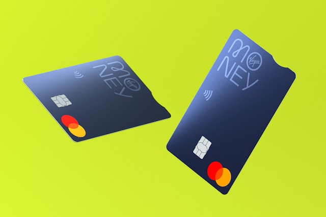
A stacked version of the logo is used for applications where users are already familiar with the brand, such as in stores, on bank cards or any existing customer communications, and is especially useful for applications where horizontal space is limited.
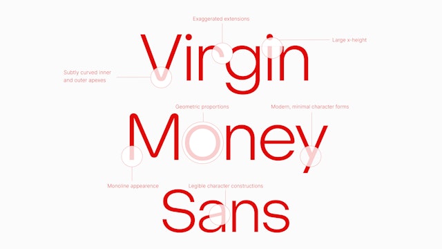
A bespoke typeface was commissioned from Luke Prowse and comprises of two distinct cuts to enable the brand to adjust its visual tone of voice, Virgin Money Sans and Virgin Money Loop.
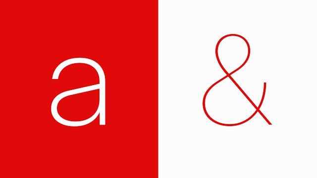
Virgin Money Sans has five weights: Thin, Light, Regular, Medium and Bold. The design elements of the typeface have been carefully considered and crafted to create a distinctive font which gives optimum legibility across a wide range of sizes and applications. The overall construction is a balance of geometric curves, nuanced humanist forms, and hard edges and angles, creating a visual form that references Virgin Money’s functional and pragmatic side while embodying its people-centred approach.
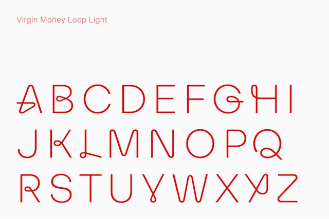
Virgin Money Loop is a modified version of Virgin Money Sans which incorporates the distinctive brand loop element into the character set. These new forms create a sense of movement and in some instances, the impression that the letter is created from a single line. Depending on the context, the number of looped characters or discretionary ligatures used within a word or phrase can be adjusted to reduce or augment the level of visual personality required.
The instantly recognisable Virgin red is the brand’s primary colour and is the cornerstone of the Virgin Money brand. The secondary brand palette created by the design team is vibrant and energetic, designed to respond and adapt to any new brand message.
Three linear patterns based on the Virgin Money ‘M’ are used across the new identity, these can be used as a repeat element, scaled and cropped or overlayed on photography. With the bank’s emphasis on digital, Pentagram also designed a new set of icons for use on Virgin Money’s relaunched website and app. These mirror the brand assets, through the use of loops and humanist geometric curves.
The bank has extended its progressive approach to its physical spaces too, creating welcoming stores that anyone can use (designed IAM Architects). The stores include workspaces, event spaces, recording studios and private meeting rooms for use by customers and their guests. The vibrant colour palette and large scale patterns give the spaces an energetic and modern feel, with the Virgin Loop typeface used throughout to reinforce the playful and informal vibe.
Virgin Money also provides business banking services in addition to its consumer banking. Based on the main retail brand, a distinct and sophisticated visual language was created for Virgin Money Business, featuring a reduced usage of the looped typeface, a lighter version of the Virgin Money pattern, and a streamlined colour palette.
Virgin Money offers a new High Street banking experience which combines its trusted brand values with a playful people-centred approach, and Pentagram has created a distinctive and flexible identity which perfectly embodies this.
Office
Partners
Project team
- Amy Joycey
- Kimberley Langham
- Jack Llewellyn
- Albert Sanjuán
- Laura Chan
- Luis Gutiérrez
- David Bhalla
- Ben Leonard
- Josh Geoghegan Deo
- Emma Hickey
