While Waitrose & Partners saw this as the perfect opportunity to reassess and reduce its packaging, it was important that the new packaging should also inform, inspire and most of all delight its loyal customer base.

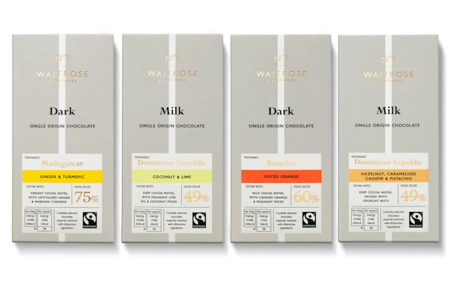


It was vital that both the design and the messaging conveyed the expectations of Waitrose & Partners’ discerning customers.
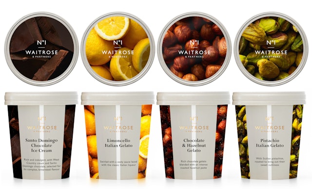

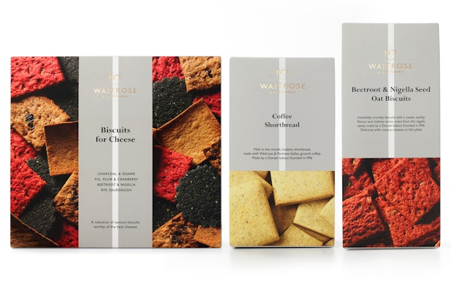
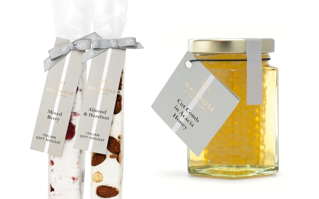

All the design and production elements combine to reinforce the message that Waitrose & Partners No.1 provides the best quality products on offer, not only in Waitrose & Partners but across the whole High Street.



Pentagram has designed the new identity for Waitrose & Partners No.1, the premium own brand range of products from Waitrose & Partners.
Following on from the three new unified brand identities created for the John Lewis Partnership and its much-loved retail brands, John Lewis & Partners and Waitrose & Partners, Pentagram has been commissioned to reassess every Waitrose & Partners own brand product – these account for between 80-90% of all the products that are stocked both in store and online. While Waitrose & Partners saw this as the perfect opportunity to reassess and reduce its packaging, it was important that the new packaging should also inform, inspire and most of all delight its loyal customer base.
Building on the new identity, Pentagram streamlined Waitrose & Partners’ own brand offer from twelve sub brands, removing sub-brands wherever possible, with Waitrose & Partners No.1 becoming the top tier offer.
Renamed as Waitrose & Partners No.1, this is the first line to be rolled out. Both the scale and speed of the project was unprecedented, with 600 individual products involved. It was vital that both the design and the messaging conveyed the expectations of Waitrose & Partners’ discerning customers, who are looking for a high quality experience, with distinctive and authentic products.
All the design and production elements, including sophisticated product photography, restrained typography, the muted colour palette and uncoated paper stock, combine to reinforce the message that Waitrose & Partners No.1 provides the best quality products on offer, not only in Waitrose & Partners but across the whole High Street.
The Waitrose & Partners No.1 and Waitrose & Partners marks are both set in Gill and when stacked are separated by a short horizontal line which works like an underline, emphasising the premium quality of the range. This is combined with a distinctive pale vertical line on a warm grey background which appears on all of the products, helping draw the eye to the product information and pulling all of the different elements together.
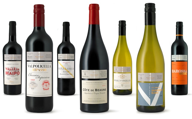
For the first time wines are included in the Waitrose & Partners No.1 offer, with the ‘Waitrose in Partnership with…’ range now becoming part of Waitrose & Partners No.1. A smaller rectangular label sits above the main label and features the Waitrose & Partners No.1 mark, and details about where the wine was produced, with small cut details to help segregate the information. The main label is not branded and has been designed to reflect the qualities of each independent producer.
The redesign has been an immediate success, with sales of Waitrose & Partners No.1 ready meals alone increasing by nearly 40%. The redesign elevates Waitrose & Partners’ premium offer to a new level, positioning it alongside both premium brands and artisan products, but at a much more realistic price point. It creates an own brand that the customer can really aspire to, not have to compromise on.
Client
Waitrose & PartnersSector
- Food & Drink
- Consumer Brands
Discipline
- Brand Identity
- Verbal Identity
Office
- London
Partner
Project team
- Martina Casonato
- Tiffany Fenner
- Romilly Winter
- Daren Howells
- Richard Clarke
- Sateen Panagiotopoulou
- Ry Coleman
- Jane Kemp
