Created by the legendary graphic designer Paul Rand in 1959, the Westinghouse logo is one of the most widely recognized corporate symbols in American history.
Pentagram began by building a new brand manual, drawing inspiration from Rand’s original to create a cohesive identity that pays homage to the legacy of Westinghouse.


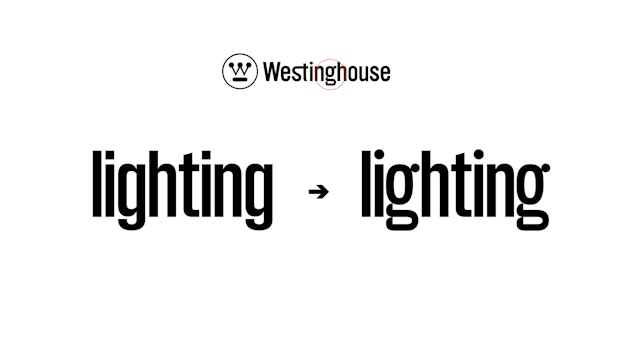
The identity introduces a custom font that updates the characters ‘i’ and ‘g’ to resemble the distinctive typography of Rand’s Westinghouse logo.


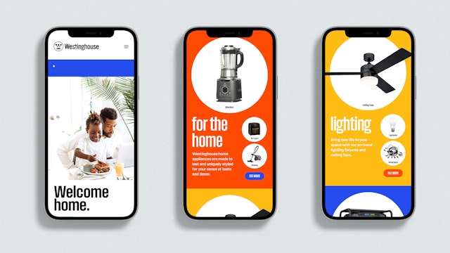
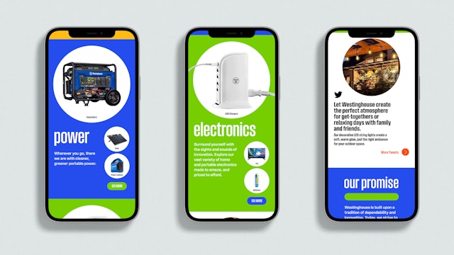
The website seamlessly integrates all the new visual elements of the revitalized brand, including the newly designed font, the circles, and the parallel lines, and features a historical timeline.
George Westinghouse was a true pioneer of the industrial age. An inventor, engineer, and entrepreneur, he is best known for his contributions to the development of electricity, particularly the creation of the alternating current (AC) system. Westinghouse’s collaboration with Nikola Tesla, a brilliant young engineer and inventor, proved to be a turning point in the so-called War of Currents, a bitter battle between AC and direct current (DC) proponents. Westinghouse’s AC system, which he and Tesla developed and marketed, revolutionized the world and forever changed the way we power our homes, businesses, and cities.
For the next century Westinghouse achieved fascinating firsts in electrical innovation, including the first long-distance transmission of high-voltage AC power, the first commercial radio broadcast and the camera that captured the first steps on the moon during the Apollo 11 mission. Today, the Westinghouse logo can be found on products ranging from nuclear power plants and large industrial motors to televisions, light bulbs, generators, and more.
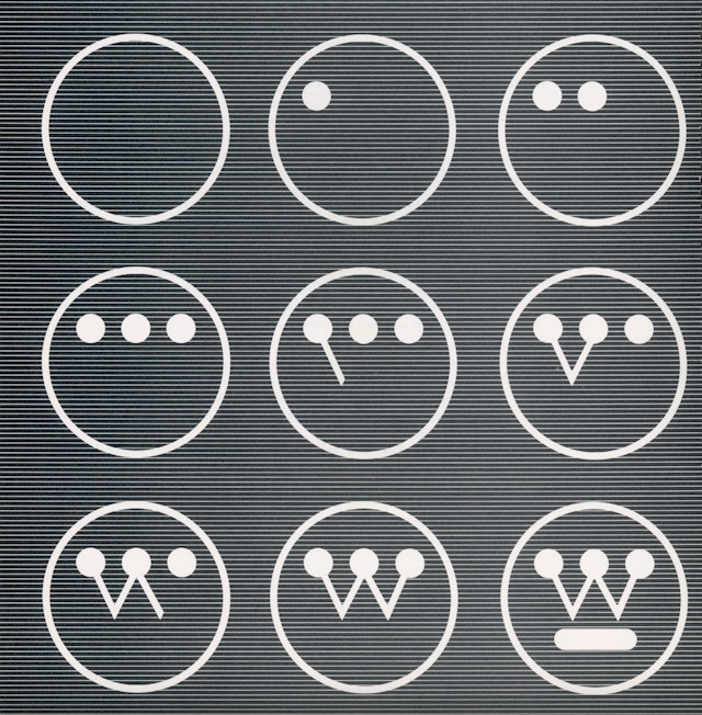
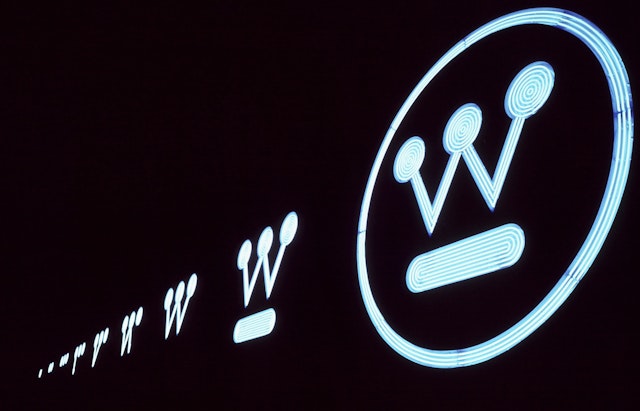
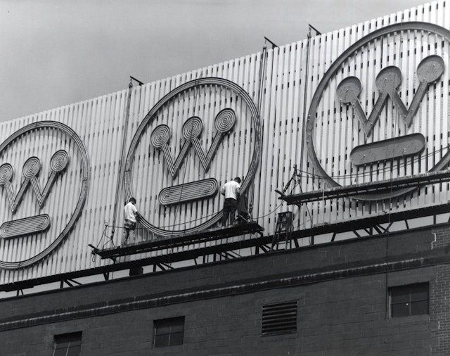
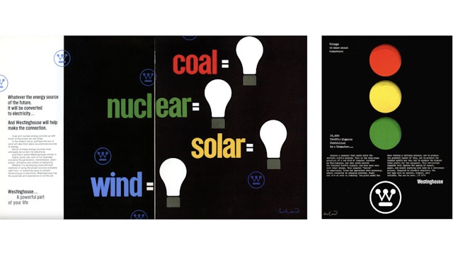
The Westinghouse logo, undoubtedly one of the most iconic corporate symbols in American history, was created in 1959 by the legendary graphic designer Paul Rand. Rand’s design, which features a stylized “W” formed by connecting lines and dots resembling a circuit board, perfectly captured the company’s forward-thinking and innovative spirit. Rand was commissioned to design the logo by Eliot Noyes, an architect and industrial designer who was consulting for Westinghouse at the time. Rand’s Westinghouse identity system also included a complete alphabet, color system, packaging, and styles for posters and advertising, all of which helped to establish the company’s brand identity and reputation for quality and innovation.
In the summer of 2021, James Cline, Jr., along with a group of private investors, acquired the Westinghouse brand. Cline, who was the founder and CEO of Westinghouse Outdoor Power equipment, had previously achieved remarkable success in developing the brand in the outdoor power industry, growing the business by over 800% in just five years. He recognized the immense power of the Westinghouse brand, not only in its longstanding legacy but also in its innovative design. After the acquisition, Cline hired Kevin Drain as the new brand director, given his prior experience in building the visual identity of the generator business. Drain reached out to Pentagram, requesting assistance in creating new brand standards that would appeal to a younger demographic and revitalize the brand.
Drain explained that the visuals were all very masculine and outdated, which posed a significant problem for the brand. Also, the brand’s website, westinghouse.com, was essentially a shell site that redirected users to different divisions within the brand. Each division’s site looked inconsistent from the main site, which created a disjointed user experience.
Aside from Rand’s logo, Westinghouse used very few of Rand’s original brand components. If the logo wasn’t present on promotions, Westinghouse looked very similar to its competitors.
Pentagram began by building a new brand manual for Westinghouse, drawing inspiration from Paul Rand’s original Westinghouse Graphics Identification Manual made in the early 1960s. The Rand brand manual is timeless, with design that still looks contemporary and differentiates Westinghouse from its competitors.
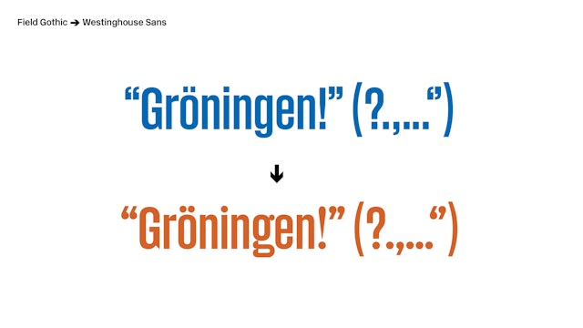
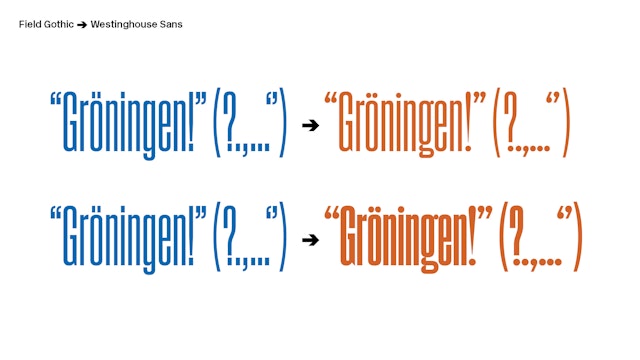
Rand had developed a unique font for the brand, which needed to be redrawn and programmed. As if by magic, the Pentagram team happened to receive a mailer from Signal Type Foundry featuring a typeface inspired by Rand’s Westinghouse Gothic. They immediately recognized its potential and enlisted the foundry to help modify the font. Working with Signal, the Pentagram designers manipulated the characters “i” and “g“ to resemble the Westinghouse logo to create the new bespoke typeface, Westinghouse Sans.
Circles were a powerful symbol in the original Westinghouse branding, representing lights on a circuit board. These are now used on the new website to unify varying product photography by inserting silhouetted images into colored circles that designate a product type. This approach is very consistent with Rand’s original visual language.
Groups of parallel powerful lines were another motif that was used in the Rand system. Initially the Pentagram designers didn’t understand why these were used, but then discovered the Westinghouse logo inserted between the metal lines at the base of an escalator. These lines then became an essential part of the visual language and are utilized on various touchpoints, including packaging, marketing materials, and the website.
In addition to the visual identity, a new brand platform was developed that updates the mission, vision, and values of Westinghouse to reflect its history and commitment to innovation. This is summed up in a new tagline, “Powering People Since 1886.”
The new website integrates all the updated Westinghouse visual elements, and also features a Westinghouse historical timeline that allows visitors to explore the rich legacy of the brand.
“The evolution of this logo is proof that great design will always be great. If you have a classic design like Rand’s logo, why not keep it—especially when it’s been created to stand the test of time,” says Drain. “Pentagram has taken the original design and modernized it brilliantly, bringing it into the 21st century.”
Client
WestinghouseSector
- Manufacturing & Industrials
Discipline
- Brand Identity
- Packaging
- Brand Strategy
Office
- New York
Partner
Project team
- Kirstin Rocke-Huber
- Billie Rene
- Yansong Yang
- Olivia Ray
Collaborators
- Hunter Tura, strategy/positioning


