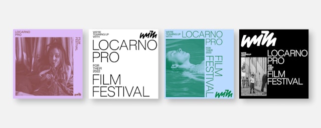
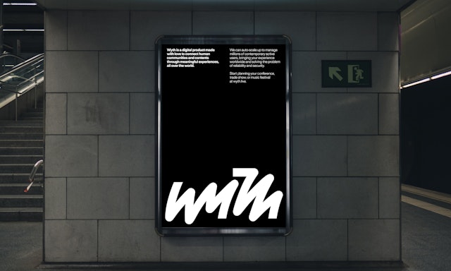
Every person’s perspective is different, and the logo is designed to convey the beauty and individuality of human expression.

The mark intentionally plays with legibility, suggesting the scrawl of personal handwriting and the spontaneity of conversation.

The expressive logo is set off by simple but striking typography dynamically arranged in data-based word clouds.


Wyth is an experience creation platform that helps organizations develop custom virtual spaces where the physical and digital seamlessly converge to bring people together for live, interactive events. The cloud-based solution can be used to present everything from corporate conferences, product launches and training sessions to sporting events, music festivals and fashion shows, all with an emphasis on human connection. Even if an event or community is entirely virtual, everyone involved will feel like they are participating for real—chatting, networking, collaborating and sharing.
Pentagram partner Giorgia Lupi and team have developed a new brand identity for Wyth that highlights the human-centered qualities at the heart of the platform. The expressive logo is accompanied by a dynamic, data-driven approach to type, color and motion that captures a vibrant sense of community. The framework encompasses brand strategy, positioning and messaging that emphasize the creative possibilities of the solution.
Every person’s perspective is different, and the logo is designed to convey the beauty and individuality of human expression. The mark intentionally plays with legibility, suggesting the scrawl of personal handwriting and the spontaneity of conversation. The letterforms are linked in a visual echo of the short, memorable name. (The logo will almost always appear in a context that also includes the URL or social media handle, where the name is spelled out.)
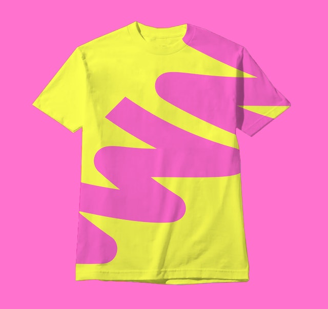
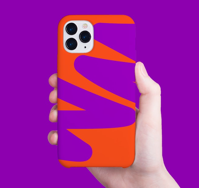
The mark abstractly reads as fluid and expressive, but was carefully constructed through numerous hand-drawn explorations. The curves are built from repeated geometric ellipses, and the ends of the letters align on an underlying grid for stability. Structurally, the logo is broken into a pair of halves: the letterforms within each part are joined, but a gap in the middle splits “Wyth” into two shapes that are paired “with” each other. The mark can be scaled up and down, or used as a graphic motif, cropped into details or arranged in colorful patterns.
The logo is set off by a simple but striking approach to typography that is inspired by word clouds. Arranged at clean 90-degree angles in a tight grid, these networks of words visually echo the cloud based nature of Wyth and its worldwide reach. Using two different type sizes, emphasis can be put on specific words to give a sense of individual meaning and expression. The brand typeface is Rules (by Blaze Type), a neo-grotesque font with squared endings.
The position and rotation of the type can be changed to create dynamic, free-form compositions that also incorporate the logo and other imagery. Most importantly, these variations can be rooted in data, with the type moving and scaling to indicate quantity, location or other measures. The cloud might be geospatial, showing how many attendees have joined the event and from where; or track data in real time to make the visualization “breathe” as information is updated.
Just as the kinetic type suggests the fluidity of shifting perspectives, color is used to represent a spectrum of emotions. To develop the brand palette, the designers identified four socio-emotional “pillars” that are important to Wyth: passion, inspiration, learning and empathy. The team then tested a select group of users for their color subjectivity, asking them to match the emotions with a chosen set of colors. Interestingly, all of the participants answered in the same way, reinforcing the universal nature of color categories. Black and white are the base colors for the brand, acting as a blank canvas for users’ creativity, just like the platform itself.
