
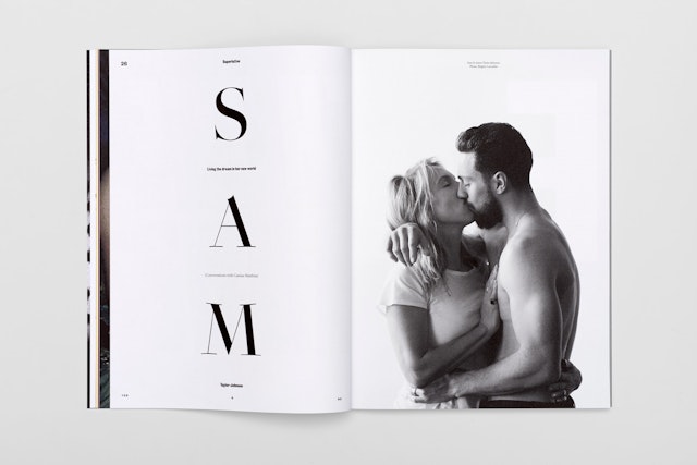

The design deliberately strikes against the considered visuals that are currently popular in the magazine market, employing a more ballsy and opinionated aesthetic.

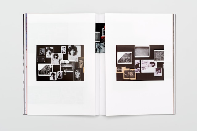
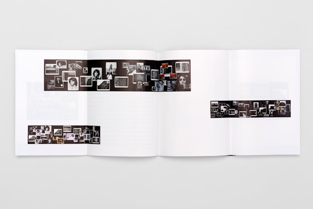



Pentagram have designed the inaugural issue of YES & NO, a quarterly magazine covering arts, culture, science, technology and progress. Named 'The Prototype Issue', the publication features in-depth interviews with Sam Taylor-Johnson and Vitalie Taittinger, a centrefold spread by Tom Burr and recipes from Michel Roux Jr.
YES & NO represents a defiant movement against the certainties that increasingly divide us. It speaks to a constituency dismayed by the stark choices that have defined the political landscape since early 2016. It is for people who believe in a more fluid, creative approach; for people who see value in exploring life from all sides and who embrace a multiple range of solutions.
It is the brainchild of Cassius Matthias, the former assistant of film director Anthony Minghella, who wanted to create a magazine that vigorously questions the binary-led modern world, sparking creativity, critical thinking and abstract thought in the process. “Yes & No won’t dictate what you should think and is more likely to raise questions than offer answers”, says Cassius, “the vision is to open an evolving conversation between the content and you.”
Cassius approached Pentagram after seeing Circular magazine, which our partner Domenic Lippa has designed for the past 12 years. Pentagram and Cassius then worked together to develop the visual feel and positioning of the magazine, making its editorial structure as provocative as its content.
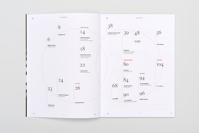
The design deliberately strikes against the considered visuals that are currently popular in the magazine market, employing a more ballsy and opinionated aesthetic. Traditional editorial structures - like an article being restricted to a single issue - and editorial navigation have been played with, making YES & NO an unapologetically intelligent offer that trusts its readers to explore without traditional signposting.
YES & NO’s desire to challenge traditional magazine structures is immediately apparent from its cover, which has no clear masthead, acting as a blank canvas for the logotype to separate to move around in relation to the cover image.
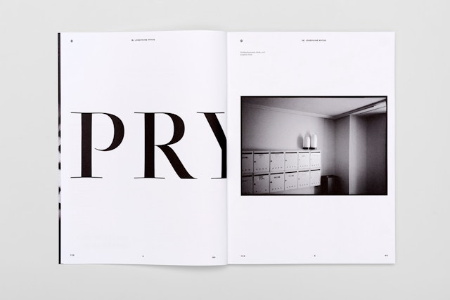
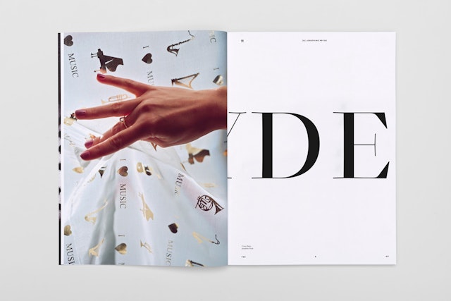
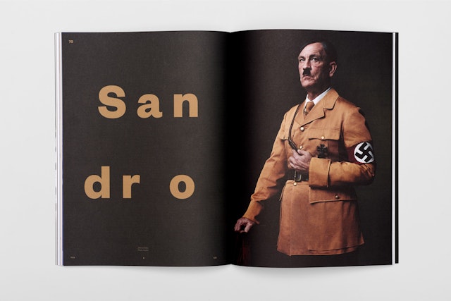
Within the magazine, advertisements have been replaced with typographic interventions, which divide the magazine into sections. The inclusion of these interventions speak to YES & NO’s confidence, preferring to launch without advertisements than have them shoehorned in.
YES & NO is now available to purchase from magazine retailers.
Office
- London
