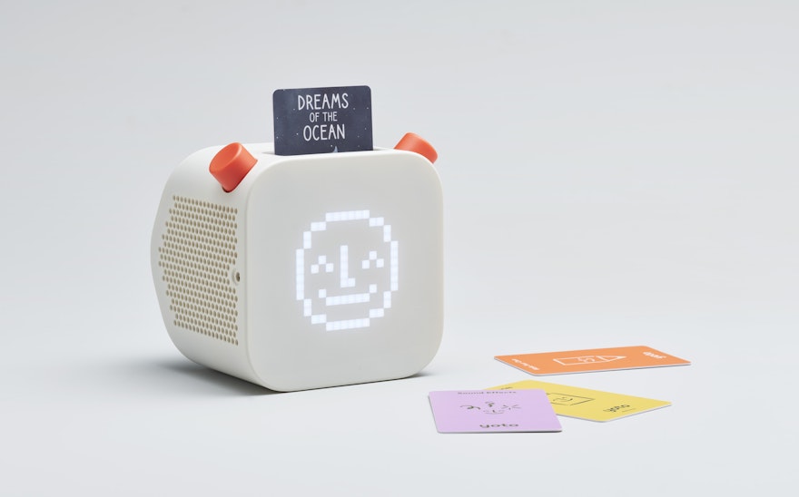


The industrial design team followed a research-led process to develop the Yoto Player, interviewing families and children to understand what they found important and then developing a design that prioritised kids being in control.

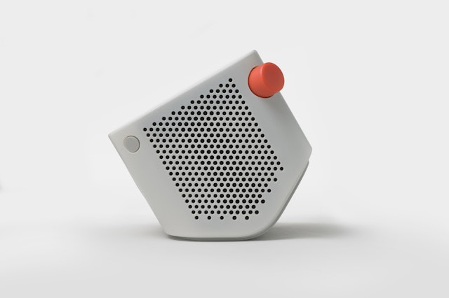
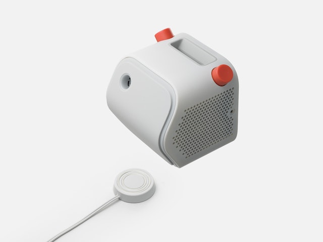
The angled back allows it to be placed upright on a table or shelf, or tipped back with the display facing the child when used on the floor.

The graphic design team developed the Yoto symbol to work across print, online and on the Yoto Player’s 16 x 16 pixel display. The team refined, designed and illustrated every aspect of the Yoto visual identity, starting with the Yoto symbol.




Yoto is an interactive, screen-free audio platform for children which delivers stories, music, radio and podcasts for families safely with the Yoto Player, a connected screen-free speaker. A key feature of the Yoto experience is the use of physical cards for playback and control of audio content.
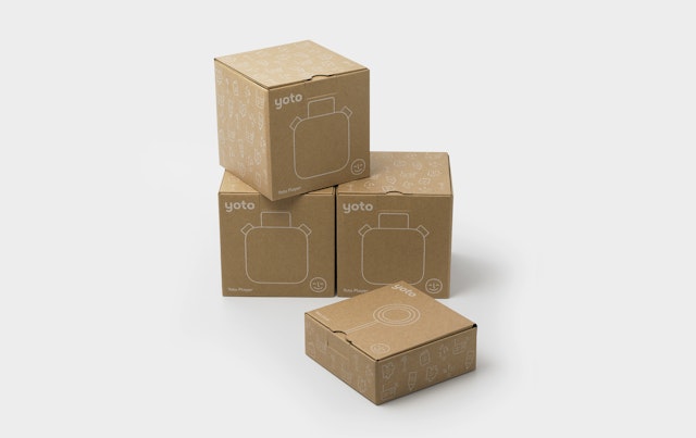
Pentagram developed the industrial design of the Yoto Player, the brand identity, packaging and visual identity.
Collaborating with Yoto CEO Ben Drury and CCO Tom Ballhatchet, the industrial design team followed a research-led process to develop the Yoto Player, interviewing families and children to understand what they found important and then developing a design that prioritised kids being in control. Content cards and two simple push and twist buttons allow playback and control of audio. A 16 x 16-pixel colour display shines magically through the front surface of the device, providing feedback and interactive content without being distracting.
The device has a battery to allow it to be used anywhere and a magnetic dock so kids can charge it safely themselves when required. The angled back enables it to be placed upright on a table or shelf, or tipped back with the display facing the child when used on the floor. Turning the device on its face launches a special bedtime mode with the display put to sleep and the rear nightlight activated.
The graphic design team developed the Yoto symbol to work across print, online and on the Yoto Player’s 16 x 16-pixel display. The team refined, designed and illustrated every aspect of the Yoto visual identity, starting with the Yoto symbol. The original Yoto logomark had a smiling, friendly face—this was refined by the design team, and the features of the face were used to match the letterforms within the wordmark itself.
Castledown by Colophon Foundry was selected as the primary typeface as it is aligned with the Montessori principles, with letterforms mimicking the action of drawing letters, as children first learn to write. An aesthetically pleasing typeface that also improved students’ reading and writing skills, Castledown was initially developed by the foundry as a bespoke typeface to unify typography throughout Castledown Primary School in Hastings.
The Yoto team was aware that the final colour palette had to appeal to both children and their parents, and Pentagram curated a sophisticated palette that feels both playful and modern. The brand has two distinct colour palettes: the Yoto brand colours and the card category colours.
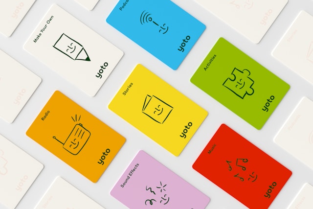
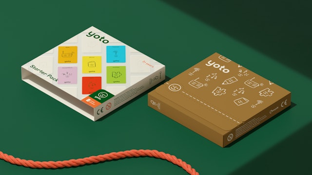
The cards with Yoto content are divided into six categories: Stories, Music, Podcast, Activities, Sound Effects and Radio. Users can also purchase a ‘Make Your Own’ card which allows children to draw and upload their own homemade content. Previous card categories were hard to identify, as the icons on the back of cards were small and difficult to read and decipher. Pentagram created a distinct colour and icon system to make them easily identifiable by both children and parents. The friendly Yoto face without the circle appears in all category icons, and bespoke illustrations indicate each card’s category. These illustrations can also be found across all of the Yoto packaging.
Pentagram’s motion design team also explored the limits of the 16x16 screen, testing and retesting to ensure a fluid animation that appears whenever the device starts up.
Office
- London
Partners
Project team
- Amy Joycey
- Albert Sanjuán
- Nav Bhatia
- Harc Lee
- Yemima Lorberbaum
