

Pentagram has created a new name, visual identity and packaging that moves the concept away from the youthful associations of the original Baskin Robbins brand.


As well as evoking associations with coffee and chocolate, the first two letters of ‘Brown’ act as an acronym for ‘Baskin Robbins’.


A family of circles and spots — extrapolated from the target-style ‘O’ icon — has been applied across the identity, resulting in a coherent visual language that swiftly communicates the cafe's product offering to its time-poor customers.
SPC Group is a Seoul-based food conglomerate with a track record of building market-leading franchise brands in South Korea, notably Paris Baguette. They launched Baskin Robbins in 1985 and followed up with Dunkin’ Donuts in 1993. Since then, SPC Group has established over 2000 ice cream and donut stores across Korea.
SPC’s latest offering is a concept store that builds on the success of the Baskin Robbins franchise in Korea, adapting the proposition to create a premium dessert cafe, targeted at Seoul's sophisticated working professionals. Pentagram has created a new name, visual identity and packaging that moves the concept away from the youthful associations of the original Baskin Robbins brand.
The new name, ‘Baskin Robbins Brown’, was chosen following strong performance in local focus groups. As well as evoking associations with coffee and chocolate, the first two letters of ‘Brown’ act as an acronym for ‘Baskin Robbins’.
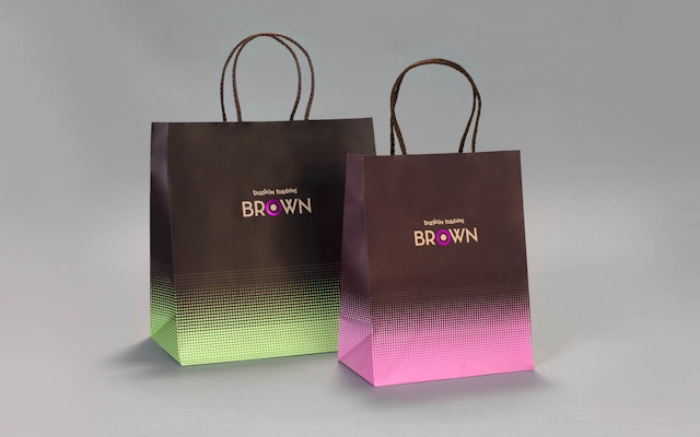
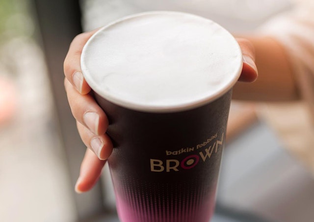
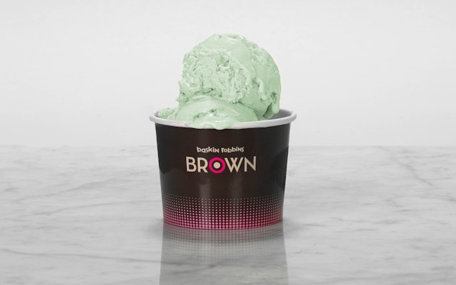
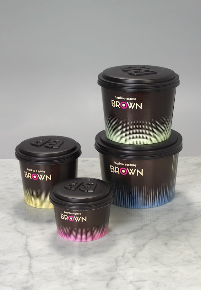
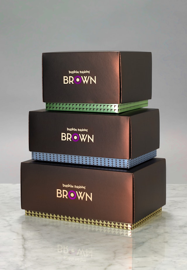
The logo juxtaposes the playful aesthetic of Baskin Robbins’ original mark with the art deco-esque elegance of the new ‘Brown’ logotype. The ‘O’ in ‘Brown’ retains the Baskin Robbins pink at the heart of the identity and acts as both a punctuation mark to emphasise the ‘BR’ acronym. A family of circles and spots — extrapolated from the target-style ‘O’ icon — has been applied across the identity, resulting in a coherent visual language that swiftly communicates the cafe's product offering to its time-poor customers.
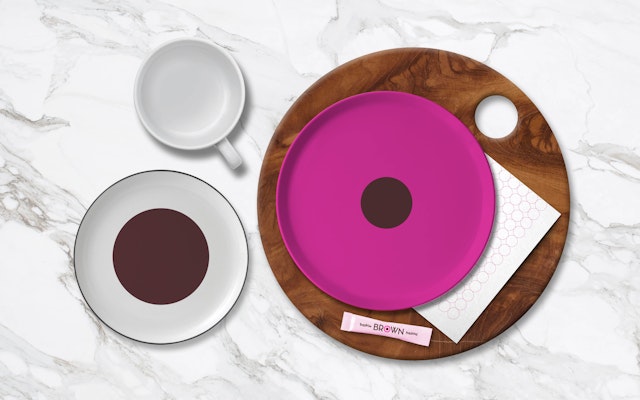
The visual identity combines a mature Neapolitan colour palette with eye-catching geometric patterns, designed to appeal to the cafe’s professional audience. Pentagram also designed a comprehensive program of product packaging and environmental graphics for the cafe, maintaining a clean and modern aesthetic throughout.
Client
SPC GroupSector
- Food & Drink
Discipline
- Brand Identity
- Signage & Environmental Graphics
- Packaging


