


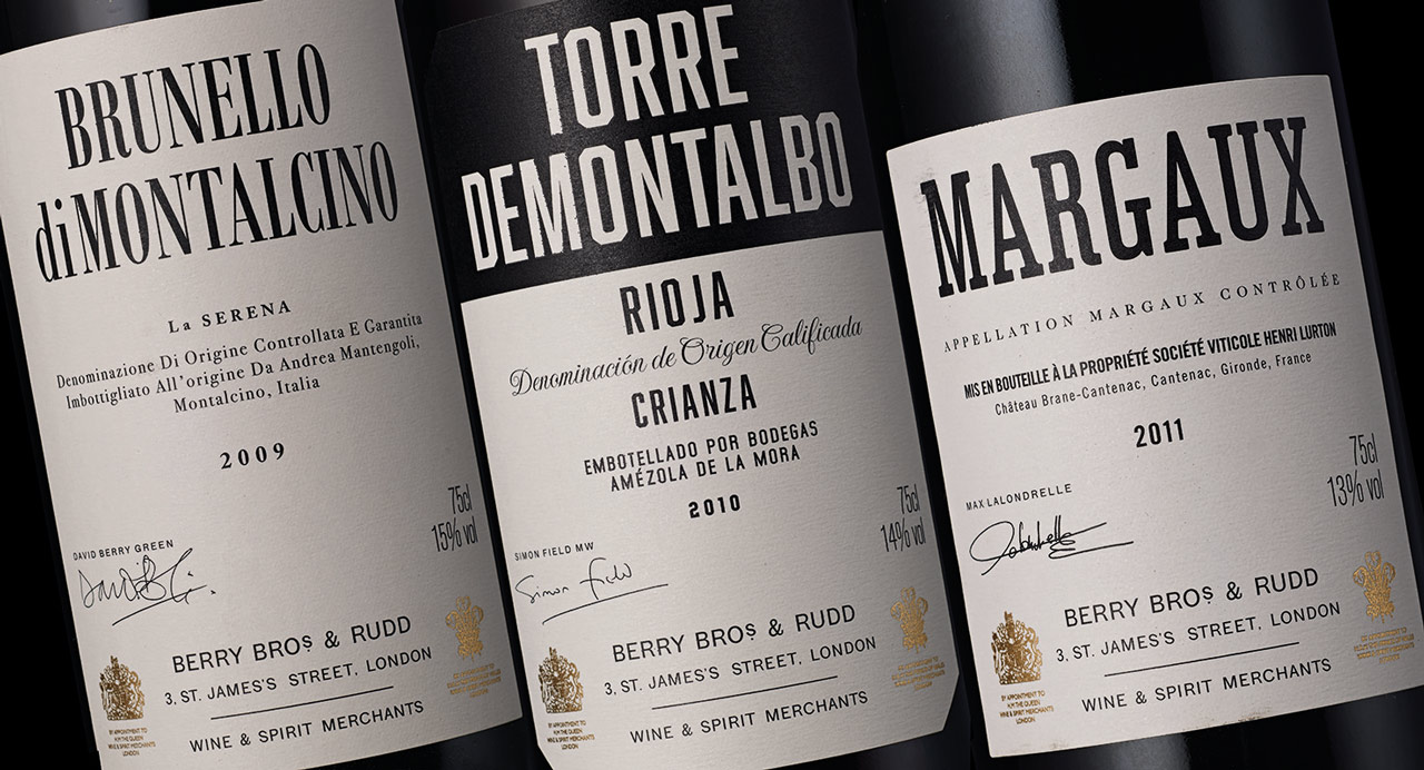
The labels are largely typographic with the brand logotype underpinning each design and wine type.


Berry Bros. & Rudd are one of the world's oldest and most respected wine merchants who have been based in London's St. James Street for over 300 years. Alongside developing a brand identity for the merchants, Pentagram spent two years designing 60 labels for Berry Bros. & Rudd's own brand selection.
With Berry Bros. & Rudd’s extraordinary heritage, the central tenet in the design is authenticity. Whilst creating an overall visual approach, that has a consistent set of design principles unique to Berry Bros. & Rudd, each wine required an individual nuance, resonant with its own provenance."
All the labels are essentially black and white with gold royal warrants, and are largely typographic in design. The brand logotype sits at the bottom of each label, so underpinning each design and wine type.
Structurally, each label design is the same, but within the overall framework there are typographic details in the wine name and descriptive text that are particular to each. This is the approach for the core Regional Reserve wines.
For the more individualistic Producer Partnership wines, graphic design has almost been removed. The labels are pared back, with simply the Berry Bros. & Rudd logotype, and all other information handwritten by the winemaker themselves, indicative of an authentic relationship – the intimacy of the maker and the curator. The inspiration for this once came from the history uncovered in Berry Bros. & Rudd's cellars.
Office
- London
