

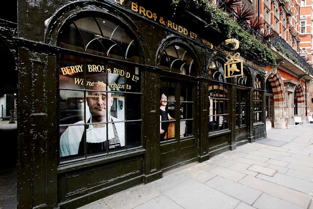

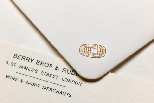
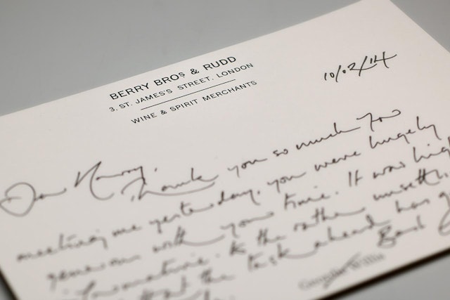
To uncover its lost stories, Pentagram scoured the grounds of Berry Bros. & Rudd’s original home at No. 3, researching and photographing a host of branded artefacts spanning five centuries.
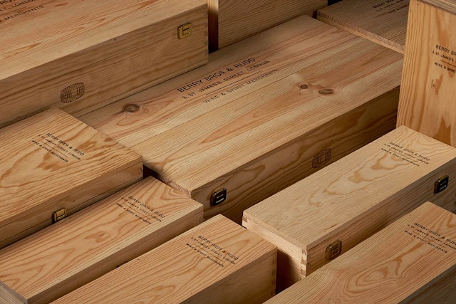
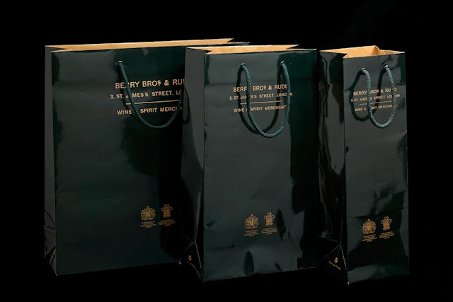
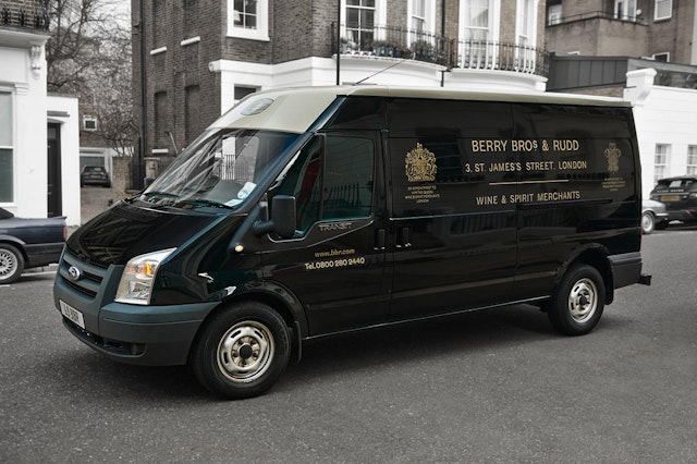
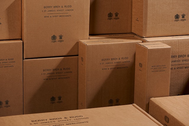

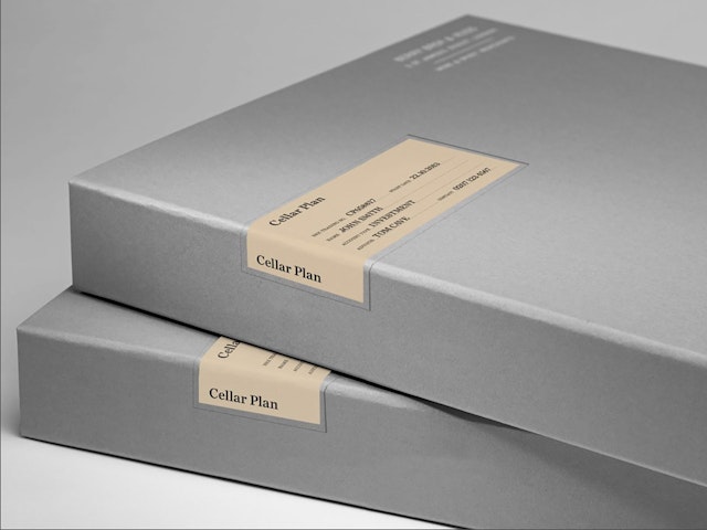
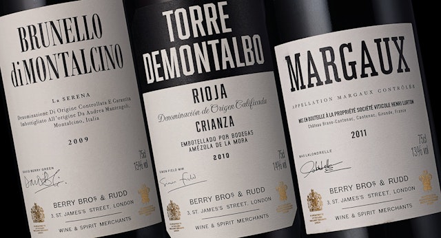

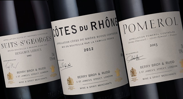


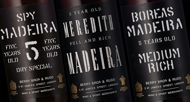

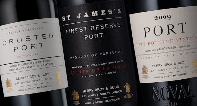
Creating a modern, robust identity for the world's most respected wine merchants, Berry Bros. & Rudd, who are still based in their original home of No. 3 St James Street, was a particular challenge. Berry Bros. & Rudd are the direct link between the makers and the drinkers of wine.
The new identity had to feel as if it had always existed. The previous manifestation had been created in the 1980's and had no reference to the company's history or authenticity. To uncover its lost stories, Pentagram scoured the grounds of Berry Bros. & Rudd’s original home at No. 3, researching and photographing a host of branded artefacts spanning five centuries. Studying wine labels, walls and old publications, a great array of typographic styles were found, each with their own eccentricities.
Pentagram spent days simply being with the history of this extraordinary company. In its cellars, archives and warehouses, relentlessly photographing and soaking up its spirit. Among the historic collection discovered were a series of distinctive labels that were both timeless and understated — so much the nature of the brand. The blend of typography and charming handwritten notes captured the expression of so much that is Berry Bros. & Rudd.
The final logotype was drawn from the best of several of these pieces of type, preserving the idiosyncratic anomalies such as the unnecessary comma after the No. 3, which are so evocative and the very heart of the company.
This same approach was applied to symbols and colour. The corporate green was taken from the shop fascia, as well as the warm gold of its lettering. The cool greys from the walls of their state of the art warehouse in Basingstoke alongside the polished mahogany from the boardroom table in No. 3 add to the palette, representing the two sides of the business: modern science and age old wisdom.
The narrative of the brand is essentially told through reportage photography, revealing its own environments and conveying the intimate nature of the company's relationships with the wine makers.
So substantial is the story behind Berry Bros. & Rudd that nothing needs dressing or fabricating, just retelling in the most candid and honest manner. The final identity is a respectful returning of wonderful things, lost in the past, reborn as a platform for an ambitious future. The hand of the designer is almost invisible, invention would have been useless.
Since developing the identity, Pentagram has continued to work with Berry Bros. & Rudd, and has designed labels for their Own Selection, Fortified Wines and Exceptional Casks collections.
Office
- London
