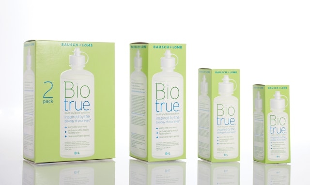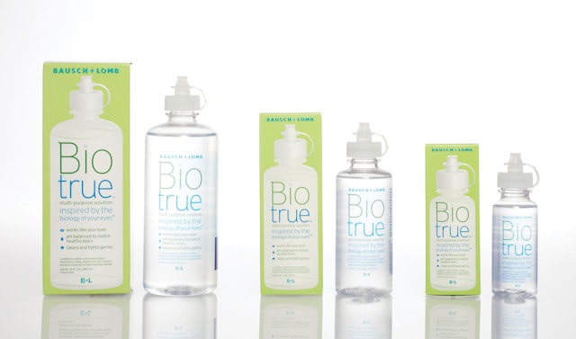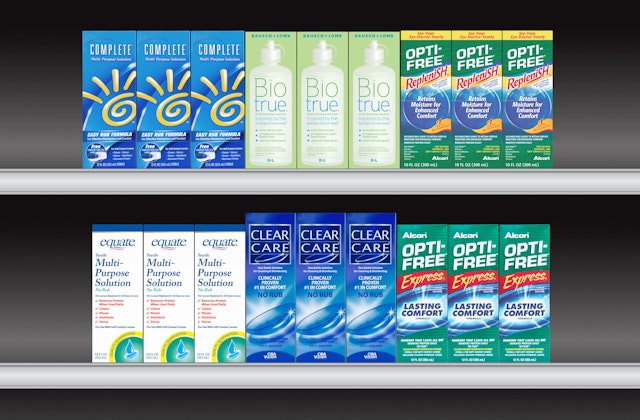


The graphics are distinctive and stand apart from other solutions on the store shelves, introducing Biotrue™ as a true innovation in its product category.


Biotrue™ is a new multi-purpose contact lens solution from Bausch + Lomb that is based on the biology of the eye. A breakthrough in its category, Biotrue™ employs principles of biomimetics—a field of science that examines materials found in nature and mimics their best assets to create optimal products. The multi-purpose solution works like the eye to help lenses stay clean and moist throughout the day.
Pentagram has designed the brand identity and packaging for Biotrue™ that establish the product as a unique new concept in lens care. The project was completed in collaboration with Fran Gormley at Greenwich Marketing Group and is the latest in Pentagram's ongoing work for Bausch + Lomb, one of the world’s largest healthcare brands.
The Biotrue™ logo breaks the word into two parts. The "i" is dotted with a drop of liquid that catches the logo in its reflection. Bausch + Lomb developed Biotrue™ following extensive research that analyzed how the eye naturally works to clean, hydrate and keep itself healthy. Biotrue™ is pH-balanced to match healthy tears, helping to maintain the eye’s natural condition. The solution contains hyaluronan, a natural lubricant found in the body and in the eye that helps attract moisture. Biotrue™ also keeps beneficial tear proteins active in the eye and contains disinfectants to fight against bacteria and keep lenses feeling clean and comfortable.
The brand identity and packaging for Biotrue™ is fresh, simple and modern, presenting the product as scientifically advanced, accessible and authentic. The identity uses the colors of blue and green to suggest moisture and nature. The logo breaks the name into two parts—Bio and True—and the “i” in Bio has been dotted with a drop of liquid that catches a reflection of the logo. The Biotrue™ packaging is green, emphasizing the product’s basis in nature, and features a picture of the bottle, showing exactly what is inside the box. The graphics are distinctive and stand apart from other solutions on the store shelves, introducing Biotrue™ as a true innovation in its product category.
Working closely with the scientists at Bausch + Lomb, Greenwich Marketing Group developed the brand name Biotrue™ and the core positioning premise––“inspired by the biology of your eyes™”––for the multi-purpose solution. “We had a unique product that works like the eye itself,” said Fran Gormley, principal of Greenwich Marketing Group. “Our goal was to create a brand name, a positioning and an image that reflected this breakthrough.”
The Biotrue™ project is the third Pentagram has completed in an ongoing collaboration with Bausch + Lomb, following the development of a new corporate identity for the company and a redesign of the brand identity and packaging for its renu® multi-purpose solutions.
Office
- New York
